When you enter the license key and activate the BASIC, PRO or AGENCY license, you will get the ability to customize under construction pages via a Drag&Drop builder.
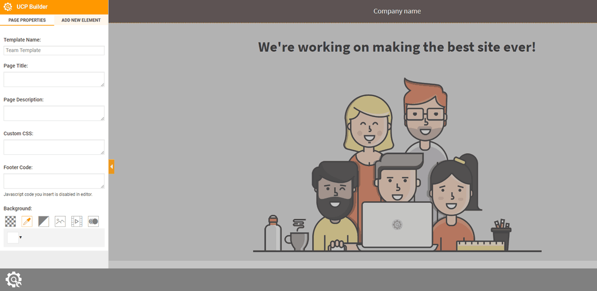
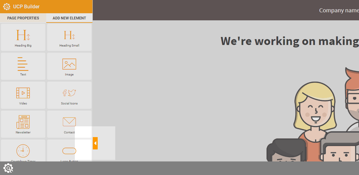
Page Properties tab
Inserting elements and actually designing a page is fun. But before devoting time to sorting elements on your page, you should configure a few thing about the page, and we advise not to skip them:
- Template Name – name you will see while working with the plugin and managing pages
- Page Title – the SEO title of your page that’s shown in the browser
- Page Description – the SEO description of the page
- Custom CSS – write any CSS you want to apply to the page you’re customizing
- Footer Code – enter any Javascript code in the footer. Javascript code you insert is disabled in the editor.
- Background – choose from transparent, solid background, gradient background, image, video or animated background
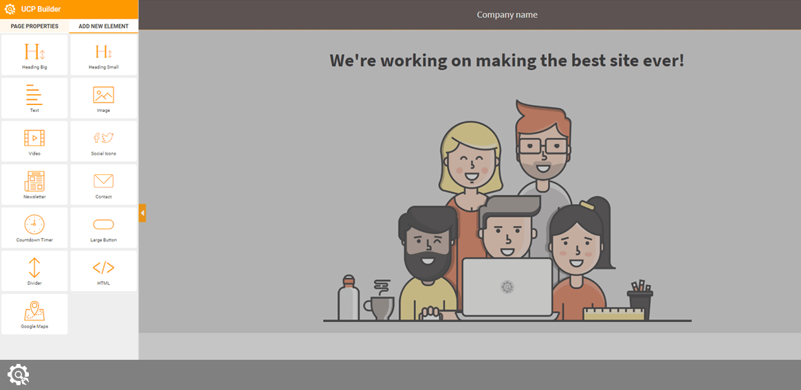
Add New Element tab
Currently, there are 13 elements you can use in the UnderConstructionPage PRO version of the plugin. To add an element to the page, simply drag and drop the element from the left-side menu to the page on the right side. Once you drop an element, the menu on the left side will change and show all options available for that element
Depending on the license you have purchased, you will be able to use some or all the elements:
- Heading Big
- Heading Small
- Text
- Image
- Video
- Social Icons
- Newsletter
- Contact
- Countdown Timer
- Large Button
- Divider
- HTML
- Google Maps
Except for the Newsletter and Contact elements that have some extra options, all the other elements have the same module options that allow you to modify:
- Module Width – switch the module with to one quarter, one third, half, three quarters or make it full container width.
- Padding – modify the position of the element from all sides
- Border – change its color, style, and thickness
- Background – make it transparent, solid, gradient, or choose a background image
- Full-Width Background – turn on the option if you want the background image to stretch across the full width of the page
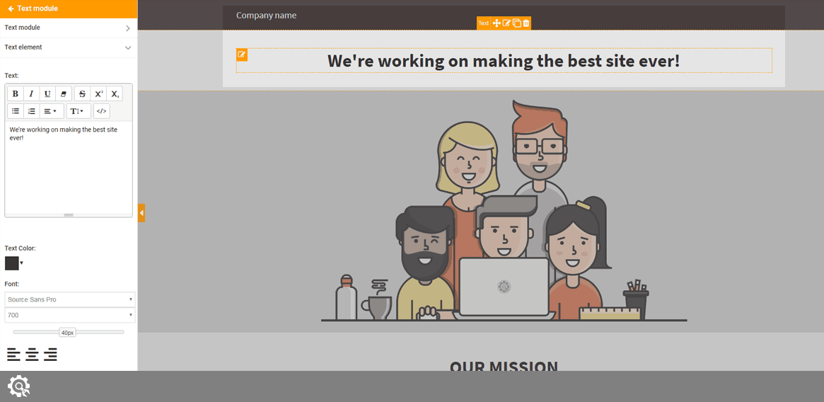
Heading Big, Heading Small & Text modules
The text element tab lets you change the text and work on the formatting. Use the editor to write anything you want, format the text, change the color, font type & size, and choose the alignment of the text in that element.
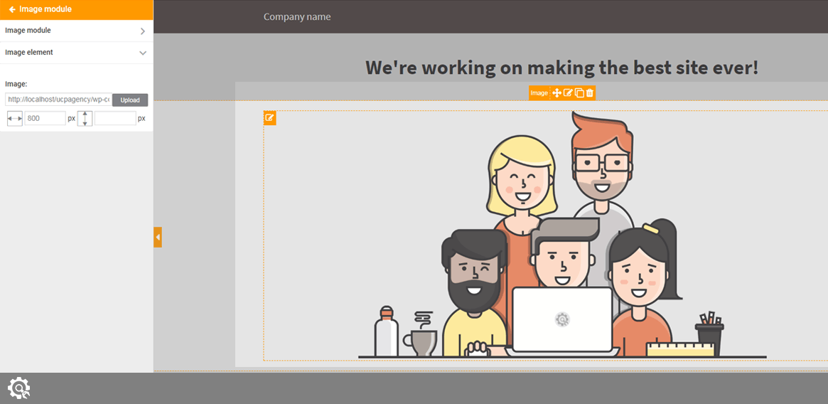
Image
By switching to the Image element tab, you can add a picture to the page by uploading it. Simply click the upload button which will open a new lightbox. There, you will be able to
- Upload an image
- Use an image from your Media Library
- Search Unsplash image (library of more than 300k free images)
- Choose original UCP images
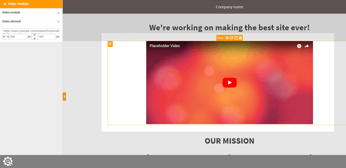
On the same tab, just below the upload button, you can set width & height of the image
Video
By switching to the Video element tab, you will be able to add a video from Youtube or Vimeo. Simply copy the URL to the video and paste it into the field. It’s also possible to select the width & height of every video that you embed.
Social icons
After dragging the module to your new page, you will be able to change the icons color and size in pixels. To feature the icon on the page, select the icon by putting a check in the checkbox next to it. Then copy the URL to the social media site that you want to link to.
For example, your URL to Twitter should look like this: https://twitter.com/webfactoryltd
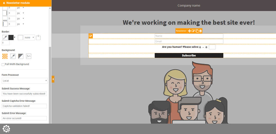
Newsletter
The Newsletter module is a bit more complex one. Because of the, there are a few more options you can set. By adding the Newsletter module, you will be able to start collecting email addresses from your visitors and store them locally (default), use MailChimp or any other 3rd party autoresponder to process the form.
The standard module gets a few more extra options:
- Form Processor – Choose local, local + Mailchimp or local + Zapier. MailChimp and Zapier options will appear after you set them up in the settings
- Submit Success Message – customize the message shown to a user after the form has been successfully sent
- Submit Captcha Error Message – customize the message shown to a user if Captcha hasn’t been correct
- Submit Error Message – customize the message that shows if something else was wrong
After the standard module, there are four other elements you can modify for the Newsletter module:
- First Input Element – enter name and placeholder for the first input box. This is where you subscribers will write their name. Make sure the name of the element matches the name of the field in your autoresponder. You can style the field to your likings.
- Second Input Element – enter name and placeholder for the second input box. This is where your subscribers will their email address. Make sure the name of the element matches the name of the field in your autoresponder. You can style the field to your likings.
- Captcha Element – enable or disable Captcha (security check that prevents robots from automatically submitting forms)
- Submit Element – enter name and placeholder for the submit element. This is the button your subscribers will have to click in order to submit the form. Make sure the name of the element matches the name of the field in your autoresponder. You can style the field to your likings.
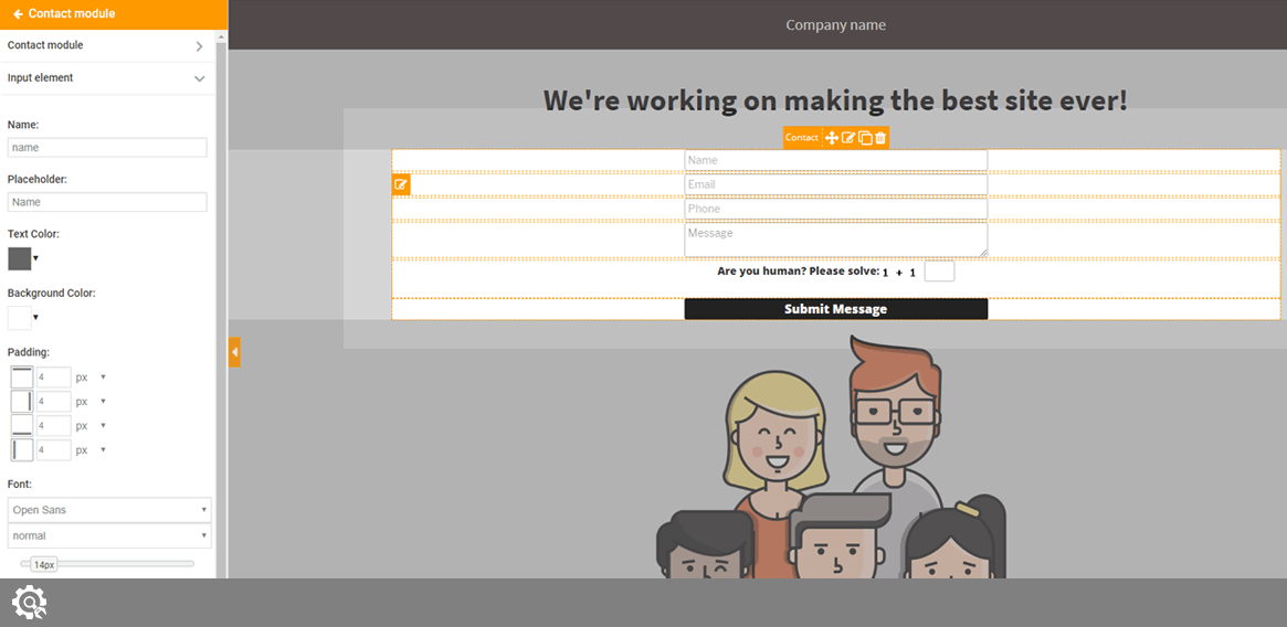
Contact
Similar to the Newsletter Element, this is a more complex module. By adding the Contact form, your visitor will be able to contact you through the form. You can process the messages locally (default), via MailChimp, Zapier or any other autoresponder that can generate HTML forms.
The standard module gets a few more extra options:
- Form Processor – Choose local, local + Mailchimp, local + Zapier or local + autoresponder. MailChimp, autoresponder, and Zapier options will appear after you set them up in the settings
- Admin Email – your email address where you will receive the message
- Confirmation Email Subject – subject of the email that users will receive after they contact you
- Confirmation Email Body – the message that users will receive after they contact you
- Submit Success Message – customize the message shown to a user after the form has been successfully sent
- Submit Captcha Error Message – customize the message shown to a user if Captcha hasn’t been correct
- Submit Error Message – customize the message that shows if something else was wrong
After the standard module, there are six more elements you can modify for the Contact module:
- First Input Element – enter name and placeholder for the first input box. This is where you subscribers will write their name. Make sure the name of the element matches the name of the field in your autoresponder. You can style the field to your likings.
- Second Input Element – enter name and placeholder for the second input box. This is where your subscribers will their email address. Make sure the name of the element matches the name of the field in your autoresponder. You can style the field to your likings.
- Third Input Element – enter name and placeholder for the third input box. This is where your subscribers will their phone number. Make sure the name of the element matches the name of the field in your autoresponder. You can style the field to your likings.
- Text Area Element – customize the field where users write the message
- Captcha Element – enable or disable Captcha (security check that prevents robots from automatically submitting forms)
- Submit Element – enter name and placeholder for the submit element. This is the button your subscribers will have to click in order to submit the form. Make sure the name of the element matches the name of the field in your autoresponder. You can style the field to your likings.
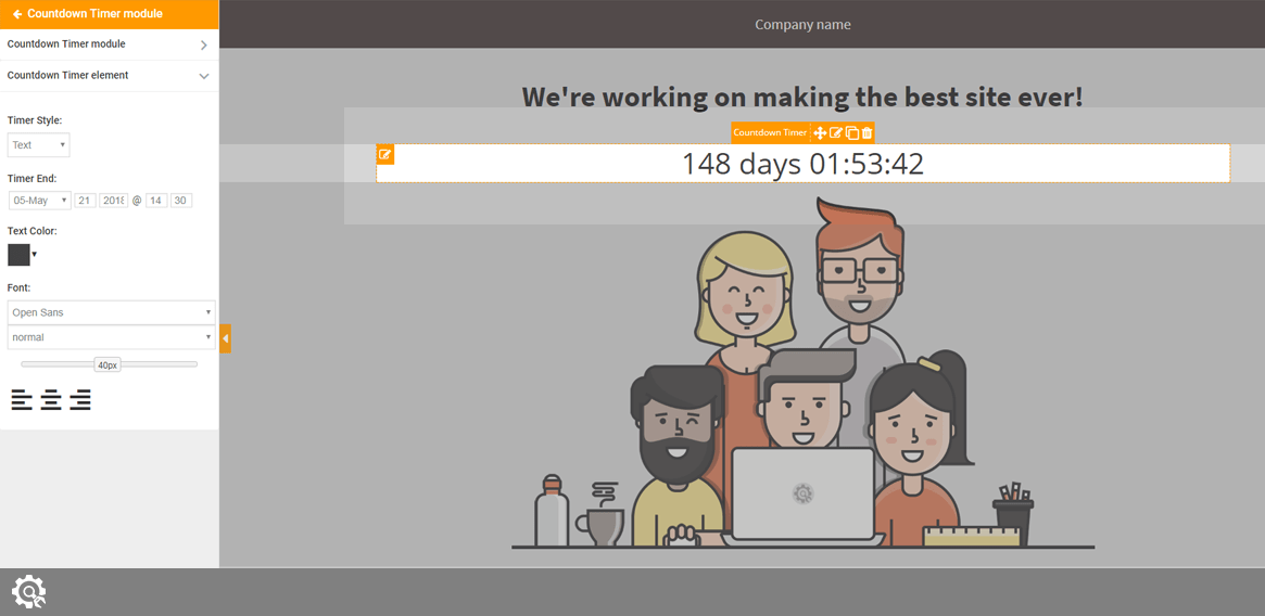
Countdown Timer
A countdown timer is a simple element that will show your visitor the time until the launch of your site. Or it can count down to anything you want (maybe until a giveaway you’re launching, special discount or New Year).
There are two styles you can choose from:
- Text – a simple text showing the numbers
- Flip – printable time cards with numbers that flip on number change
Here you can change the date and time to which the timer will count down. You can also style the timer by choosing the text color, size, font, and alignment.
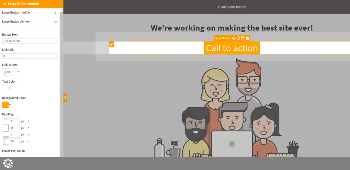
Large button
By placing a button, you can create a visible call to action that will attract visitor’s attention. The button can be styled to your likings:
- Button text – a text that will be shown on the button
- Button link – URL of a page where you want to lead a visitor who clicks on the button
- Link Target – _self opens the link in the same tab, while _blank opens it in the new tab
- Text Color – color of the text that’s displayed on the button
- Background Color – Color of the button
- Padding – modify the position of the button from all sides
- Hover Text Color – change the color of the text while user hovers the cursor over it
- Font – change the font, it’s type, size, and alignment
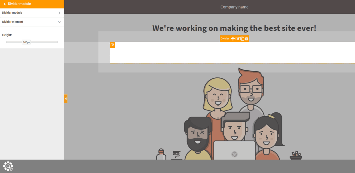
Divider
A Divider is a simple element that will let you add a space between other elements. Simply drag and drop a Divider to the page, and choose its height.
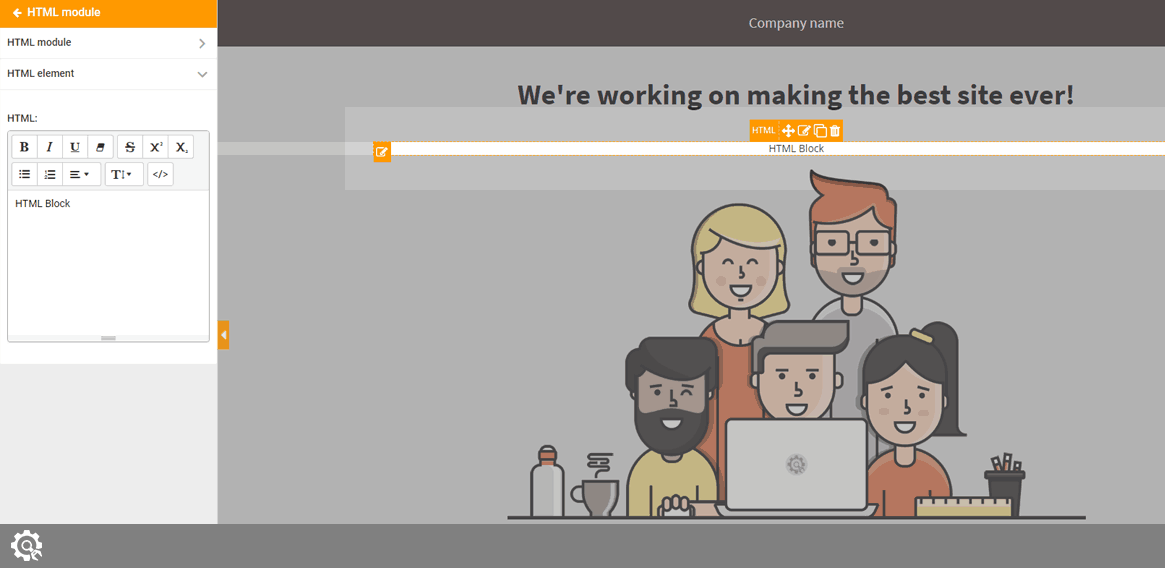
HTML
If you want to add custom HTML code in order to achieve a specific result, this is the element you will need on the page. Drag and drop the element to any position on the page, and write the HTML code you want to execute.
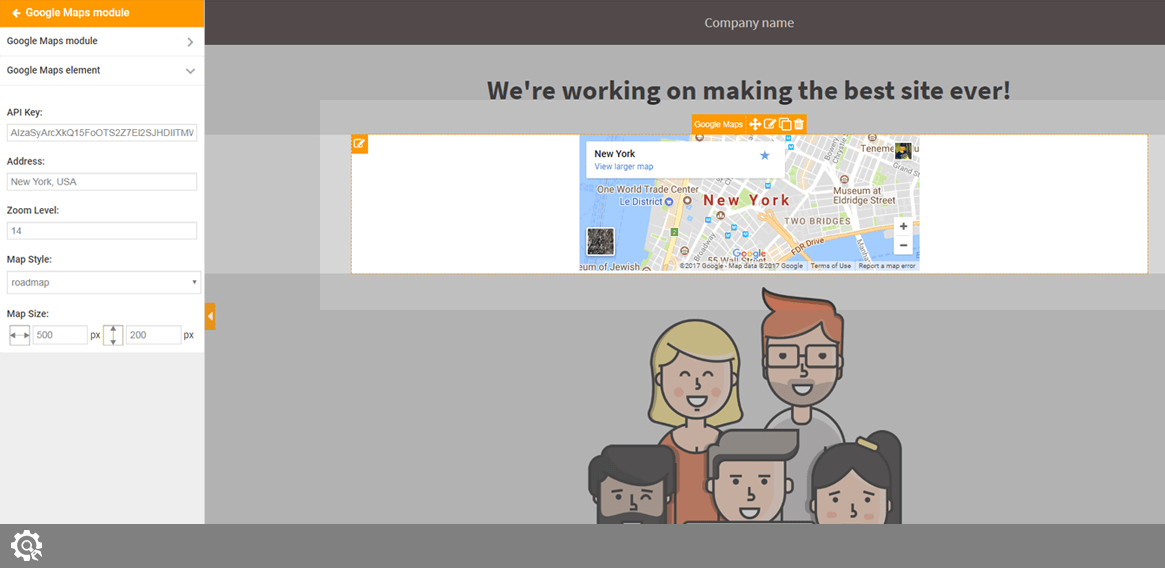
Google Maps
With this element, you can quickly insert a Google Maps and shown any location on your page. After placing the module on the page, there are few things that you need to set up in order for the map to work correctly:
- API key – you will need to generate a free API key to make the map work
- Address – write an address you want to show on the map
- Zoom Level – write any number between 1 and 22 to set the zoom level
- Map Style – there are four map styles you can choose from: roadmap, satellite, hybrid, terrain
- Map Size – choose width and height of the map in pixels
Managing elements on the page
Once you have a specific element on the page, you can still edit it and change its features. By hovering your mouse cursor over the element on the right side of the page (the preview), a new set of icons will appear on it:

- Element Name – this is just a label that lets you recognize the element
- Move – click on the move icon and drag the element to a new position
- Edit – click on the icon to edit the element. Options will appear on the left side menu so you can change the values
- Clone – click on the icon to clone the element. New instance of the element will appear just below the original one
- Delete – click on the icon to remove the element from your page
Editor management
On the left-bottom part of the page, you can see a few icons that will let you manage the editor and your page.
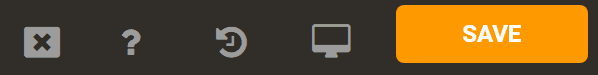
- Close the editor – click on the button to close the editor and return to the plugin’s settings
- Help – shows the documentation
- History – click on the icon to open a menu. Choose to Remove all modules at once or Undo all changes you’ve done until clicking the button
- Device Preview – click the icon to open a menu. Choose Desktop, Tablet or Phone to change the preview window.
- Save – click the icons to Save and Activate, Save as or just Save the template
If you want to preview the page in full screen, you can close the left-side menu by clicking the little arrow button on the middle. Please see the screenshot.
Documentation didn't help? Contact support!
Customers who purchased and have a valid PRO license - contact our support via the contact form built into the plugin or use the general contact form. If you're using the later method please include your license key in the message or contact us via the email address used when purchasing. This speeds things along.
Using the free version? We have you covered too. Head over to the forums. First look at older threads and if you don't find anything useful open a new thread. Support is community-powered so it can take some time to get an answer. If you need premium support this second - upgrade to PRO.