Conversion rates vary a fair bit depending on what industry you’re in.
But, did you know that industry average conversion rates aren’t applying to the top 25% of sites?
That’s right, with a few simple guidelines you have a higher chance to turn the traffic into valuable clicks.
Although traffic is the lifeblood of any website, converting visitors to customers is crucial for your business. At the end of the day, you need visitors to buy your products, right?
What is a Landing Page?
So, before we get into the details, let’s give a brief intro on what is a landing page means.
The process flow for the visitor normally goes as follows:
- A user searches for a keyword on Google
- He discovers your Landing Page
- He reads through the content and clicks on your CTA (Conversion)
Many of us might have a feeling of being stuck in the “industry average” when it comes to the percentage of conversions.
Yet as I mentioned earlier, the top 25% of websites in your niche convert at a much higher rate. Sometimes even double the industry standard.
And if you think it’s impossible to be in this top 25%, think again! I’m betting if you already see conversions on your website, there is not much you need to do. All you need is a few slight adjustments and you’ll be good to go.
Let’s examine some of the vital components of successful landing pages to see how we can optimize them:
1. Content
Since you’ve managed to get visitors to your website, you need to make sure your content is high-quality as well.
Start by looking at the headline and the first paragraph of your content. These might be more important than you think.
A compelling headline gives a great “first impression” to people. This often makes them want to read further. Focus on it being intriguing and value-oriented, but remain unambiguous.
Once you’ve managed to grab the reader’s attention, you need to quickly introduce the topic in the first paragraph. You can do it by going from general to more specific.
Here is what we mean by that;
“Black wolves are a member of the canine family. They are found across North America, Europe, and Asia. Although black-furred, they are actually a variation of the grey wolf. The different coloration is caused by a color mutation.”
The first sentence serves as a general introduction, while the rest of the paragraph expands on specifics.
Once you’ve done that, the rest of your content needs to resolve issues or questions. Consider the needs of your customers and direct the content towards those areas.
Read this choose the right web host article to get an idea of a clear content structure. A clear structure helps readers learn everything about the topic, even by skimming.
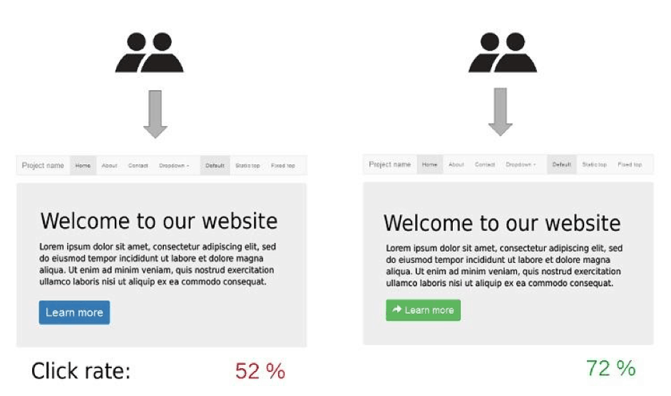
2. Call-to-action

Caption: AirBnB’s CTA is clear and addresses the needs of its entire market segment at once
The call-to-action (CTA) is the hook that dangles at the end of your baited line. Once your excellent content attracts visitors in, they are ready to bite. However, avoid using too many CTAs on the landing page as that will confuse your visitors.
Ensure that your CTA is clear, attractive and singular. Don’t distract your reader’s attention, especially when it doesn’t make sense to do so.
Tips on setting up the perfect CTA;
- Build it around an emotional trigger – This usually an incentive to increase effectiveness. Such as, the potential to earn money, gain something valuable or discover more about a certain topic.
- Ensure clarity – If you want a reader to click on your CTA, make sure the reason is clear. All CTAs need a logical buildup that works your reader towards the eventual action. Also, instead of generic terms such as “submit” or “go”, label your CTA with a potential result. Examples of this include “Earn Cash Today” or “Join the Community Now”.
- Be Surgical – CTAs that are short and concise are often the most effective. Try to keep your CTA shorter than five words such as the examples above.
- Position Strategically – Give your readers a chance to read the marketing spiel. Placing your CTA after the marketing message is a standard tactic. This set up applies even with very little content. Remember, though, not all languages read from left to right. Therefore, you have to follow the logical reading flow of your target market.
- Convey Urgency – Visitors who arrive at your landing page are often looking for something. Once on your site, usher them towards a resolution by letting them know they’re only a step away.
3. Include Testimonials
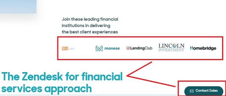
Caption: ZenDesk places testimonials from the leading customer very neatly near their CTA and branding
People need a sense of confidence when making purchasing decisions. Small businesses may not have the clout that is associated with major brand names. But, they can let visitors know that other customers have been satisfied with them.
Gain credibility and convince customers of the transparency by using customer testimonials. Place these near your CTAs. It would be best if those testimonials are verifiable. You can do so by adding a link to the actual statement or comment on a third-party site.
4. The Sales Funnel
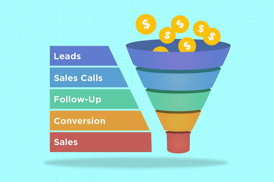
Caption: Traditional sales funnel (Source: 760marketing)
The sales funnel is a process that leads a potential customer to become an actual customer. Each stage has its purpose. It helps to build a logical flow of progression. Because of the different stages of the funnel, it can be easy for site owners to get distracted in the process. Make sure that you link the various stages of the funnel correctly.
Your lead generation tool is one of the most important parts of the sales funnel. It is the most exposed extension of your site and reaches a great number of potential visitors. Using a lead generator like an email marketing tool can be vital to the success of your site. But, you need to use it effectively.
You gain a chance to widen your lead generation funnel by using email marketing tools. At the same time, there’s a potential to increase the effectiveness of your marketing funnel. By building your funnel correctly or adjusting it to become more streamlined, it can be more beneficial than you think.
5. Visuals
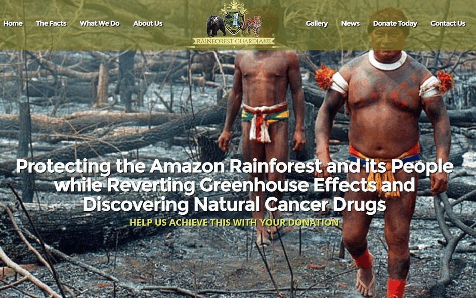
Caption: Visuals can be immensely impactful on your visitors such as this front page large image on Rainforest Guardians.
Humans process images much faster than text. Studies have shown that visuals often have a significant impact than text elements. Site owners already know this instinctively. Yet, it is also crucial for you to ensure the visuals you use are effective.
As a general guideline, your visuals should;
- Be Relevant – Try to ensure that your key visual showcases your product. If you are a service provider, relate relevance through the visual instead.
- Of Quality – Despite high-quality images taking up more resources, you must not overlook the importance. The quality of your images is important as they often also shape the visitor’s impression of your site or brand.
- Convey Feeling – People agree with the saying that a picture paints a thousand words. And that’s because it’s true. Using this tactic can help ensure you convey an impactful message. It also offers your readers the visual understanding or gives a sense of what to expect.
6. Build trust
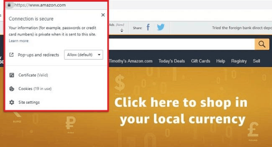
Caption: Don’t forget that your SSL certificate is also part of the trust-building process
Earlier, I mentioned transparency and building trust with your visitors. Aside from customer testimonials, other elements of your site also contribute to this. Take for example the tiny part of your site that displays SSL certification.
Not all websites collect payments for purchases. But, any sort of information collected might also scare your readers. People are more wary about online privacy these days. Things that involve giving personal details and contact information can raise visitors’ concern.
In this case, an SSL certification can go a long way to start the trust-building process. Yet aside from that, there are many other little things that you can do as well. Using data security badges, having clear privacy policies and other similar tactics can help too.
Customers’ concerns are beyond the legitimacy of your site. They also need to know that you are paying attention to their safety and security as well.
7. Consistency
Remember that to build effective landing pages, the entire process must be consistent. Consistency is the key not only to create effective landing pages but also important to keep visitors stay at your site.
Try to ensure the message is focused when you deliver it. Remember that you are moving visitors along a process and any break in the middle may lose some of them.
If you are using multiple advertisements to generate leads, keep them in clear channels. Each lead should follow the right path towards the sale. Everything along the same path should be consistent.
8. Plan for Mobile
Source: Google
Many website owners are now beginning to plan for mobile. Yet, often this has gone only as far as using responsive themes. If you’re one of the ‘responsive website’ owners, have you considered other elements aside from visuals and text?
For example, are the forms on your landing pages mobile friendly? Mobile devices have much less available real estate for users to type on or view. Remember to consider that as well. Standard long forms should have their mobile equivalent or you may lose more customers than expected.
9. Finally, Test Your Landing Pages
Caption: A/B Testing can help you choose the best version of a landing page (Source: Wikipedia)
Once you’ve made the changes to improve your landing pages, you have to test those changes out. It’s necessary to see how effective those changes are. And A/B testing is the process of testing two (or more) versions of a product to see which is more effective.
It is usual in A/B testing to check for the effectiveness of individual elements, so don’t make all your changes at once. Tweaking a headline can be considered as one change, while a swapped of main visual could be another.
By going through the A/B testing process for your landing page, you can make sure the changes are positive. The landing page revamps will result in a positive impact on your site. You can do this incrementally. If you simply have a large site with too many products then an automated tool might be able to lend a hand.
The process should help you to;
- Choose the best version for your landing page
- Understand how your users behave
- Identify new opportunities
Conclusion: Make Small Changes
The job of increasing conversions from your landing pages may seem quite daunting. There are a ton of very small, but thoughtful things you need to do – one at a time.
Think of it as a learning process. Do it progressively as part of your journey towards joining the top 25% of websites. Being methodical help and if you document the process, you will be well on your journey.
Things also might change over time. If you’ve tried something you love before but it doesn’t seem to work, come back to it later. Everything evolves and what works today may or may not tomorrow. It is a work in progress and the changes you make all help in their own way.