Your site’s contact forms can result in higher conversions, but they need to offer an excellent user interface (UI). The forms used to reach other business owners (B2B) are often lengthy and demand deeply personal information. Users might be reluctant to share a telephone number or details about their age or income.
Unbounce reported that including a phone number field dropped conversions by 5% or more. Unless you absolutely must have their phone number, make the field optional, or remove it altogether. Think about what information you need to serve the customer effectively and ask only for that at first.
One of the best ways to learn what forms work best for your company is by studying how others present theirs. Below, you’ll find five tips for creating excellent contact forms and some examples.
1. Segment Your Audience
The best contact forms separate your audience into groups. You can then market to them very specifically. There are many reasons a customer might contact you. They might want to ask a question about the product, ask for help if something breaks, or reach out about technical issues.
Segmentation allows you to get them to the right department and get the help they need. Grouping customers makes your contact more efficient.
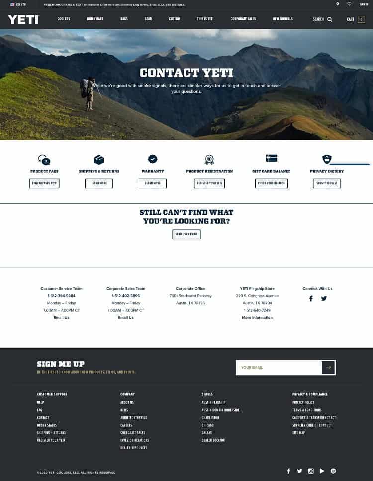
Yeti segments its audience into groups such as those who want common answers to product questions, warranty concerns, and privacy inquiries. They also have a button if none of the segments work for you. Although Yeti is business-to-consumer (B2C), they also have a B2B portion of their audience. Segmenting allows them to serve both individuals and business owners from one page.
2. Offer Something of Value
What are the expectations users have for your website? For example, they likely expect your navigation to be near the top of the page and the logo to be in the upper left. They may also assume you will offer them something of value if they provide their information to you. In a digital world, personal details are a commodity that people trade for free books or information.
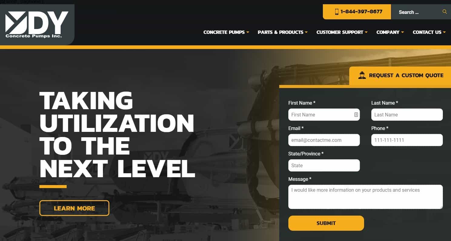
DY Concrete Pumps offers a custom quote if you provide your name, email, and telephone number. The form perfectly matches the design of the rest of the website, but the yellow tab stating you can get an estimate draws the user’s attention.
3. Offer Options
There may be times when a user looks at a form and realizes they don’t want to fill in all those details and wait for a response. Offer options for them to get in touch in other ways right on your contact form.
Include your toll-free phone number, email address, and even a live chat button right on your Contact Us page.
The more ways you offer for the user to get in touch, the more likely they’ll convert from a browser into a lead.
4. Integrate Registration With Social Media
Increase conversions by making registration as straightforward as possible. You can integrate your form with popular social media channels so users can sign up with the click of a single button rather than filling in their email and other fields. The contact form grabs all the same information from the person’s profile.
Studies vary on the best length for a form. Some show that a shorter form converts better and others a long one. It makes sense to collect only the details you absolutely must-have.
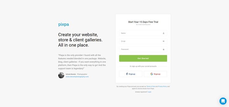
Pixpa has a short signup form but also adds buttons for Facebook and Google so you can sign up with your social accounts. By keeping registration as easy as possible, you’ll wind up with more leads.
5. Add Trust Factors
You’re asking people to trust that you’ll protect their info. However, they have no reason to believe you’re going to watch out for them. Add in trust factors to show they should share their private details with you.
You might include badges from memberships in organizations related to your industry. You could include testimonials, privacy policy, and easy-to-find contact information. The key is to show that you put their privacy first and won’t resell their personal data to third parties without their permission.
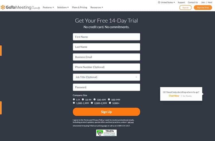
GoToMeeting offers a 14-day free trial for companies that want to try out the online conference system. They offer a Contact Us button in the upper right corner of the page. They also have a live chat feature on the bottom left side. Note the TRUSTe Verified Privacy seal just under the contact form and their toll-free telephone number.
Improve Conversions
The average website only converts a small fraction of the people who visit. Anything you can do to increase your conversions will improve your bottom line as a business. Try some of the techniques listed above and keep refining your form until you’re happy with the response rate. Improving your contact form is a process that occurs over time rather than something that happens with a single edit or two.