Is your landing page generating enough conversion? If not, it is time to find out the reasons behind it. Maybe you are not doing enough testing. Or you should get a clear idea on which elements work better than others to make your pages highly rewarding.
Landing pages are the first step that builds a bridge between your online store and the customer.
They give a visitor the first impression of your business. So it’s vital that you understand and apply landing page optimization techniques that can achieve your business goals.
In this post, I’m going to show you some of the most effective landing page hacks that can boost your conversion rate significantly.
Keep reading.
Landing Page Copy: Keep it concise and interactive
A great landing page can communicate clearly and convince visitors to become your leads. How are you going to do that?
Marketers often emphasize too much on visuals and show little interest in landing page copy. This results in losing conversions.
Nonetheless, you still must build your landing pages so that they are visually stunning. But still, the main job depends on the words you are using to make someone fall for your offers and services.
You should trigger the emotion of your visitors, like pain points and desires with your copy.
For example, take a look into this Pinterest landing page below.
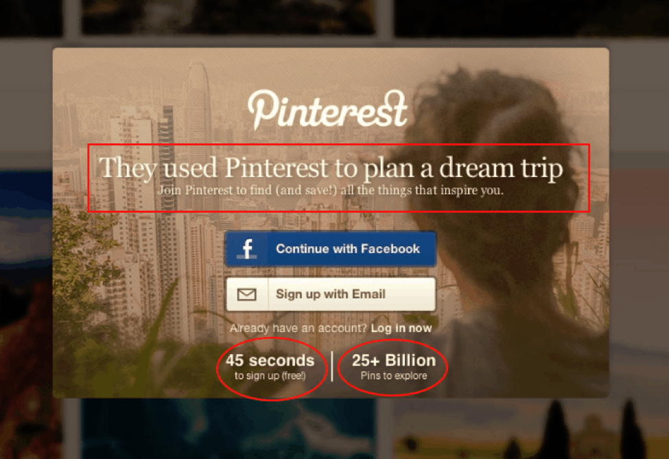
Here, the first copy lets you know that you can use Pinterest to plan your travel trip. People always dream of roaming the most beautiful places with their family and friends, so the headline here easily triggers this emotion. Don’t you agree?
The next one keeps up your excitement. They tell you it only takes 45 seconds to get 25+ billions of pins. Does it click on the right emotion? What do you think?
The most natural tips for writing your landing page copy that converts is to remember three sentences.
- Make it simple and short
- Keep your words to the point
- Help visitors with your copy
Landing Page CTA: Keep it Appealing And Personalise
CTA (Call to Action) buttons are one of the essential parts of your landing page. Unless they are goal-oriented, your landing pages will fail to impact the conversion rates.
So using a CTA that tempts someone’s interest is necessary here.
CTA’s without a goal or which are not personalized are never going to help your landing page succeed. Just look at this example below.
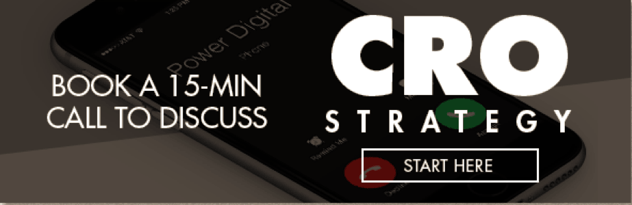
Here, you can’t even make clear what the offer really is! It’s not personalized, and not even attractive. Moreover, it doesn’t have a specific goal.
Now, see what Netflix did on this landing page.
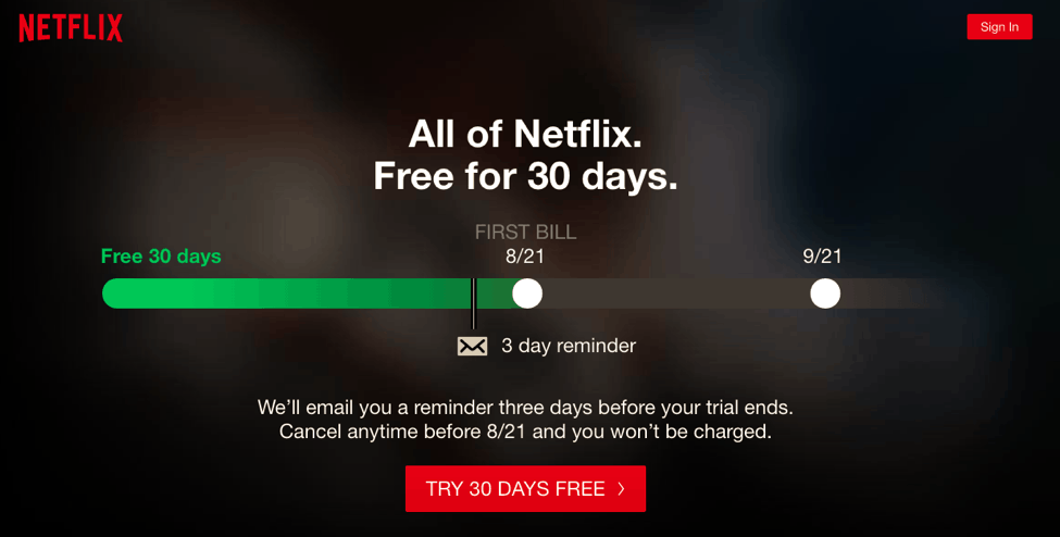
After they let you know what you are going to get, a CTA like “Try 30 Days Free” is juicy.
Landing Page CTA: Double-deal Technique
We are still talking about CTA. You display your offer and lure people to get it via CTA. Most of the CTA is single-minded. They feature one benefit at a time.
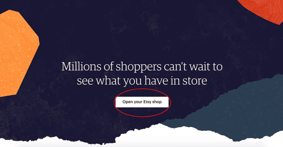
Etsy is an online store that focused on selling the handmade and vintage artistic product. The landing page you see above is a typical example of single-deal CTA. It could be double up if they use “Open an Etsy Shop & Spread Your Art”.
So, why not simply put the words in such a way that makes your visitors believe that you are giving two deals at a time?
Let’s double up your call to action as Trello did.
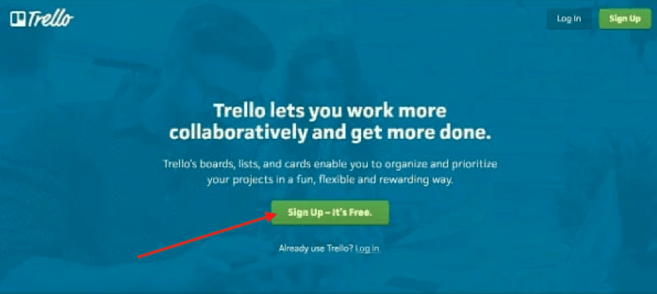
You can see that. Trello wants you to sign up, and at the same time, they let you know that it’s free.
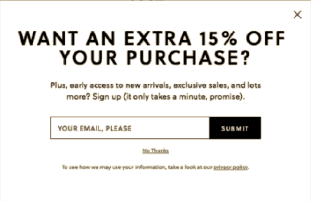
Landing Page Opt-in: Keep The Forms Simple
According to Marketing Land, 58% of US people like to share personal data if you create the right circumstances. How to do that?
If you offer something valuable, the visitors willingly provide their name and email address. What else could you need? After a visitor becomes your customer, you can always get the rest of the personal info.
Here’s you can see a straightforward opt-in form by Macy’s.
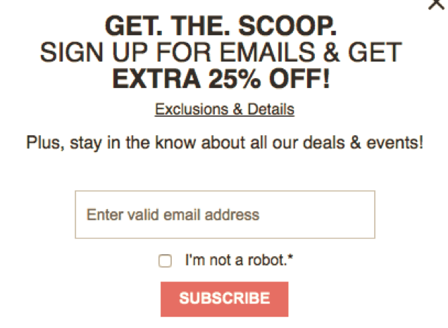
The easiest method to generate leads is to create a simple opt-in form.
Landing Page Elements: Be Focused And Cut Out The Unnecessary
The main objective of a landing page is to generate leads. Just like a click-through landing page must take a visitor directly to a sales page. Both need to focus highly on accomplishing their goals.
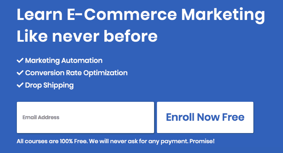
You should cut off or remove any elements which seem extra and unnecessary. For example, a lead generation landing page doesn’t need a navigation bar or being too large that it needs to scroll down.
Look at this landing page of the Intent marketer, which is a free eCommerce learning platform. They simply tell you their offer and ask a little information. That’s it.
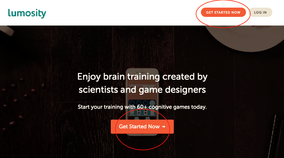
Same things go with the click-through page. You don’t need to put an opt-in form here. Instead, some helpful and attractive copy can make a visitor smile.
For example, Lumosity uses two CTA button here, and some words that can convince people.
Landing Page Exit: Deploy Exit Pop-up
What is an exit pop-up?
According to the wiki, the exit-intent pop-up is a technique online shops and websites use to retain visitors who are going to leave the site.
After a visitor becomes your customer and makes an action, or opt-in to your email list, you can touch his emotions with exit pop-up.
Just before someone leaves your site, offer them something that gets them to come back to you. So, you are going to create an exit pop-up which can remind a visitor that he was searching for something, and didn’t make a purchase yet. Or, next time he visits your online store, he may get an extra commission on a specific product.
You need to tailor a highly valuable offer for your exit pop-up. Let’s see how.
- As I have mentioned above, you can offer a discount.
- You can offer a content upgrade.
- You can give visitors to choose different service of your website.
Here you can see, that J.Crew offer a 15% on the first purchase in this exit-intent pop-up.
Before a customer leaving their site, this pop-up must influence him to shop with J.Crew again.
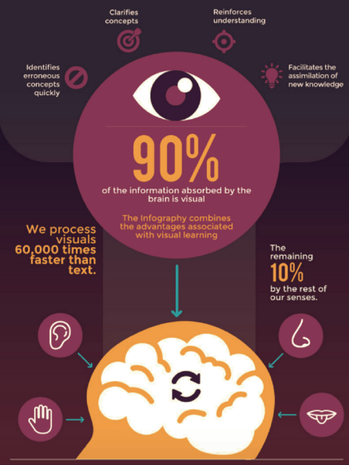
Landing Page Visuals: Keep the Design Meaningful And Attractive
Why are images so impactful for your landing pages?
A study by Venngage shows that 80% of people can recall what they see compared to 20% of people who can remember what they read, and only 10% can remember what they hear.
(Source)
You see the difference. Visuals are the great catch of any landing pages.
So, you must design your landing page, maintaining a visual hierarchy. Use images that can inform and help your visitor to understand your offer.
So, if you want to make the highest impact from your landing page visuals, you can follow these tactics by Content Marketing Institute.
- Display an elusive object in something substantial.
- Use icons and illustrations to tell a story.
- Try to use an icon rather than text.
- Choose your CTA button color following your website design and theme color.
Landing Page Credibility: Use Customer Testimonials
You can use customers testimonials in your landing page copy. It’s useful because 85% of customers said they read up to 10 reviews before choosing a product or business.
See how the eCommerce marketing platform OmniKick is using this technique on their landing page.
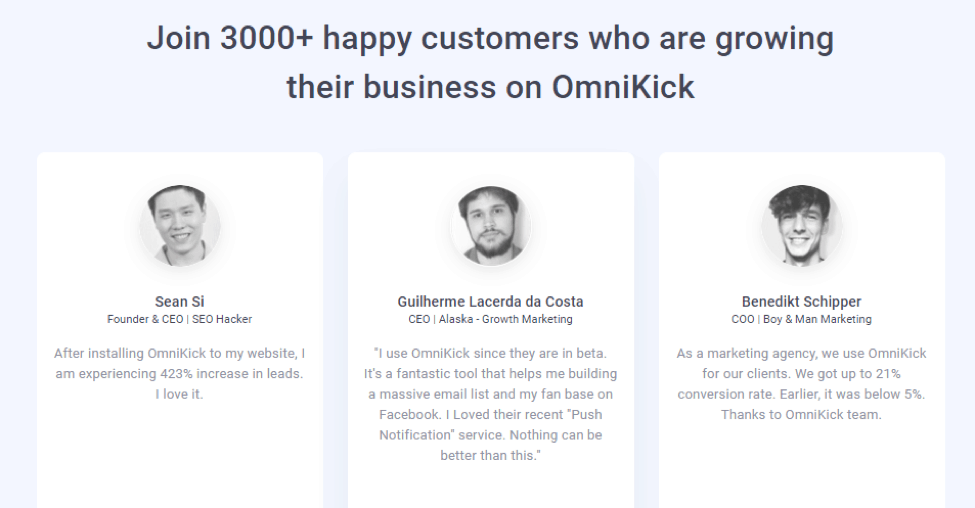
Testimonials help visitors get a clear idea of what others are thinking about your business. It ensures your quality and helps to establish trust.
There are various ways you can put customer testimonials on your landing pages. Some of them are:
- Twitter cards. You can share screenshots of your customer’s tweets if they praise your online store.
- You can use the company logos, which are your online partners. It can generate a feeling that your online store is trustable.
- Like amazon, video testimonials are also very helpful to create highly converting landing pages.
Landing Page Offers: Don’t Sell, Create Need
One of the hardest parts of a landing page is creating lucrative offers. It’s the first key to gain leads, which eventually turns up to conversions.
Before you tailor your offer, ask yourself a question. Is it compelling and helpful enough to convert a visitor into a customer?
If the answer is yes, you are on the exact move to success. If not, think over and over.
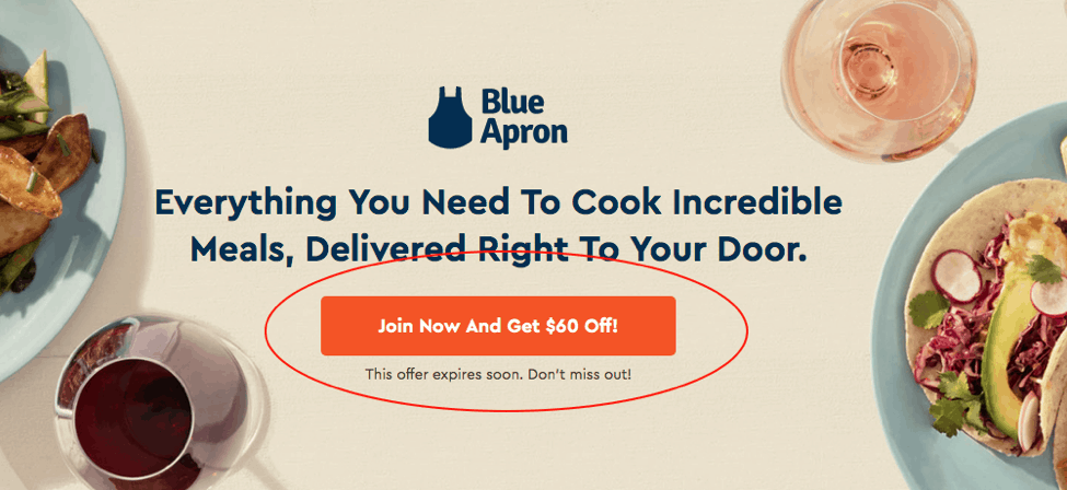
Look at this landing page of Blue Apron. This online restaurant wants you to choose your dishes and ingredients. If you’re going to grab any deals, they offer a $60 instant discount.
Offer something that makes a difference.
If you have an online grocery shop, you cannot offer an SEO guide rather than a cookbook or commission.
Landing Page Responsiveness: Make It Mobile-friendly
The number of global mobile users will reach to 4.68 billion by 2019. There’s no way back from it. People are already browsing websites from their smartphones.
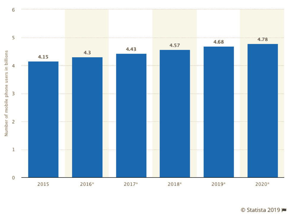
So you must create mobile responsive landing pages. Almost 27% of U.S. people use their mobile for retail eCommerce purchase in 2018.
If your landing pages are well accessible from smartphones, then you are on your way to getting the highest results from your landing pages.
Here I’m providing you some clever tips to create highly optimized mobile landing page.
- You must create them separately
- Create an attractive header
- Add a sublime “click to call” or “call to action button.”
- Be minimalistic to use visual
- Stay with single column view
Let’s look at this mobile landing page of Wester Rise. In this limited scope, they cover the brand awareness and benefits.
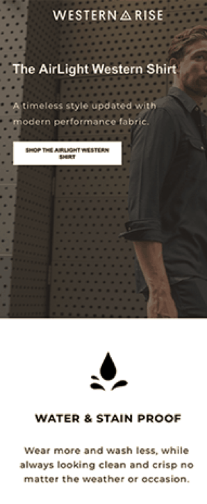
It’s simple and converting, don’t you think?
You can also read this guide about mobile responsive landing pages from search engine journals.
Final Thoughts
So, now that you have read all these top hacks, I believe you can create high converting landing pages for your online store. Just make sure you are also following SEO landing page guidelines to ensure proper visibility and ranking.
A straightforward note I want to add here: there is no “one rule fits all” tactics in this game. You must reinvent your strategy over and over again. Keep A/B testing your landing pages regularly.
The more you test, the more you gain. That’s the deal here.
Do you have some questions in mind? Don’t forget to give your opinion in the comment section below.
Author Bio:
Kaji Enamul Islam is a writer of eCommerce and digital business industries. Besides, his addiction to fiction, fact, movies, and books are possessive. Right now, he is working as a content marketing executive at OmniKick and Intent Marketer.