Many writers find that writing an article for a website is a different experience.
Not only do they have to create a tone that appeals to web users, but it also has to be designed in just the right way. When you’re writing a web article, you have to think of the potential audience that is reading your text, but you already knew that.
What you need is more information on what are the best design elements for text on a website. Keep on reading!
Typography
One of the most critical factors for your articles is choosing typography.
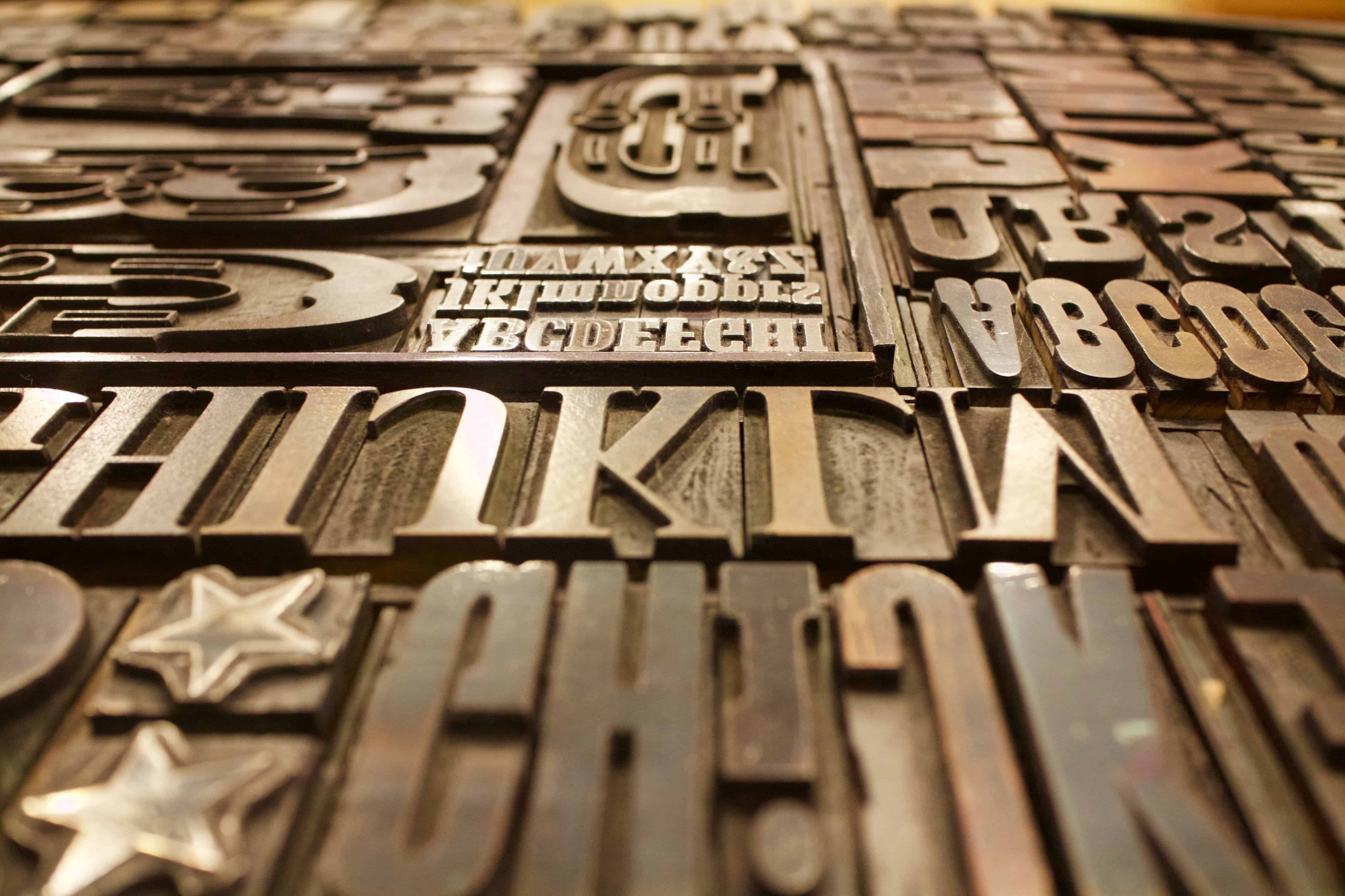
If you have a blog or a news site, this typography should be consistent throughout. For this reason, choosing the right typography is an essential factor. It’s arguably one of the most important things to consider.
The right typeface can make your article more powerful. Likewise, the wrong font can completely ruin a great piece. It allows you to define a tone.
Most fonts have been designed with a purpose in mind. You need to find this purpose and use it to your benefit.
There are thousands of different typefaces to choose from, which can make finding the perfect one a little complicated.
Consider your brand, tone, and topic of the articles. If you’re looking for recommendations regarding the most suitable font for your site, you should look into services and resources like BestEssay, WoWGrade, and TypeWolf. They can offer some insight into making your writing more legible.
The Rhythm
This design element is exciting and helps make the article incredibly appealing. 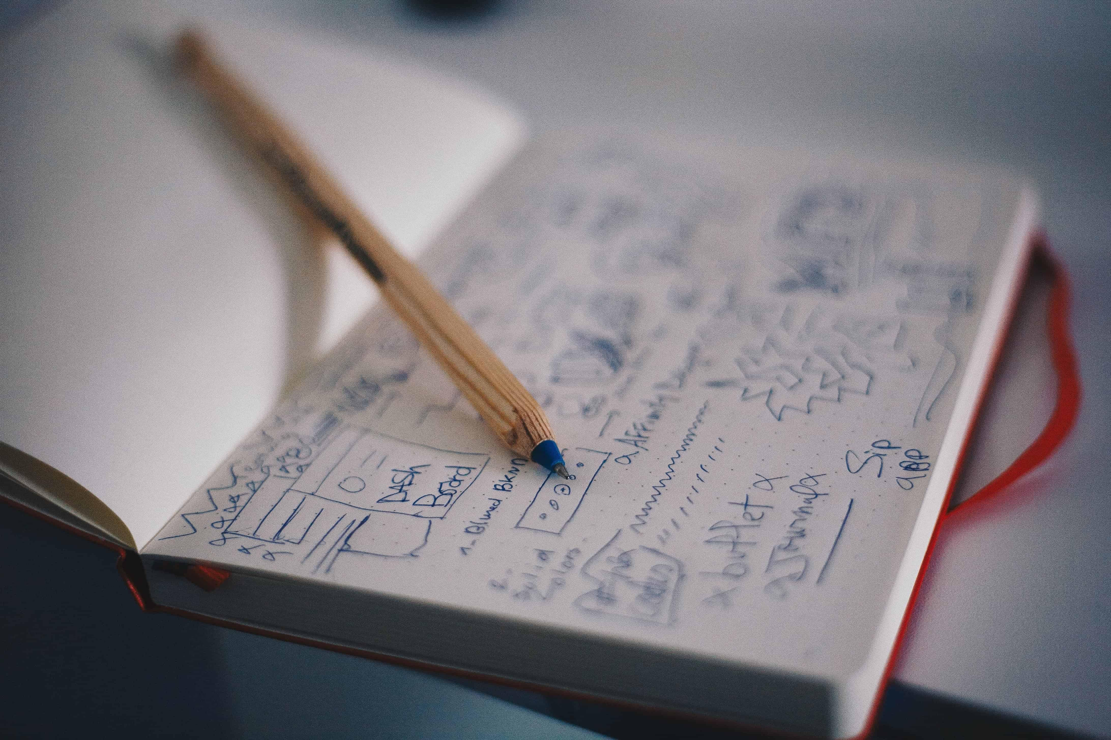
You need to make sure that you balance everything perfectly in your article.
The way that you lay all your elements out is such an important design choice. You need to make sure that you create an excellent balance and rhythm.
Everything design choice should look effortless and flow gracefully.
This is the rhythm, and if it is slightly off, it can be detrimental for your article.
Space
On the point about rhythm, space can help. The way that you balance your space plays such a big part in your article.
You need to discover the right amount of space, which will help everything flow perfectly.
You need to consider how every element in your article relates to each other. There’s space between text and space between images and headlines.
You need to ensure that you give everything enough breathing space. This is usually referred to as negative space, while positive space is the actual letters.
Using negative space as part of the design is crucial for every writer. It will help the reader navigate their way through the article, and can also ensure that eyes rest.
Remember, too much space will make your article look unfinished, while too little space will be challenging to read.
Finding the perfect balance is an essential design element.
Alignments
Alignment is a design element of every article, that can be really satisfying to master.
You might not realize this, but when you’re reading an article, you’re always following a grid or structure. It’s this that makes the writing easier to digest and pleasant to read.
Some writers purposely attempt to create a chaotic design, to match their tone. Regardless, a structure is crucial.
The rule of thumb is to always align to the left. People generally read from left to right, top to bottom. Centered or right-aligned text is challenging to read.
The point, line, and shape
These are seen as the most fundamental building blocks of any article.
With these blocks, you can create anything you want.
“As an article point of view, you can create shapes and lines to compliment your article. You can add text into different formats.” — Amanda Kroger, UX designer at Supreme Dissertations.
Hierarchy
With articles, there is a hierarchy with the different design elements.
At the top of this hierarchal scale, we have the most critical aspects of an article.
For example, headlines should be clear and bold. Your reader should not have to think about it.

On the next tier, we have the elements such as subtitles and pull quotes.
Make sure these are eye-catching and noticeable, but not as appealing as your headlines.
On the bottom of the hierarchal tier, is the body copy, link, and extra information.
Of course, this is just in regards to design.
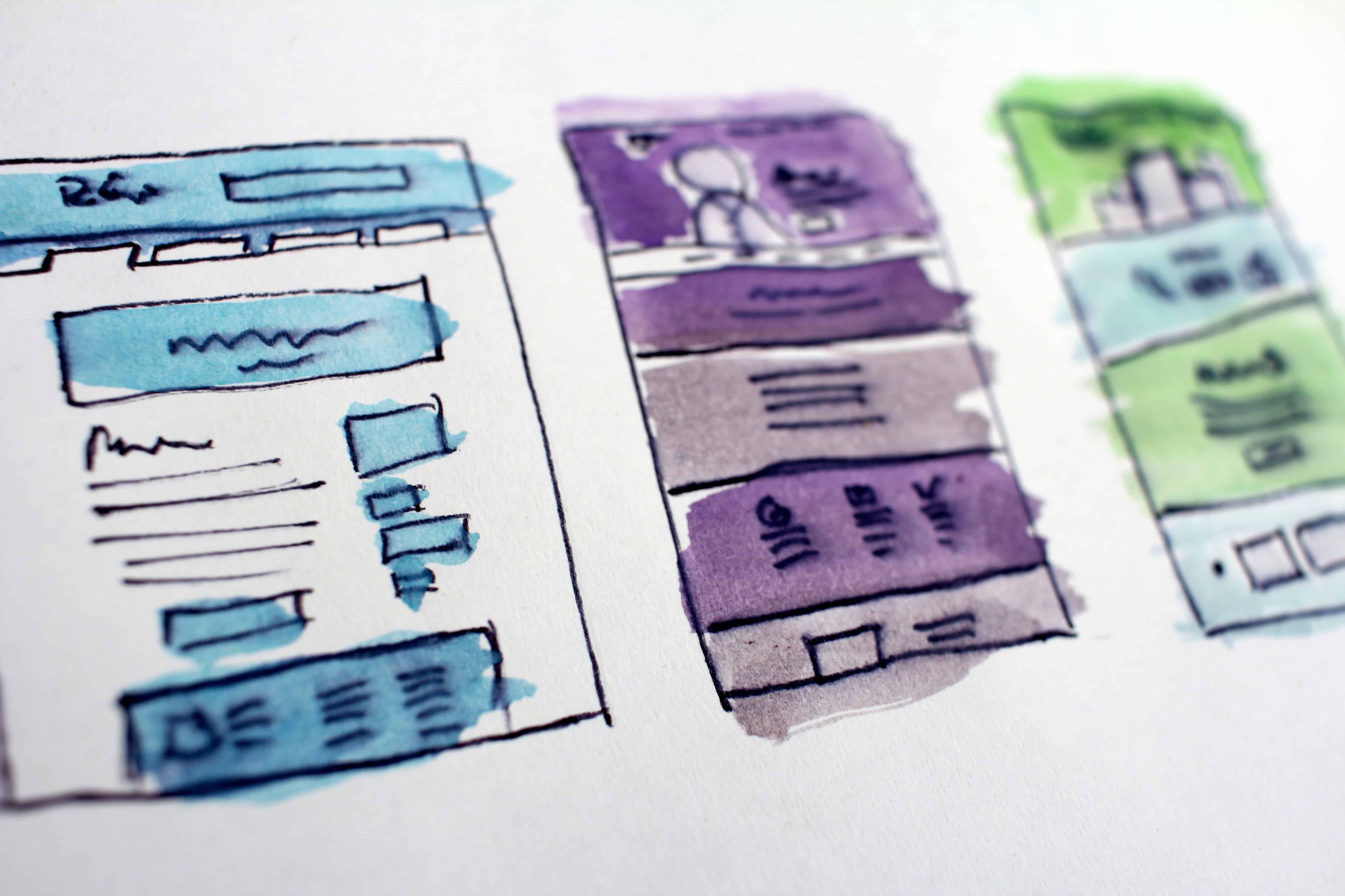
Visuals
Many writers fail to consider the visuals in an article. While it’s very true that your writing is the most critical element, visuals help to keep articles appealing.
Many readers find massive bodies of text very off-putting. Breaking up this with images, videos, infographics, and illustrations is a great design technique.
Color
In the same way, adding color to your articles is a way to make sure that people will find your entire website attractive, ultimately ensuring that they stay on the article.
The human eye can see over 10 million different colors. From the moment we’re born, we begin to associate certain colors with specific things or feelings.

An example of this is with traffic lights. Though they may just be colors, we attribute red with stop and green with go. We take different actions, depending on the colors that we see.
With this in mind, you can add meaning and intention to your article, solely with color. Picking the right color is essential, you just have to keep in mind what you’re using it for.
Website articles allow you to have the hover-over option, which gives you the chance to change the colors.
Scale
The scale is another design element that helps you create rhythm and balance, but it also plays into the hierarchal detail that we mentioned earlier.
Not every element in your article should have the same kind of importance. For example, a heading should be much more prominent than a link.
One of the best ways to illustrate this is with scale.
Your headlines should be much larger than your byline. Your infographic should be much bigger than your social share buttons.
Every article is very unique, and the size of individual elements varies greatly.
All in all, the scale should be used by you to highlight specific areas. It’s a design element that makes such a big difference.
Write for lazy people
Internet articles are mainly read by people who are mostly browsing on their mobile device.
They want the entire experience to be straightforward. With this in mind, you should write and design your article for lazy people.
- Make your copy easy to read with:
- Short paragraphs
- Bullet points
- Skipping unnecessary words and jargon
- Shorten it wherever reasonable
- Utilize negative space
- Use illustrations and infographics to support your point
Here’s a bunch of useful services and resources that can provide you with information on how to adapt your texts to the current article writing standards:
- Trust My Paper — a popular writing service that hires niche professionals
- Editage Insights — a famous website dedicated to writing standards
- Grab My Essay — a long running-writing service loved that work with a broad spectrum of B2C and B2B businesses
- Studicus — a writing service that started with writing for students but extended its services and currently works with a host of large-scale companies
- Freelance Writer’s Den — an online community for writers where you can find a lot of useful information on writing standards
Think about your target audience with this too. What do they expect when they click onto your article? Make sure your reader puts minimal effort into reading your article – both in the design and the copy.
Conclusion
These are essential design elements to make sure that your article is not only easy to read but appealing. Using the right design techniques will not only help you to gain readers but also retain them.
Although you “can’t judge a book by its cover,” it’s incredibly true that many internet users do. If your design isn’t user-friendly, they will be likely to look elsewhere for similar information. Design with intent, and make sure everything flows beautifully.