Creating a customer-centered website requires attention to detail and a full understanding of your target audience. Anyone can put together a site with some content and a basic structure, including navigation, header, and footer.
There are around 3.48 billion internet users around the world. Of course, not all those people are your target audience. Your audience is much narrower, making up a specific location or demographic and then narrowing down into those interested in your product or service. However, you can start with the needs of the many when looking at what makes a usable website. Include features such as accessibility, ease of use, and beautiful aesthetics. You can then narrow down features to meet the specific needs of your customer base.
1. Personalize Your Site
One of the best things about modern technology is the ability to track who has visited your website in the past and what their patterns were. You can easily offer custom selections based on past shopping behavior, the person’s location, or even what the weather is like outside. Cookies are one way of tracking your site visitors, for example, but you can also use geolocation to give you additional information.

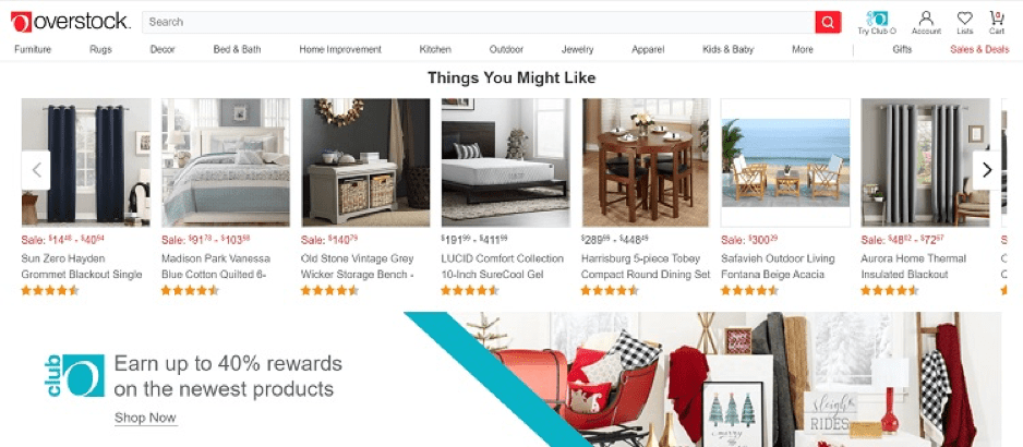
Overstock offers their current deals near the top of their page, but as you scroll down, they also display “items you might be interested in.” They base these selections on past browsing behavior. If you’ve looked at bedroom furniture, for instance, they’ll show you a selection of items like dressers, headboards and bedside tables. How far down you browsed and how specifically you filtered options will determine how tailored the options are to your needs and tastes.
2. Consider New Technology
As you design your site, keep in mind technology is changing rapidly. Your site may need to be accessible to smart speakers and other devices not yet invented. Keep a pulse on what is new and what your site visitors are most likely to use. If most of your customers are millennials and younger, they are more likely to have the latest technology gadgets, while if you serve baby boomers, you may be able to keep designs more straightforward for a while.
3. Offer Options
While it’s true that offering additional options for your products can ramp up production costs, it also helps meet the needs of your customers. Depending on what type of product you’re selling, having different sizes and colors available can mean the difference between a sale and a lost customer. If you sell home goods, a variety of colors is a must. Think about the options you’d like if you were in your customer’s shoes, and do your best to provide those selections.

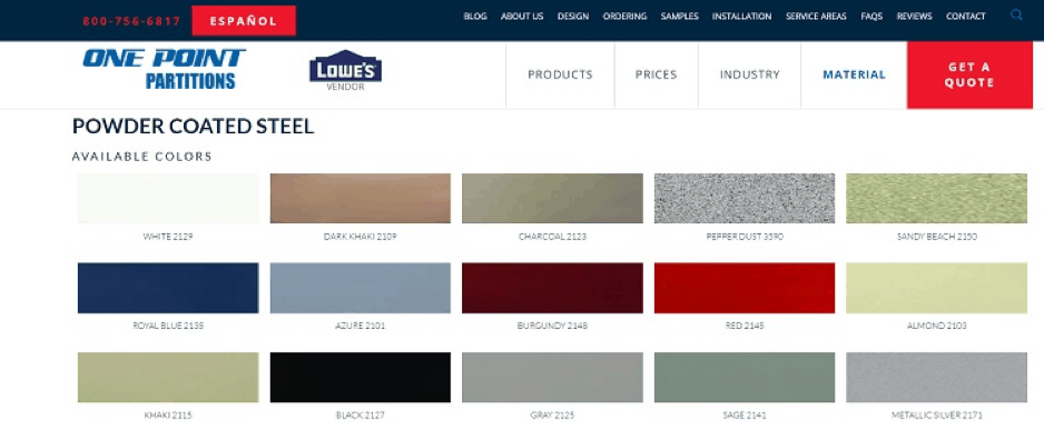
One Point Partitions offers systems that go into a variety of businesses and decors. With that in mind, they offer their products in a range of materials and colors. Note the selection of color samples you can easily print and hold up in a room to see how they mesh with other elements already there.
4. Add Relevant Information
If you want visitors to leave your site well-informed and with a full understanding of what you have to offer, you must share detailed information that educates them on your products. The content you add to your website drives conversions. Think about the most common questions customers have before purchasing your product and include articles, infographics, whitepapers, and videos to highlight those facts.
5. Provide Clear CTAs
Users don’t want to have to guess what action they should take. Make sure your calls to action (CTAs) are easy to find. The CTA button should contrast sharply with the rest of the page, and any words on the CTA should explain what happens when the users click on the element. Use descriptive action verbs.

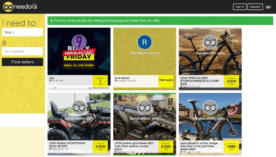
Needora uses a black CTA button that contrasts with the yellow background. They also provide a little white space around the button, so it stands out and is easy to find. The words instruct users to “Find Sellers.”
6. Showcase New Items
If you want to meet the needs of returning visitors, make sure you highlight new or featured items in a prominent location. Those who’ve bought from you before may be there specifically to see if you have any new products they might be interested in. Share relevant images that showcase the benefits of the product near the top of the page just under the header, or at least above the fold.
7. Test Mobile Compatibility
More and more people are accessing websites via their mobile devices. If your site isn’t mobile-responsive, you may miss out on a large percentage of your traffic.
Make sure you have optimized everything on your site for both desktop and mobile by using images that resize easily and text that is readable in different sizes. Once you’ve created a mobile-friendly design, test how it works on your smartphone, and ask others to access the site from their phones, too. You can also test online via various websites, but a real-life run-through is your best bet for finding possible glitches.
Survey Your Visitors
Once you’ve implemented the features above and tweaked your site to be as user-centered as possible, go ahead and poll your regular customers. Ascertain how well the current design works for them. Find out what features they dislike, what they use the most, and what is missing that they’d like to see. The best feedback you can get on how well your site performs with customers is from your actual clients. Ask them outright what you need to do to improve, then implement those changes as quickly as possible.
