Page 404 is possibly the most ubiquitous error message on the Internet, and everyone knows what it means – the page you are looking for doesn’t exist, probably because you followed a broken link or mistyped a URL.
What you might not know is that your page 404 can be used to do a lot more than simply tell your user something went wrong. As well as helping the user to get where they are trying to go, page 404 is also an opportunity to entertain the user, show some of your brand’s personality, and convert a lost visitor into an engaged customer.
According to SpringTrax, 74% of users will leave a site upon encountering a 404 page, so it is vital you do everything you can with this page to prevent that!
While you’ll always hope users never see it, there is always the possibility that your 404 page is the first page a user sees on your site. Not only do you need to make sure they don’t leave out of frustration, but also grab their attention and encourage them to learn more about your business.
So how do you achieve this?
Let your artist show off
Even the most complex 404 page doesn’t need to contain a great deal of information, which means you have a lot of empty space at your disposal – make the most of it!
A bold, full-page graphic can ease the frustration of getting lost and retains your user’s attention despite the problem.
This could be anything from a simple vector image to a photograph showing off your products or the lifestyle you want to promote. Just keep it on-brand and related to what your business does.
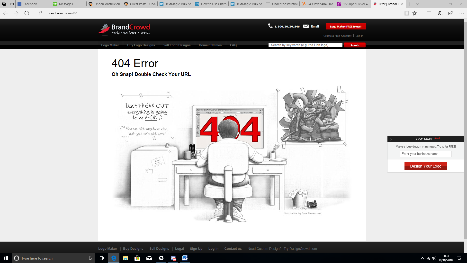
This John Mascarenhas illustration on Brand Crowd’s 404 page does a perfect job of both capturing the audience’s attention while focusing on what the business is all about so first-time visitors aren’t confused.
Make it funny
Including some gentle humor in your 404 page can take the sting out of clicking that broken link and again, this is a chance to show some personality as well as hold the user’s attention to your site.
There are a lot of ways to do this. If you do decide to include some humor, make sure it ties into the rest of the page – for example, if you have created a visual pun with the page’s graphics, support it with the explanatory text.
You have a lot of room to play with the text without having to worry the user won’t understand since just about everyone already knows why they are here.
Even if you don’t feel that joking around is the right approach for your brand, at the very least make sure your 404 message is simple and straightforward, avoiding unnecessary technical details sure to put your visitor to sleep.
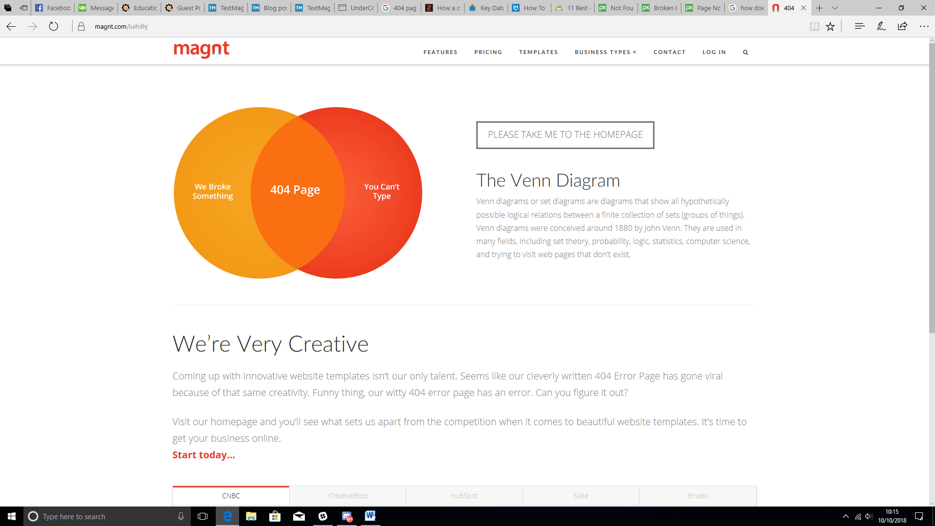
404 page on magnt.com
This brilliantly-designed 404 page on magnt.com tells the user everything they need to know and hopefully makes them chuckle at the same time. Telling the user they can’t type is a risky move and goes against Tip #7, but the bluntness works in the context of the joke, so they get away with it here.
Make it interactive
It may not be a suitable approach for every business, but putting some interactive elements on your 404 page can be a real attention-grabber, and serve as a brief distraction to soften the blow of following that broken link.
Interactivity could be as simple as a few animated elements that respond to cursor movement, to a simple toy or even a game. Google arguably started this trend with its now-famous dinosaur game hidden in its Chrome browser, and they can make users feel like they have stumbled on a secret ‘Easter Egg’ rather than just taken a wrong turning.
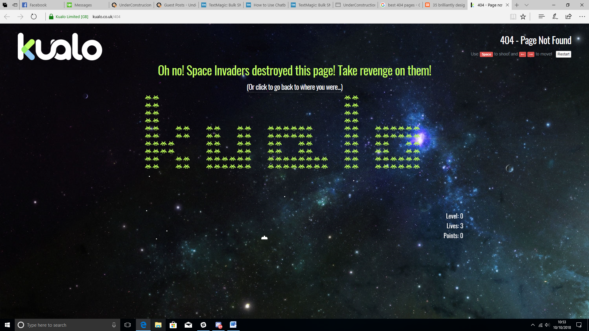
Kualo go above and beyond with their interactive 404 page, with a simple Space Invaders clone to keep the user on the page, and even going so far as to offer a discount for high scores!
Include navigation tools
When a visitor hits your 404 page, the one thing you know about them is that they are looking for a specific page on your site, and they are having some trouble finding it.
So it makes sense to help them along to their destination, right?
This point is very dependent on the rest of your website; if your overall design is sleek and simple, you don’t want to ruin that effect with links to every part of your site cluttering up the page. As long as visitors can easily navigate the whole site from the home page, a link back to this is all you need.
Remember – Your visitor may have arrived here from another website, with little knowledge of your company, a link to the homepage might convince them to familiarise themselves rather than simply leave.
On the other hand, if you have a complex and multi-faceted site, having to return to the home page can feel like going all the way back to square one for your visitors. You still don’t need to include a full site map, but links to the main sections of your site and a search function will be appreciated.
You can cut down the number of links needed for a complex site by also having a chatbot pop up and try to help your visitor out. There are certainly those who roll their eyes when they see a chatbot, but chatbots can be more appealing to your less technically-minded visitors, who may struggle to get what they want from the search bar and leave out of frustration.
If you include a search function, you could also run an automatic search on keywords from the failed URL to provide the user with some options as soon as they arrive.
If your site makes use of a navigational banner, the simplest solution is simply to include this on the 404 page.
Include contact information
One of the reasons your visitor might have ended up here is through following a broken link either on your site or one of your affiliates.
Simply providing a support email address works, but a link to a contact form will get more responses as it takes less work from the user to contact you. Avoid including the contact form on the 404 page itself, as it will take up space and clutter your design.
Make it easy for them to alert you to the problem, and then get that link fixed! However much work you put into your 404 page, it is still better if your users never see it.
A 404 error won’t directly impact your search rankings, but without a redirect, you still lose out on link equity for any broken links, so it is good SEO practice to fix them!
One example of redirecting to avoid a 404 error that is particularly useful while you are building or expanding your site is sending the user to a ‘coming soon’ landing page that will get them excited instead of frustrated.
On that note, it is always a good idea to check your site for broken links every now and then; there are plenty of free online tools such as Dead Link Checker to do this for you.
Keep it simple
Your user just hit a dead end, and they’re already frustrated. The last thing you want to do is overload them with information and options that frustrate them further.
When it comes to providing links and suggestions, don’t include anything that doesn’t need to be there. Aim to include no more than 4 or 5 links.
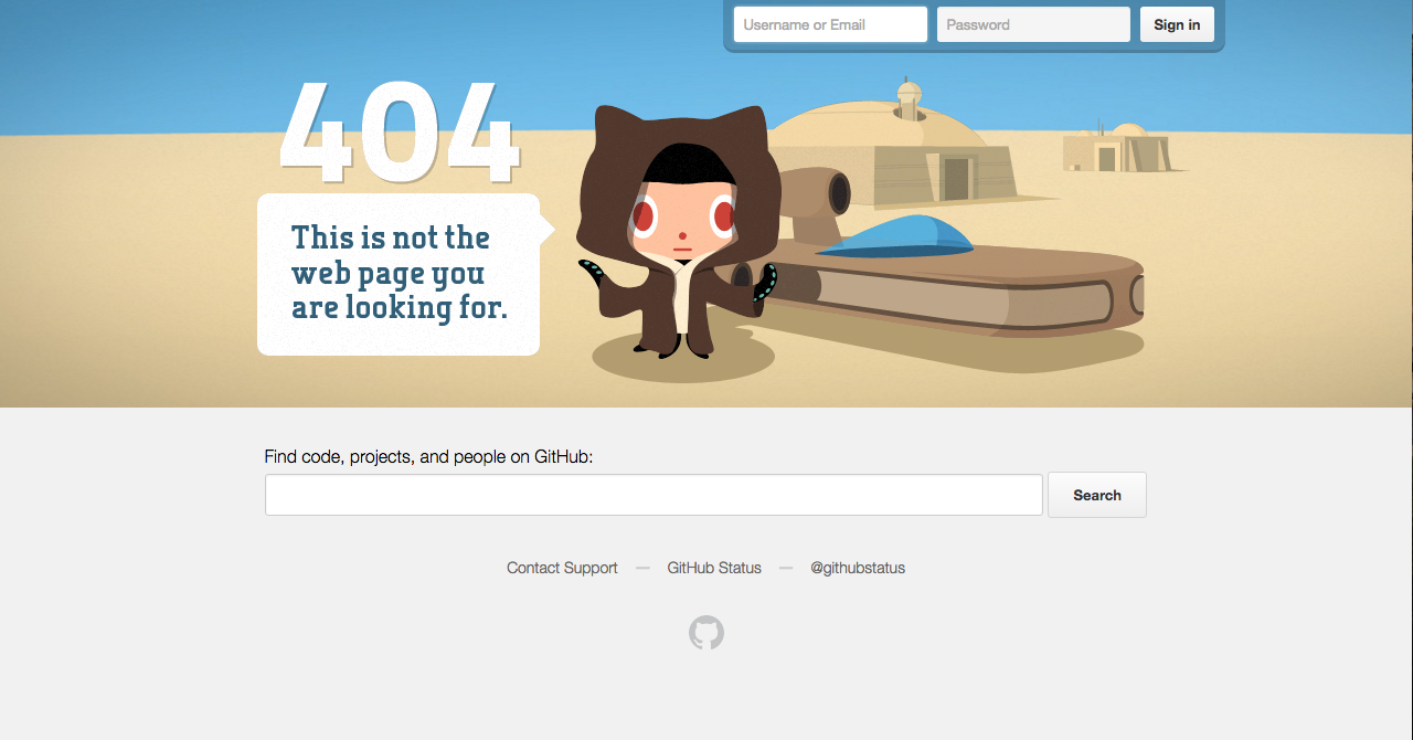
This 404 page from GitHub is a perfect example of how to keep a simple layout while giving the user everything they need. A simple and appealing graphic soothes the frustration while staying on-brand and in keeping with the site’s geeky image with a cheeky movie reference, but the lower half is kept blank so the user can see the important elements clearly. From here the user can search for the content they were looking for, contact support and check the current server status. Note how there are no links on the page except those relevant to solving the problem.
Take the blame
There are plenty of possible causes for a 404 error and a few of them, like a mistyped URL or a copy-and-paste mistake, are ultimately down to the user. You don’t know which it is so apologize for the problem and don’t make your visitor feel like the issue is their fault as this will only frustrate them further.
Looking to maximize your results with your 404 page? The Under Construction Page plugin offers a zero effort all-in-one solution for maintenance, sales and landing pages, complete with a huge bank of high-quality images and easy customization through a drag-and-drop builder.
Create a unique 404 page in seconds!