Have you ever had an experience when you visited a store and couldn’t find what you needed? You searched everywhere, but everything was disorganized. You tried to get help, but no one was there to guide you. Eventually, you left the store empty-handed and frustrated. This was probably a negative experience for you, and most likely you didn’t go back to that store again.
Now, think about a time when you went to a store and had a positive experience. When you walked in the door, you could immediately tell where products were located since they were organized logically by categories. You found what you needed, made your purchase, and left happy.
This is the difference between a good user experience and a bad user experience.
User experience is how a person feels when interacting with a system. The system could be physical like a grocery store or the dashboard of a car, or it can be digital like an app or a website. For the purposes of this article, we’re going to talk about the user experience on your website.
User Experience for Websites
User experience is about making decisions based on the users’ needs. Instead of thinking about what you want from your website, focus on the experience your website visitors are having.
How do they feel when they interact with the site?
How easy is it for them to find what they need?
Did they come with questions and leave with answers?
Will their experience be delightful or frustrating?
These are essential questions to ask when designing the user experience of your website. Creating a positive experience for your website visitors can turn them from strangers into customers, and eventually evangelists for your brand. For example, please take a look at Upvote.Shop.
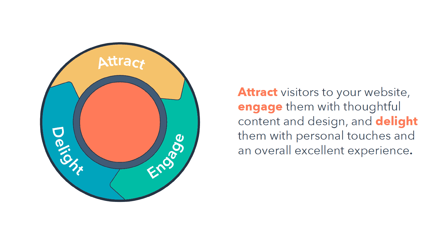
This process is illustrated by the inbound methodology. Attract visitors to your website, engage them with thoughtful content and design, and delight them with personal touches and an overall excellent experience. This will not only create a better experience for your users, but it’ll benefit your business as well.
For example, after incorporating suggestions from their community into their website, ESPN.com saw a 35% increase in revenue.
Your website is your number one digital asset. But you have a very limited amount of time to make a good first impression on your website visitors. The experience people have will make or break their image of you within the first milliseconds, and it will decide whether they’re going to do business with you or not.
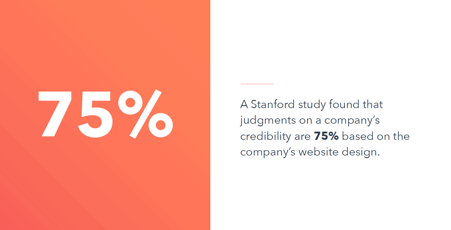
A Stanford study found that judgments on a company’s credibility are 75% based on the company’s website design.
But a website’s design isn’t just about looks.
The interface is only one element of the overall user experience design of a website. It’s the entire experience someone has when they land on your site, from your navigation to your copy, to the images or videos you choose to include.
A website with a good user experience helps visitors accomplish their goals. So, understanding your visitors’ needs should be first and foremost when designing the user experience of your website.
By keeping your user’s goals in mind, you’ll stay focused and have a set of guidelines to help you make decisions when it comes time to design your website.
What Are the Elements of a Good Website User Experience?
Designing a great user experience is all about seeing your website through your users’ eyes. Every decision you make should be based on their needs and goals.
Five key characteristics of a good website user experience
- Useful
- Intuitive
- Consistent
- Accessible
- Appealing
Useful Websites
People are coming to your website for a reason, pointing to the importance of having a useful website. They might be looking for your pricing, trying to chat with someone on your customer support team, or searching for your blog. If your website doesn’t help visitors achieve their goals, then it isn’t useful, and they’ll leave as quickly as they came.
Get clear on what your user’s goals are. You can do this by conducting research and talking to your customers. Surveys are a great way to get a large response from your audience about your website. Ask specific questions such as, “Why did you visit the site?” and “What were you trying to find?” Make things as straightforward as possible.
You can also invite your customers to chat with you by live chat, emailing them, or posting on social media. You’d be surprised by how many people are willing to talk to you and share their experiences. But if you are struggling to get responses, offer an incentive like a coupon or an exclusive content offer.

To get data without reaching out to your customers directly, consider using heat mapping software. Programs like Hotjar or Lucky Orange analyze where people are spending time on your website and where they might be struggling.
There are countless ways to perform user research and it’s a broad discipline. If you want to learn more, check out our Ultimate Guide to Designing the User Experience.
Intuitive Websites
If a visitor doesn’t know where to look or what’s relevant to them, it can result in a confusing or negative user experience.
To create an intuitive website, make sure each page answers one question at a time and asks visitors to take one action at a time. Providing too much information or asking too much of your visitors will confuse them and cause them to take no action at all.
Don’t overwhelm your visitors. Make sure that each page asks only one question and demands only one action from them
Simplify the experience by keeping each page focused on one question and one call-to-action. What do people need to know on this page, and what do you want them to do once they know it?
Take the pricing page for Slack as an example. People are coming to this page to learn about the pricing options for Slack and what features are available at each level. The page answers this question in a well-laid-out table, and then prompts the visitor to “Get started.”
Consistent Websites
Humans inherently like familiarity – a phenomenon called the Mere-Exposure Effect. The more familiar we are with something, the more we like it. It makes sense that users like consistency in websites.
Take advantage of the mere-exposure effect by creating consistency across your website. Aim for consistency in the design, page layouts, colors, and fonts, as well as in the content. To ensure consistency across your site, establish style guides for both your visual and written content.
A visual style guide lays out the guidelines for things like logos, font choices, colors, and page layouts. A written style guide establishes your tone of voice, language to use when addressing your customers, and so on.
For example, at HubSpot Academy, we have our own extensive written style guide that helps us create content that’s human and helpful while also being consistent.
Accessible Websites
An important element of your website’s user experience is accessibility. If you work with a web designer, they should manage web accessibility standards for things like readability for screen readers, color contrast, and font size. Let your designer know that there are free accessibility tools out there to evaluate your website if you haven’t already. A quick Google search for “website accessibility checker” will come up with several options.

Accessibility also refers to how visitors access your content.
In a HubSpot study, 76% of respondents said that the most important element in website design is how easy it is to find information. Help your visitors easily find the information they need by creating good navigation menus.
Your navigation is a critical piece of the user experience of your website, so it’s important to do research and prioritize what your users care about.
Perform a card sort to determine how your navigation should be structured. Card sorting is a research method used to help design or evaluate the information architecture of a website.
There are two types of card sorts:
- Open sorts
- Closed sorts
To perform an open card sort:
1. Write the names of your website pages on index cards.
2. Lay the cards out in front of your test participants.
3. Ask them to group the cards by similarity
Repeat the card sort with each individual and notice any trends that emerge. How did people choose to group the pages on your site? Design your navigation to reflect these findings.
If you’ve already decided on categories for your navigation, you can perform a closed card sort instead.
To perform a closed card sort:
1. Give your test participants the categories you’ve come up with for your website navigation.
2. Ask them to organize the index cards with the names of your website pages into those categories.
Document the results from each person, whether open- or closed-sort, by taking a picture or sketching the organization they’ve come up with.
If you already have a website and want to optimize your navigation to improve the user experience, conduct usability testing. Usability testing is a way to evaluate your website by testing it with your users.
Watch people use your website, either virtually or in-person, and note where they struggle. They may have trouble using your navigation or finding the information they need on a certain page. Then, make adjustments based on the results you find.
To learn more about user experience research methods, check out the User Testing Tools and Techniques blog and the Ultimate Guide to Website Accessibility tool.
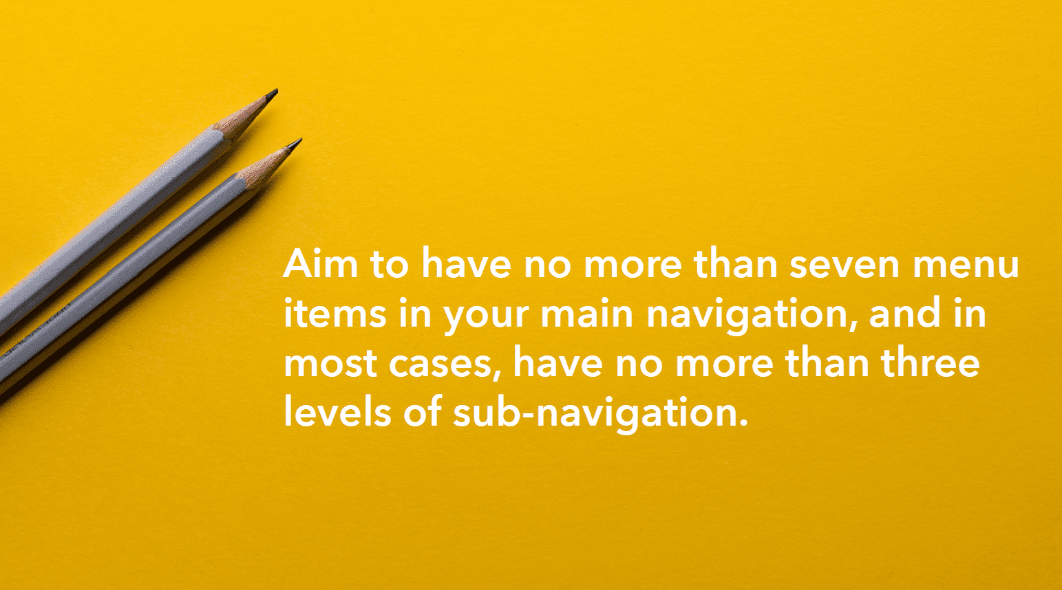
Aim to have no more than seven menu items in your main navigation, and in most cases, have no more than three levels of sub-navigation. Include your navigation menu in the header and footer of your website to simplify navigation and keep visitors engaged when they finish reading a page.
Appealing Websites
Having an appealing website doesn’t mean your site has to be flashy or complicated. Simple can also be appealing. When people can understand a page’s purpose and content at a quick glance, it creates a positive user experience.
There are a few design elements to keep in mind to create an appealing website.
- Use whitespace on your website pages to visually frame important information and shape the focus of the reader.
- A relevant image is a great way to convey a lot of information, give your page some visual interest, and support the page’s purpose.
- Consider including a video, which is proven to increase engagement.
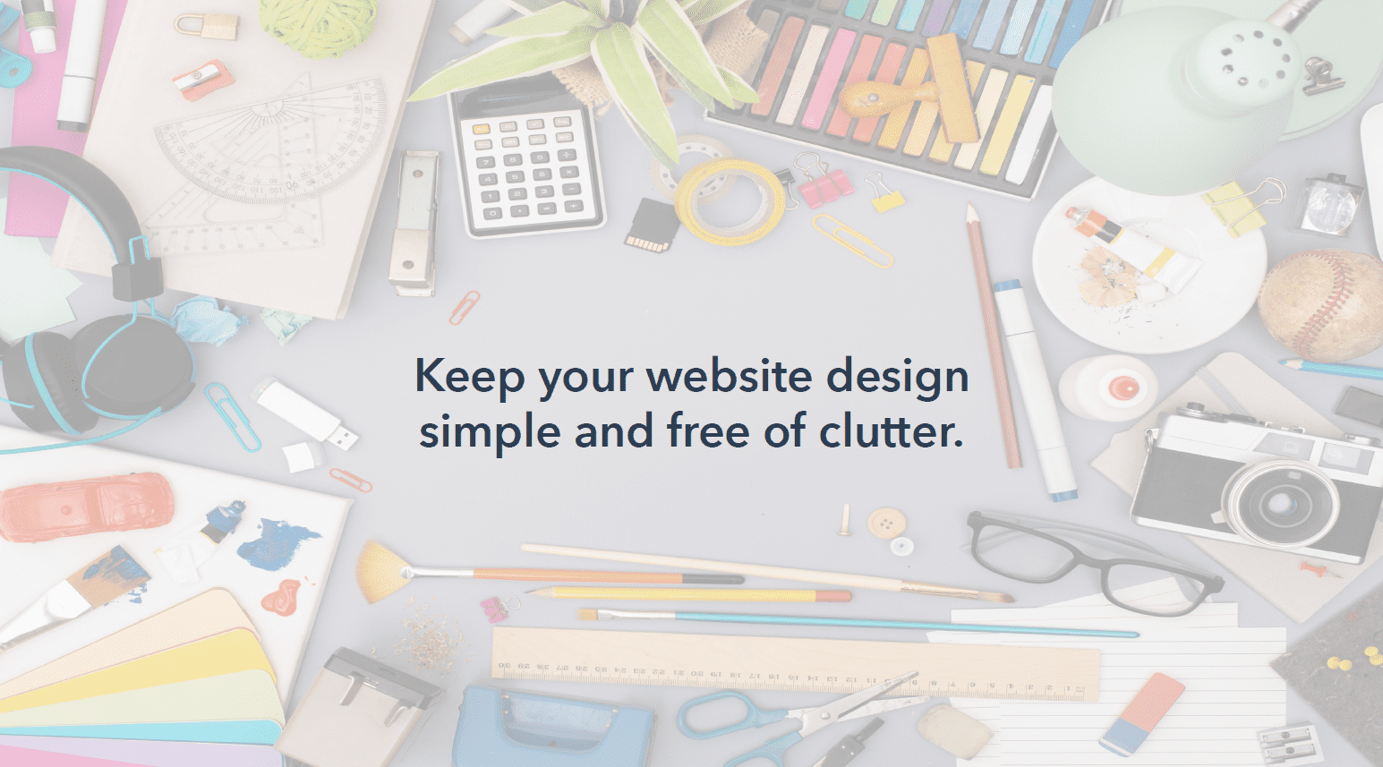
- Keep your website design simple and free of clutter.
- Make sure your color and font choices are in line with your business’s branding. Even if your brand is fun and whimsical, your website still needs to be usable, not overwhelming to the eye.
- Balance bright accent colors with neutrals or more muted colors.
- Try to stick to no more than two font families, and instead create variation using font size and weight. Your website page content should support a single goal.
When evaluating the appeal of your site, keep the intuitive principle in mind as well. You’re solving one goal per page, so choose your layout and the elements on the page wisely.
The last thing to keep in mind is that your website should be constantly evolving. Your users are always changing, so your website shouldn’t be stagnant. What worked yesterday might not work today. Always be looking at your website with a critical eye and ask yourself, “How can I simplify my website and help people achieve their goals quicker and easier?”