Did you know that up to 51.3% of all web traffic worldwide comes from mobile devices? This means that you’ll want to make sure every page on your site is mobile friendly. The most important is your landing page as it’s the first thing that your visitors will see.
Don’t know how to optimize your landing page to be mobile-friendly?
There’s no need to worry, we’ve compiled a few ways that you can optimize your landing page to keep up with the increasing switch from PC to mobile devices.
So keep on reading and find out what are some things you can do and change on your landing page. Optimize it for the mobile landscape with these tips as early as today!
What Is a Landing Page?

A landing page is the first page your visitors see when clicking on a link or an online ad to your site. Think of it as the cover page of your site, minimalistic and straight-forward. Often featuring one call to action and a few words about your brand.
Unlike the other pages on your site, a landing page’s sole purpose is to convert visitors into leads for your brand. It doesn’t have any distractions other than a simple sign up form or the call to action.
Short, Simple, and Direct
When writing the information on your landing page, you don’t want to copy everything that’s already on your homepage. If there’s too much to read and scroll around for on your landing page, visitors are more likely to leave. And you want them to find what they’re looking for and fast.
A computer screen is wider and gives you more space to add in extra information and options. This is not the same when it comes to mobile phones. Strip everything you already have on your landing page down to only what’s necessary.
There shouldn’t be any big walls of text on your landing page. Try and give a short summary of your services or products. Also, prioritize one direct call to action like “Get Started” or “Sign Up Now.”
Have One Call to Action
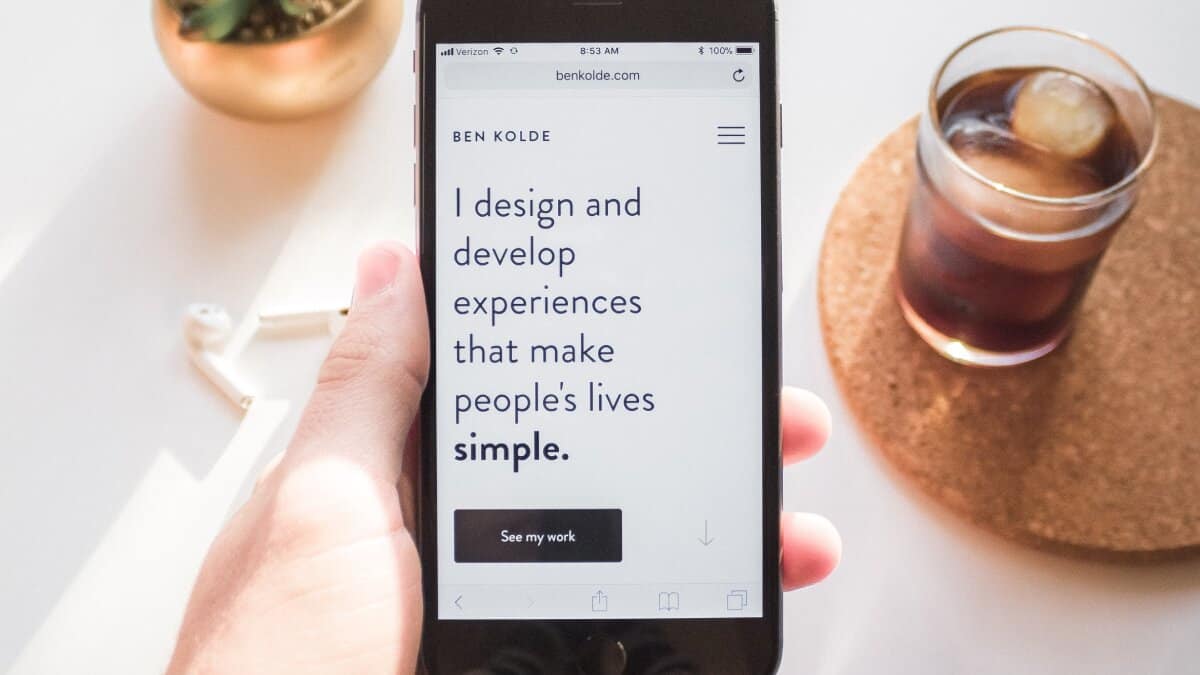
Since you’re keeping your landing page focused on one key value. You should also have one key call to action. Too many call to actions will only clutter your already limited space and confuse your visitors.
You want the call to action to be the main aspect of the entire page, meaning it has to be big and obvious. So keep the message simple and clear. And make sure that the button you’re using contrasts the rest of the page and is where your eyes are immediately drawn. Otherwise, it’ll get buried underneath the visual noise.
Also, make sure that it sticks out from the rest of the page. Your target audience should know right away what the call to action will do without having to think about it.
Speed Up Loading Time
Nobody wants to be wasting their time, so the longer the load time is, the higher the bounce rate gets. If your site takes more than 3 seconds to load, the percent of people leaving increases.
When on mobile, it doesn’t take much for people’s patience to wear thin.
Your site’s speed depends on a lot of factors, from the number of plugins you have to the size of your media. And every decision you make when creating your site leads to affecting its speed.
So, optimize images, reduce the number of active plugins, remove Flash content, and always test each page!
There’s a test on Google that you can use to see whether or not your page is mobile-friendly and optimized. This gives you a clear idea of what went wrong and how to fix the issues.
Simple Media

When we talk about media, we mean the images and videos that you use on your page. This includes the image you set as the background or maybe a promotional video on the bottom of the page. All of these can take up data, slow down your site, or make it look too busy and disorganized.
If you do add in any videos, make sure that they aren’t set to autoplay and that you give that choice to your visitors. Including too much media may distract them from the main call to action, which should be the primary focal point.
Try and keep your images and videos at a minimum, and only put them in if you absolutely have to. Also, make use of white space to avoid making your site feel messy. You don’t need a ton of media to make your site look nice.
Don’t hesitate to check this guide here if you want more information on your site’s media and other web design essentials.
Popups Should Be Mobile-Optimized
Popups can be an effective way to generate more leads on your site, especially if it’s a sign-up form. Make sure that any popups you do include on your landing page are also optimized for mobile use. As stated above, you have to keep everything simple, and this extends to any popups.
If it’s a sign-up form, make sure it only has a few fields like your name and email, as you can always ask for further information later on.
It’s also very important that you make the popup match the mobile landing page size. This is so your visitor can easily opt-out and close the popup without any difficulty.
When done right, popups can increase your conversion rate by up to 9.28%.
Design a Mobile-Friendly Landing Page Now!

We hope that after reading this article, you have a better understanding of how to optimize your landing page into a mobile-friendly one.
With more and more people using their phones instead of PCs to search, making every page of your site mobile-friendly is now a must.
Do you need help constructing the best landing page? We’re here to help. Check out more of our guides and get all the page design tips and tricks today!