Mobile application design is a tricky task to do. Designers need to focus on every tiny detail they possibly can to develop the most user-friendly interface. With our screens getting smaller by the day, shifting from large TV screens to laptop and smartphone screens, every little detail an application consists of matters. One of the core components of app design that all designers must take extreme care of is the text.
To design good quality text for mobile apps that will make the UI interesting, engaging, and easy, there are several things all designers need to take care of. In this article, digital experts of Essay Writer Pro take a look at some essential aspects that need to be in place for a mobile app text to be good enough. We’ll also share some useful tips on how to design text for a mobile app.

Source: https://www.freepik.com/free-vector/couple-chatting-social-media-vector
What are the features of a good mobile app text?
To help you design your mobile app’s text better, here are some features of good text designs that you should always keep in mind. Aiming to achieve and incorporate these qualities in your text can surely help you out!
· Readability
Readability is also sometimes referred to as legibility. It means that when the users look at their screen and on the design of the app you’ve designed, they should not find it troubling to read and analyze your text thoroughly. In fact, they shouldn’t feel the need to re-read the text to understand it. The words in your text should be instantly distinguishable.
For this, you need to focus on some factors like font size, spaces, alignment, and correct use of punctuations to ensure the readability of the text. Font size is one important element to take care of. Smaller screens do not mean that you use smaller text. Instead, the smaller the screen, the bigger the font size should be for better readability.

Source:https://www.pureseo.co.nz/wp-content/uploads/2019/02/bigstock-Ux-User-Experience-User
Also, don’t hesitate to use different kinds of tests, like unmoderated usability tests, moderated usability tests, Cloze tests. As a result, the last one obviously indicates the percentage of appropriation of the written text for the audience.
· Font selection
Font selection is imperative to good quality text. The kind of font you use will have an impact on the readability of your text, the impact of your text, and how the users perceive the text. For example, to send a memory-shortage alert, if you use a funky, informal font, then the message will lose its serious tone.
In addition, some fancy fonts are challenging to read, especially if they are curved or styled. A user wouldn’t want to waste seconds trying to figure out a word just because the font was not simple enough. Therefore, font selection plays an integral part in determining the quality of your text.
· Correct spacing (leading)
Spacing between your text is also referred to as leading in professional terms. In a mobile interface, spacing is smaller than it is on a web interface. If the spacing is out, the legibility of your text will be lost. If your text is too close and has very little to no space in between, it will all become jumbled up and become difficult to read. If the spacing is too much that the letters are far apart, then there will be no unity and consistency within the text.
· Line length
Line length refers to how many words and spaces will one line have on the interface. The greater the line length, the more efforts it will require from the reader. Go for a line length of characters ranging between 30 and 40. A longer line length will not fit the screen well and will, therefore, look bad.
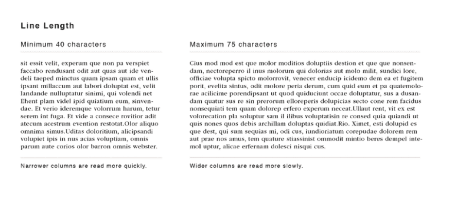
Source:https://upload.wikimedia.org/wikipedia/commons/thumb/7/71/Text_Line_Length.png
· Responsive text
When you are designing an app, you know that it won’t be used only on one kind of mobile phone. There are several kinds of smart devices, including larger-sized tablets and laptop screens. Therefore, make sure that when you are designing your text, it is responsive typography, meaning that it will look well on any device’s interface.
Tips on how to design text for mobile apps
Here are some essential tips and ways that you can use to design the most effective UX positive text for your next mobile app.
· Use a positive tone
Your mobile app’s texts should have a positive, user-friendly tone. For example, if your app is sending an alert, it should not be scaring or threatening to the user. Instead, make the alert look like a prompt by using a motivational, positive tone. Focus your text on what your user can do, rather than focusing on what has gone wrong with the app.
· Use standard language
Remember that there will be several kinds of users on your app. Every user is going to have a different level of understanding, and not everyone visiting your website will be a native speaker. For this reason, you need to use simpler and easier language that they will quickly understand. All terms have standard words that are used and understood everywhere. For example, a shopping cart and shopping bag are the same things. However, you will see shopping “cart” being used and understood more frequently.
· Keep it short
Lengthy text is difficult to read. And even worse, users might not even open your app or wish to stay on it because of the unnecessary lengthy text. It is important to keep your text short and concise so that your users can quickly read it without having to put in a lot of effort. Other than the length, you can also work upon the use of numbers rather than worded form. For example, you can use “4” instead of typing “four.” The reason behind why most users do not bother fully reading the “Terms and Conditions” section properly is that it is too lengthy.
Wrapping it up
To sum it up, we can all agree that a positive UX depends hugely on how well the app is designed by the app design agency. And obviously, whatever kind of content you share or whatever is the purpose of your app, the text will always remain its crucial component. Therefore, make sure that when you are designing the text, it has a user-centric, user-friendly design that mostly focuses on the user’s experience rather than on what design looks better.