What is it about some calls to action (CTAs) that make them convert better than others?
Many different factors come into play, including the overall design of the site and the target audience. An average click-through rate for CTAs is 4.23 percent. Of course, this varies by industry and individual button. But as a rule of thumb, you should aim for anything over average. Even small tweaks can increase your CTR significantly.
Save time and energy by focusing on the characteristics most likely to see a positive reaction.
1. Choose the Right Color
Is there one color that converts better than others for CTAs? Some people say yes, and some say no, and the results vary widely. However, blue, red, and green seem to be quite popular colors for buttons.
The right color for your site is one that meshes well with the rest of your color palette but also contrasts sharply with the elements around it. So a vivid blue on a white background is a good choice because it draws the user’s eye and invites them to click on the button.
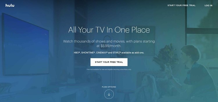
Hulu uses white for its CTA button, which is a bit different from many other sites. However, the color pops nicely over the medium blue background. The goal is to grab the buyer, and this button accomplishes that with nice use of color contrast.
2. Create a Pop-up
The user might ignore elements on your landing page, but if you add a pop-up when the user hovers near the exit button or after a certain amount of time has elapsed, you eliminate the other choices on the page and put the focus on the CTA.
While some users hate pop-ups, some sites use this technique effectively, such as by offering a special book or a free offer.
3. Use First-Person Language
Stay away from third-person for the language on your CTA button. Instead, get things on a more personal level with second- and even first-person words. Use words such as “my,” “me” and “I.” For example, you might use the words, “I Want Info” or “Give Me Free Stuff.” Your site will seem less formal and stuffy, and visitors relate better to that kind of wording.
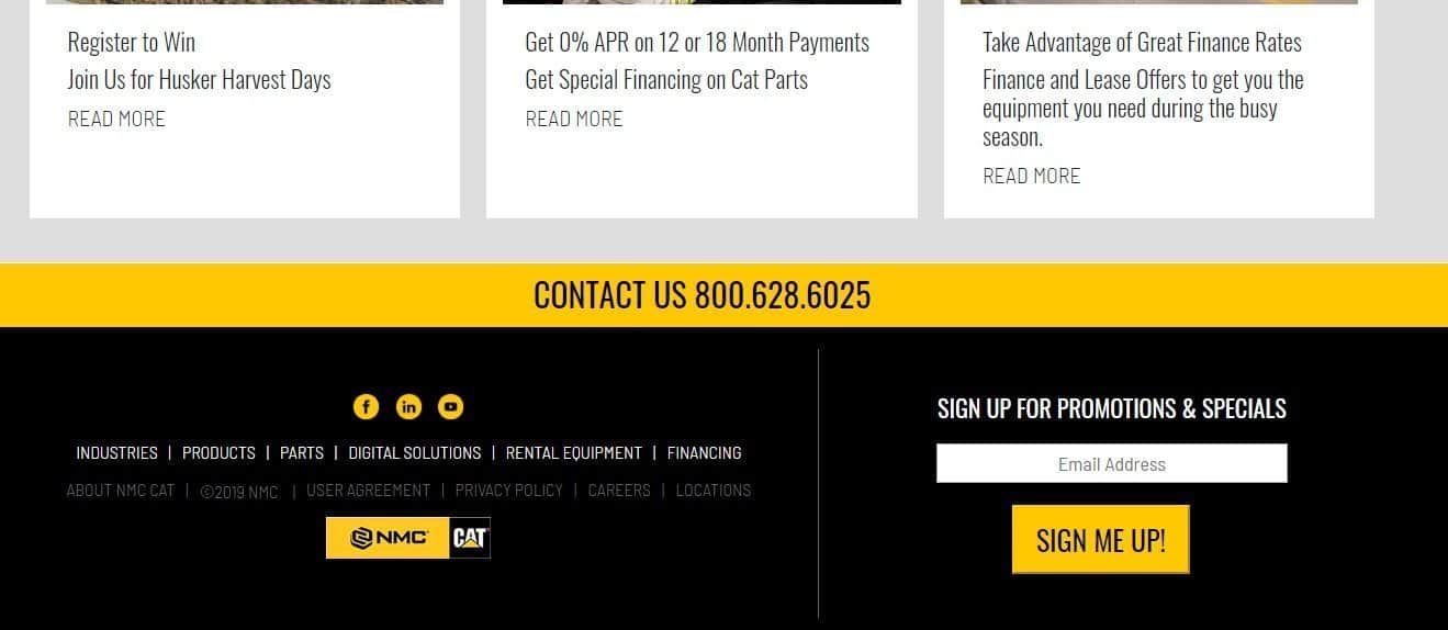
After inviting visitors to sign up for special promotions, NMC CAT uses a CTA button that reads, “Sign Me Up.” The result of clicking on the button is clear, and the wording is very personal.
4. Choose Strong Verbs
Some verbs are stronger than others. You can say you “went” to the store or you “dashed” to the store. At the same time, don’t get so creative with your language that the user doesn’t understand your meaning.
The goal is to get your point across in as few words as possible. If you can say the same thing with one word that you say with three, choose the simpler form. Look for words associated with a feeling or emotion. “Plan your dream trip” sounds better than “plan a trip.”
5. Place the CTA in a Smart Location
You’ve probably heard some experts say to put the CTA above the fold and others say to place it lower on the page after all the information. The best placement for a CTA varies depending upon how fast you can get your point across and how impatient your visitors tend to be.
One smart option is placing the CTA near the top of the page, perhaps in the navigation bar, and then again after the content on your landing page. This lets those who are impatient immediately move forward, and those who need more information to take action later.
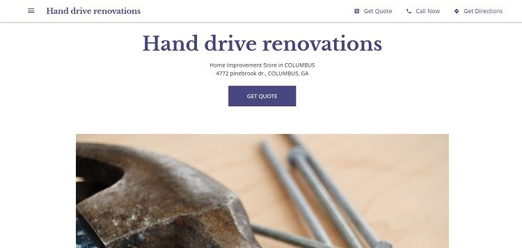
Hand Drive Renovations places their call to action in their navigation bar next to their telephone information and directions. They then place it halfway down the page but still above the fold. The focus when the user lands on the page is the CTA button further down, but if someone is searching for the navigation, they will see the other.
6. Use FOMO
Create a limited offer and tap into the fear of missing out (FOMO) in your site visitors. For example, you could offer a free book to the first 200 people or offer free limited-time shipping when the person signs up for the newsletter.
FOMO creates an effective tactic for getting more signups, but you also need to be honest and transparent. Don’t offer a free book for a limited time and then continue to offer it anyway. People will lose their trust in you and be less likely to give you their hard-earned dollars.
7. Create a Clickable Button
Your button should look like it’s clickable. It shouldn’t look like plain text or a box that doesn’t do anything. Instead, make sure the site visitor knows there is something a bit different about your CTA.
Many sites use a button that is slightly larger than the other buttons on the page or a different color. Buttons are typically seen as clickable, but you can also bevel the edges slightly or make the color change on hover. The wording also can indicate the button is clickable with action verbs.
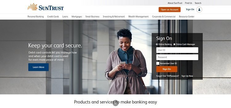
SunTrust does a good job of setting their buttons apart by creating a high contrast between the background and the CTAs. There is a slight rounding to the corners, which makes them stand out even more and shows the user they are clickable. The language makes it clear they are action buttons with “Open an Account” and “Learn More.”
Tweak Your CTAs
Use the tips above and revamp your CTAs, so they more easily convert site visitors into customers. One of the best ways of seeing how different changes affect your customer base is running some A/B tests to see how different placement, wording, and colors work for your site. With a little practice, you should be able to get better results than the average.
In Summary
Using one or two, hopefully all, of the tips mentioned above, you can gain numerous new clicks! Which one will you be using today to turn your CTAs into converting miracles?