Your landing page makes or breaks your online marketing strategy. Regardless if you are a local business or an llc florida, you need a great landing page.
Around 65 percent of marketing professionals feel lead generation and driving traffic to a website is one of their most important tasks. The two goals work intricately together, so those who visit your page are most likely to become customers.
1. Know Your Audience
The key to a landing page which converts is knowing the target audience for that page. Create a buyer persona which represents the typical customer who lands on the specific page. Gear the tone of the writing, images and even CTAs to the preferences of your buyer. For example, if your audience is mostly Generation Z, you might use pop culture references and a lighter tone than if your audience is made up of baby boomers.
2. Have One Purpose
Most sites offer multiple landing pages, but each page should have one primary purpose. If you provide too many different options on a single page, buyers grow confused about what they are supposed to do next. A strong landing page moves users to a sole purpose. For example, if your goal is to get site visitors registered for your newsletter, you might explain what your newsletter offers, give them an incentive to sign up and create a one-line form along with a subscribe button. The only other element you might put on the page is a link to your homepage via the logo or navigation at the top of the page.
3. Offer Something of Value
What is your unique value proposition which entices site visitors into converting to customers? Some sites offer a free guide, others a webinar series. The offer should be highly relevant to your business model and something which your audience can’t easily access anywhere else.
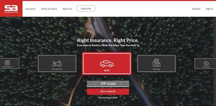
Safe Auto offers a free insurance quote to those who visit the site. Since users are already looking for insurance, this is a valid offer and gives people a chance for instant information which they can then compare with what other insurance companies offer. They do offer some options, such as auto insurance, motorcycle insurance, renters insurance and so on.
4. Convince Your Site Visitors
When people land on your page, it’s your job to convince them to stick around and that your product or service is worth looking at. Think about what stage in the buyer’s journey those who land on your page are at.
For example, if most of your traffic comes from search engines, visitors might be in the information gathering stage. On the other hand, if the majority of visitors land on your page via a video, they likely already gathered information and are ready for you to convince them to move forward.
5. Integrate a Video
The statistics about online videos are compelling. Adding a video to your landing page increases conversions as much as 80 percent. Each year, more and more people spend time watching videos online than other activities. If you want to increase conversions, a video helps answer consumer questions while engaging them. Information presented in video footage is more easily processed and remembered because it’s a visual medium.
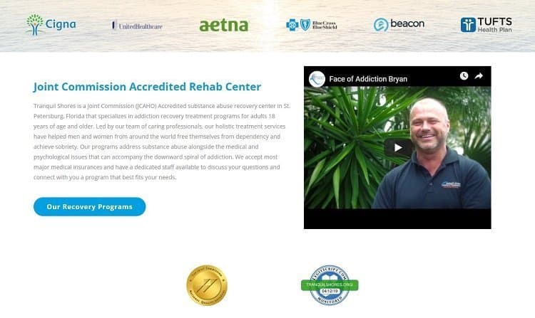
Tranquil Shores utilizes a video to highlight the benefits of their recovery program. They highlight some of their patients who’ve recovered. By sharing Brian’s personal story, they show the value of what they have to offer and reach anyone else who might struggle with similar addictions.
6. Perfect Your CTA
Your call to action is what tells site visitors the next step. Spend time perfecting the words, the color of the button and even the placement on the page. Put yourself in the user’s place and imagine what might make you click on the CTA and what would cause you to skip over it. Split tests allow you to see which colors work best within your design and draw attention and action from the user.
Study the CTAs of competitors as well. What makes their CTAs stand out and how can you emulate their success while remaining unique and true to your brand voice?
7. Create a Central Landing Page
If you offer several products or services, creating one main landing page which then links to more specific landing pages works well for general traffic arriving on your site. You may not always know exactly what the buyer wants, but you can present a list of options and then filter the user to an area more suited for their needs.
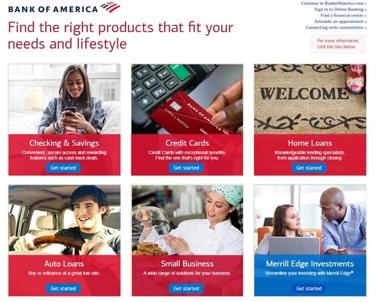
Bank of America offers a main landing page, which then breaks down their other landing pages, sending visitors for more information where it makes the most sense. Notice the clean, crisp grid layout and the categories of Checking and Savings, Credit Cards, Home Loans and Small Business. These are very different types of banking services, but their customers may use more than one, so this central landing page gives them access to multiple options.
8. Offer Details
Make your offer clear and provide the details needed. Users are less likely to purchase your product or service if they don’t fully understand what they get for their investment. Spend some of the time on your page explaining what your customer gets when they convert.
If you’re selling an item, then lay out everything included in the order, even if it is a free guide which comes with every order. If you’re selling digital goods, spend a bit of time explaining the benefits of what you’re offering and how it is different from other options.
9. Use First-Person Language
You probably noticed that many CTAs offer second person language, such as “Buy Now” or “Get Your Free Guide.” However, first-person language is very powerful because it puts the user in control of the action and is a subtle shift of them choosing to take action versus you telling them to take action.
Some earlier studies show first-person language converts better. While more recent studies aren’t readily available, the psychology behind the concept hasn’t changed and using “my” language may work well with your audience.
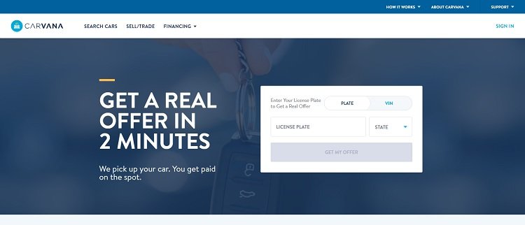
Carvana does a good job with first-person CTAs. Notice the wording on the button on their landing page for those wishing to sell a car. The CTA reads “Get My Offer.” The text encourages the user to make a decision and move forward from the landing page to the next step in the buyer journey.
10. Write a Killer Headline
The headline is typically the first element on a page the visitor reads. It also grabs their attention in search engine results. Your headline drives the tone for your entire landing page. Think about what you’d like your headline to say for you. A strong headline grabs the reader’s attention and also defines the purpose of your page. Spend time perfecting your headline, so it communicates your message in as few words as possible.
11. Include Contact Information
Would you want to buy something from a company you weren’t sure of? There is a level of trust when someone invests their money with your brand. Your landing page needs to include contact information or a link to clear info, so the consumer feels comfortable buying from you. It also shows goodwill and that you are focused on customer service and aren’t afraid to share email and phone numbers so users can connect easily.
Test and Retest
One of the keys toward creating an amazing landing page is testing each element of your page and figuring out what works for your brand and what needs changing. Although there are some best practices, each business is unique and the buyers for that business. What works for one site might not work as well for another. Test and then test some more until your landing page converts at a rate you’re pleased with.