If you have a website of your own and you’re not new into digital marketing, you know that your landing page gives the first impression to a potential visitor. This impression can either help in building a connection or play a role in creating a disconnect.
Before hiring a website agency for your company, you need to ask for the website agency’s portfolio. If you are designing your webpage, you should ask experts for the tricks of creating the most lucrative landing page, and for mistakes to avoid.
We’re here to help you with the essential elements of a useful landing page.
A CTA (Call-To-Action)
The ultimate goal for every landing page should be to persuade the visitor to take some action. The action may be of any kind. It could be getting in touch with you, making a purchase or even downloading a file. It is possible only if you add a clearly-defined Call-To-Action as CTAs mostly help in converting visitors.

The call should be included right at the top of the page, and it should consist of striking buttons, an attractive and appealing headline, and a relevant image.
Content should be in separate sections
Every section of the landing should be individual, and they should have enough white space for the content to breathe.
You should use backgrounds, white space, and images to offer visual separation. It will ensure that the users are not distracted or overwhelmed during their stay on your landing page. Most single-page websites use these to their full potential with the help of anchor navigation, which is giving each section a clear separation.
Concise and clear text
Remember that the more comfortable you can make it for your visitors to read, understand, and digest your content on the landing page, the higher will be the chances of its success. The fonts that you use should be readable with proper letter spacing and exact line-height. Go beyond content that looks good as it should also get right till a point.
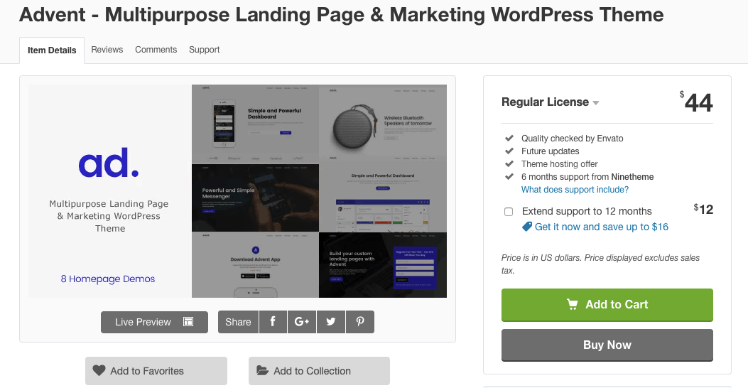
You can try out Advent, which is one of the best templates for the landing page. It provides you well-executed typography along with concise content.

Leverage visual details
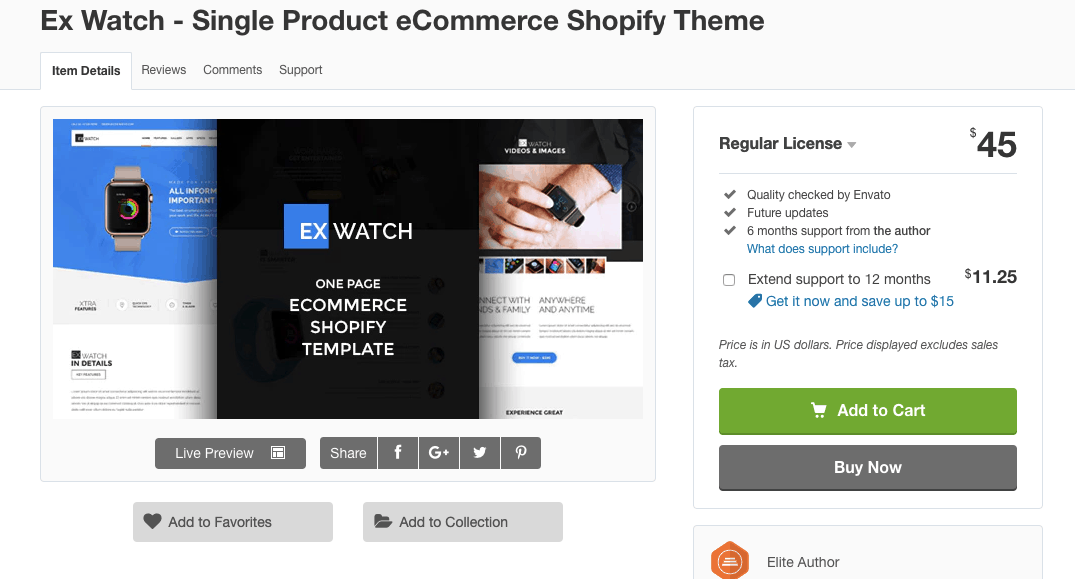
Along with text that’s both sweet and short, you should also consider using images as they best define your overall message. Visual representations can come in the form of a chart, diagram, captioned photo, or even an infographic. Visual elements are an incredible help in delivering the message to your visitors, comprehensively, and interestingly. Ex Watch is one of the best examples of a landing page.

It uses numerous necessary elements to inform the users visually. Not only that, but it is also visually appealing as it tells a story to the readers.
Therefore, if you’re new into digital marketing and you’re looking for ways to boost your conversions, focus on your landing page. Keep in mind the above features of a proper landing page before creating one for your website.
