In the world of digital marketing, we’re all a bit obsessed with conversions. There’s even an entire science devoted to conversion rate optimization.
Designing an effective landing page that makes converting visitors easier and more streamlined is often a challenge. After all, there are so many other websites out there, some of which are truly amazing. What can you do to stand out?
In order to help you overcome this hurdle, we’ve taken a look at eight landing pages and broken them down for you into their basic converting elements. Hopefully, these examples will give you plenty of ideas to take to the drawing board of your next landing page.
Plenty of choices
One of the things that make landing pages stand out is the choices you offer your visitors. And while you may feel like there’s nothing personalized you can provide – there is always something.
Take the example of EachNight:
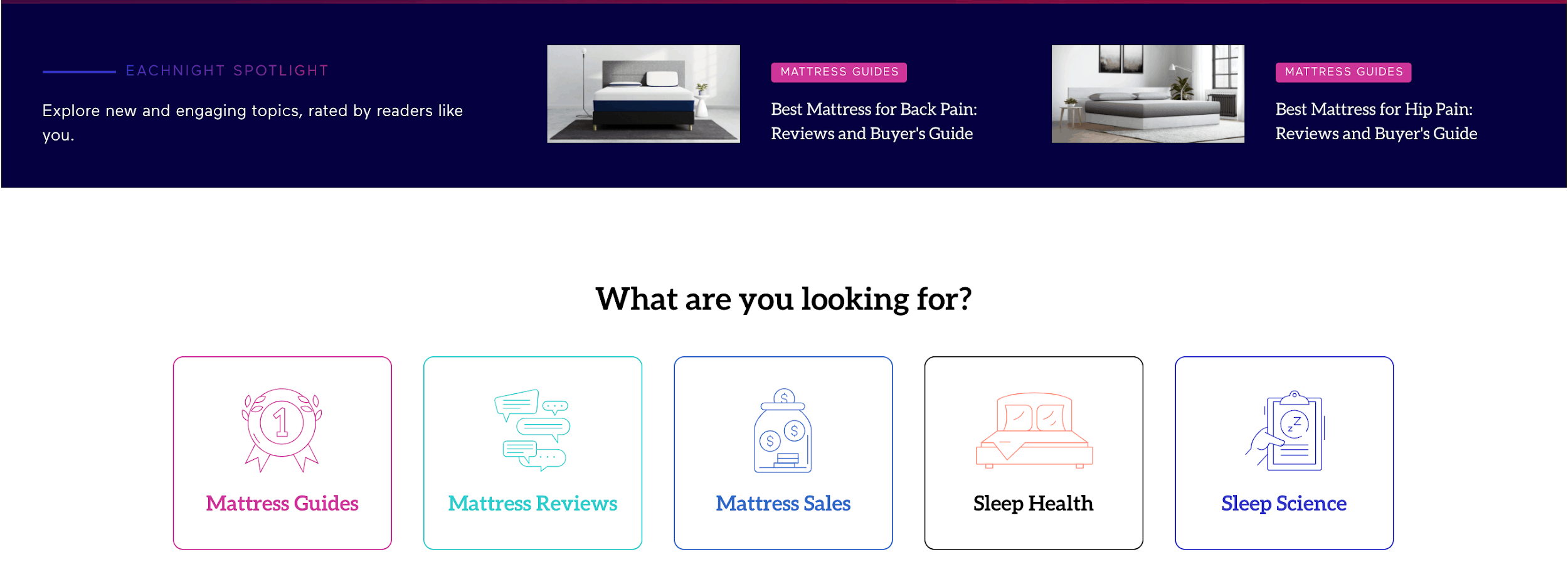
Source: eachnight.com
Just below the hero section of their homepage, they offer a choice: are you interested in mattress guides, or perhaps sleep science or sleep health?
While these icons simply lead visitors to different sections of the website, which can also be accessed from the menu, making them this prominent is an excellent way to showcase some of your most important pages and enable visitors to choose where they want to go.
The power of a good tagline
Sometimes, there is nothing that speaks louder than words. And if you manage to create a tagline, a slogan, a sentence (or two) that not only perfectly encompasses your product, but that also incentivizes your visitors to convert, half of your job is done.
Codecademy have done this wonderfully:
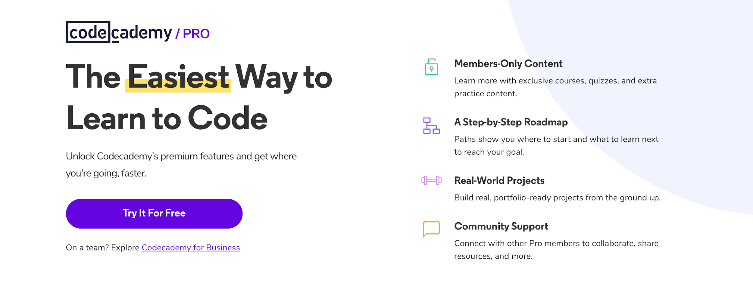
Source: codecademy.com
They have chosen to go with “the easiest way to learn to code” – and when you think how challenging yet lucrative coding actually is, when someone offers you an easy way to learn, you will jump for the chance to try it out.
Add to that a “try it for free” feature, and you have a very effective landing page.
A clear avenue of communication
No matter how well you write your landing pages, or how in-depth they are, there’s always the chance that a visitor may have a question you still haven’t answered.
Instead of having them look for it on other pages or send you an email, you can simply set up a chatbot, a live chat, or any other means of direct communication that will enable your visitors to get an answer in as real-time as possible.
Let’s look at how Aura has done it:
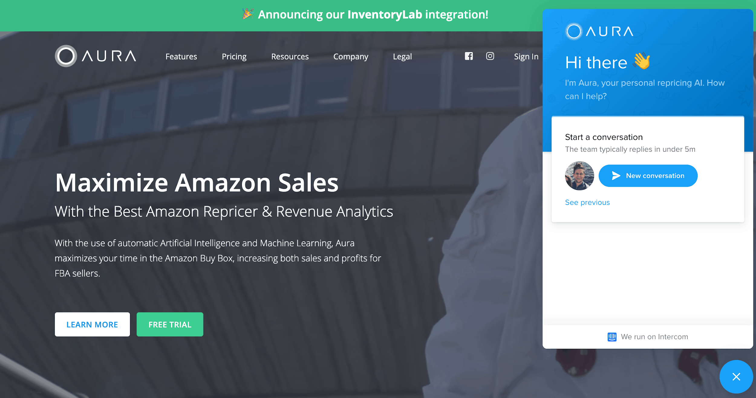
Source: goaura.com
They use Intercom for their chat, which pops up as soon as you land on their page. The chat window tells you when there is a live assistant available, but you can still leave a message even when no one is around, and know when you can expect to get an answer.
Overall, this is a great way to ensure your customers are provided with the information they need in a timely manner.
Put your users in the forefront
Showing actual cases and users is always better than reaching for stock imagery or using models to sell your product.
Upwork does this very nicely, and all of their dedicated landing pages (categorized according to the job you need to recruit a freelancer for) feature one of their best freelancers. This not only gives freelancers a chance to attract additional clients, but it also lets clients know they will be working with real people. It makes the entire process of hiring online a bit more human. And that makes it an excellent way to attract new users.
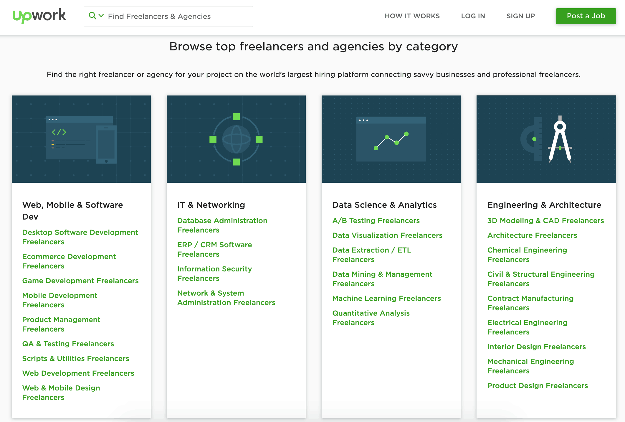
Source: upwork.com
Give the people what they want
If a user has to visit three different pages just to find what they need, you might lose them somewhere along the way. If you can give them just what they were looking for as soon as they find you, you’ll have a much easier job converting them.
Let’s look at the homepage of Air Canada:
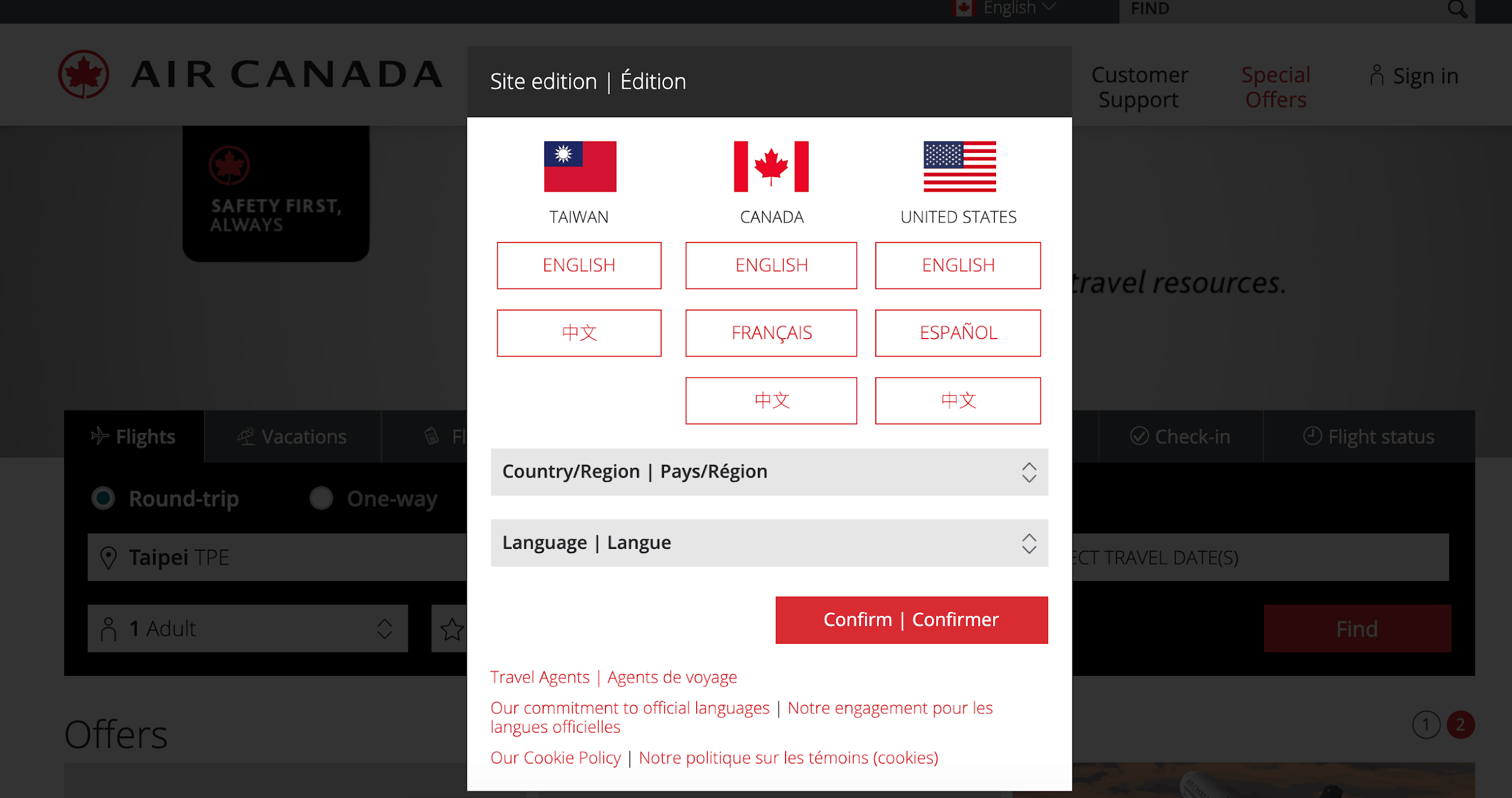
Source: aircanada.com
Not only do they ask you when you enter the website what language you want to use and where you are located, but their homepage also gives you what you need in the blink of an eye: a chance to search through their flights using the most important parameters.
This makes it much more likely for someone to book a flight – they have all the data they need, they can compare prices easily, and they don’t need to spend hours double-checking information.
Show the actual product
A lot of landing pages talk about the product in-depth and focus on all its different features. But sometimes, it’s much easier to just show it and be done with it.
Sagenine has done just that:
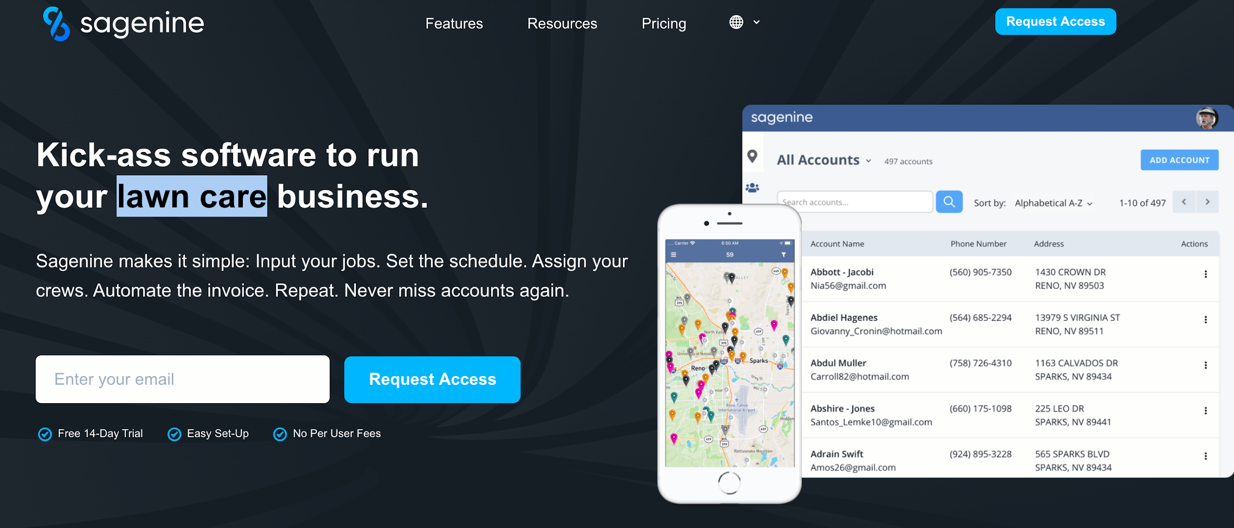
Source: sagenine.com
It’s all about the price
While there is something to be said about not listing your prices on the website, that might lose you a fair few clients. Not everyone will want to go through the process of contacting you just to be told how much they would need to pay for something.
Bluehost’s VPS server landing page shows their prices clearly and to the point. At a glance, you can tell what you’re getting, how much that will cost for what period of time, and you can compare different plans from the same page.
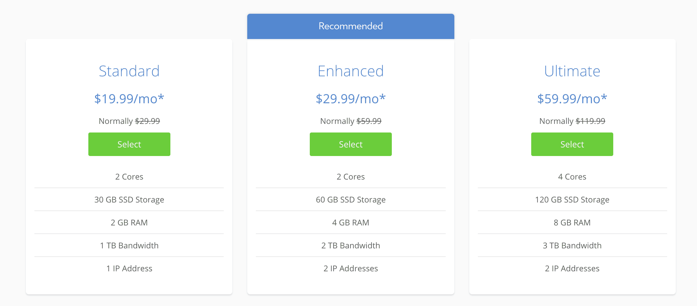
Source: bluehost.com
If you can set up your pricing in a similar fashion, you will be shortening your sales funnel – and likely converting more visitors.
The power of a review
Reviews and social proof, as well as testimonials from satisfied customers, are an excellent way to showcase the best sides of your brand. Incorporating some on your prominent landing pages can do an excellent and seamless job of converting visitors.
Forms on Fire have added an extra twist to this practice:
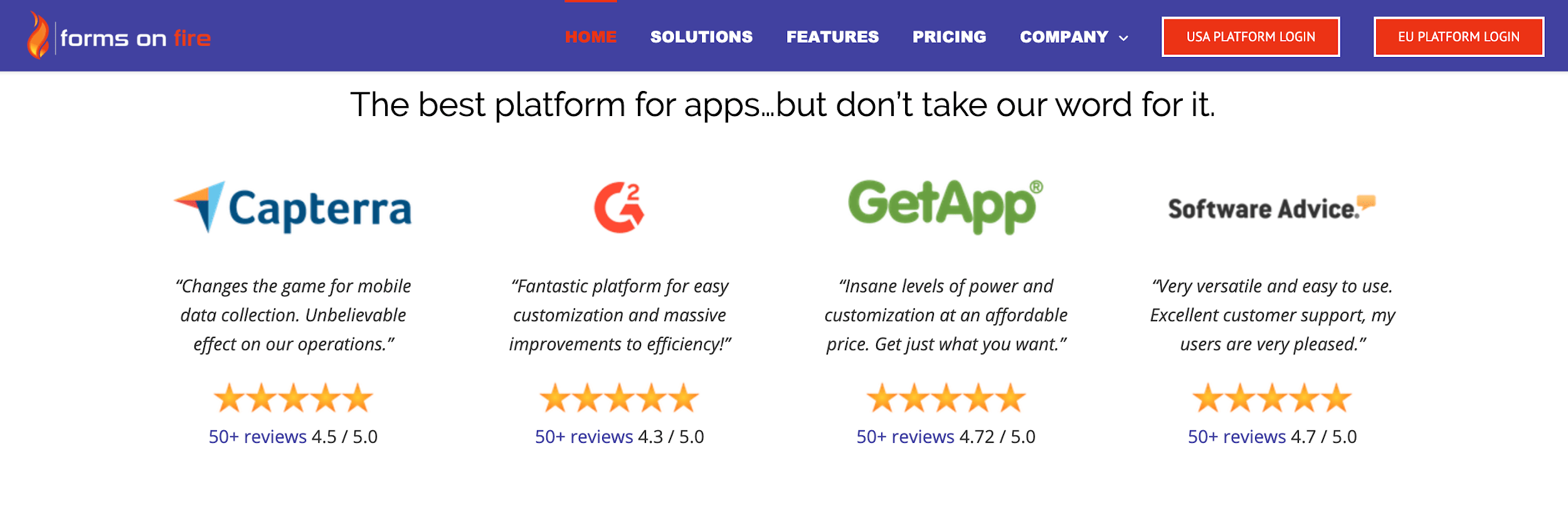
Source: formsonfire.com
They actually point to review websites and have singled out one glowing review per website on their landing page. On top of that, they’ve added a helpful link that will enable you to read up on others as well.
This is smart not only because they’re providing access to satisfied customers: they are also not afraid to point out the less-than-five-star reviews they’ve received. In an era where everybody is just trying to look their best, this is a very ingenious move.
Their hero image is all about their product, and you can, at first glance, tell if it’s something you might find useful. Of course, they’ve provided plenty of information below, diving deeper into its capabilities, but they let their design speak for itself, trusting that it can help users solve their problems.
Closing thoughts
Don’t forget that your landing pages need to be true to your own brand – don’t just go by what someone else has done well. Make sure you tell your own story, having your own target audience in mind.