The navigation bar is the map to your entire website, and users expect to see certain features in it to help them as they journey through your site. So if you have a website for an llc california, it needs a navigation bar.
There are approximately 1.7 billion websites on the internet, although the number moves up and down by the second. With that many sites, there are a few standard practices people have come to expect and a lot of input on what makes for good user experience (UX) with a navbar.
Let’s take a look at some of the things users most want in a navigation bar and commonplace things they’ve come to expect. We’ll also study some excellent B2M menu designs so you can learn from what others do well.
1. Add a Search Feature
If your site has quite a bit of information, adding a search feature is beneficial to both consumers and other business owners. Instead of having to hunt around for the exact topic they need, visitors can punch in a few keywords and pull up a list of results. While sometimes imperfect, it reduces the amount of time required to browse your site and is a nice perk to offer your users.
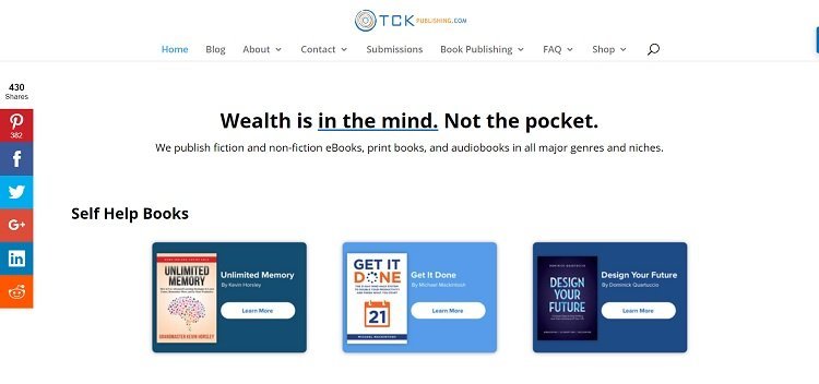
TCK Publishing offers services to writers and sells books to consumers. If someone visits the site seeking a specific title or author, they can easily find what they’re looking for with the search button. On the other hand, it also offers content aimed at writers, so providing an option to hunt for content easily works well for that part of its buying audience as well.
2. Place Contact Info on Far Right
The typical user looks to the far right for contact information when they survey the menu on any site. Think about most websites you’ve visited and where the contact button is located, and you’ll understand why. People tend to trust a company that places contact information in an easy-to-find location. It can be in the form of a link that goes to a contact page or can be a toll-free phone number or email address. The key is to offer the information consumers, and businesses expect.
3. Offer Convenient Placement
Think about where your navigation bar appears on your page. Users want to see something near the top. The menu can go horizontal or vertical, but it should be one of the first things a site visitor views. Consider placement as the user scrolls down your page, too. Do you need to add additional links in the footer, so the user doesn’t have to scroll back to the top? Perhaps you need to add a sticky nav bar that moves down the page as the user does.

Reynolds Solutions makes its menu sticky, so the bar moves down with the user. There is no need for someone to scroll to the top or bottom of the page because the navigation is available no matter where they are on the website. It also places its toll-free number in big red digits to the right edge of the navbar so that the user can phone at any point in the buying process.
4. Code in Mouseovers
If your site visitors can’t tell that your navigation menu is made up of links, then you’ve missed out on a directional cue. You can further accentuate your links and engage users by adding mouseover effects. For example, when the user hovers over the words Buy Wholesale on your menu, what happens? Does the button change colors, or perhaps the words become underlined? Think about how you can signal that clicking there creates action.
5. Tell a Story
No matter what type of product or service you sell, there is a story behind your brand that makes you who you are. Your buyers care about this story, whether they are business-to-consumer (B2C) or business-to-business (B2B) customers. Incorporate it into your navigation bar by adding an About button somewhere in the lineup.
Remember that people tend to expect the most important features to be on the left in countries where people read from left to right, so decide where in the lineup your story should go. You might feel it is the most critical aspect of what you do and place it first.
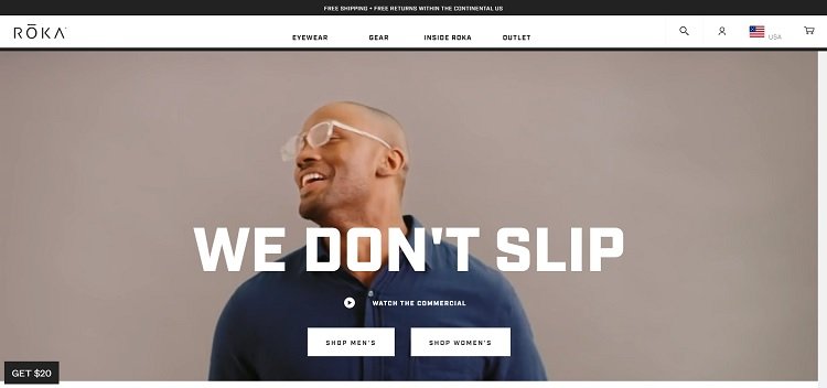
ROKA sells eyeglasses and gear specifically made for bike races and sports enthusiasts. The website has to encompass both its business partners, such as university teams and individual buyers. The navbar reflects what if offers with information about its products and then a link called Inside ROKA.
6. Check Your Type
Around 81 percent of Americans own a smartphone, and many use those mobile devices to access the internet. The fonts you use in your navigation bar must be readable on all screen sizes. Stay away from fancy scripts, as they can be hard to read and may not translate well across all browsers. Instead, use clear serif and sans-serif fonts that most people already have installed on their computers, such as a Google font or common types such as Arial or Helvetica.
7. Keep Language Simple
Keep the words for your navigation simple and to the point. Don’t try to get too creative or fancy, or you risk losing your reader. Words such as Shop, About, and Contact Us are all clear and to the point. The shorter your description, the better. If you get too lengthy, your navbar will scroll down several lines of your page and create an ugly appearance for your site.

Huddle does an excellent job of keeping the language simple in its navbar. Businesses use the software for project collaboration, but individuals also tap into the program as they go about working on a project or seeing the results of the work they’ve hired out. Note how the navigation commands are to the point, such as Features, Solutions, and Contact Us.
Test Changes
One of the best ways to see how your customers respond to your navbar is to make small changes and conduct some split testing to see how they respond. With a little focus on detail, you can create an intuitive, user-centered design that both consumers and businesses respond to.