The design of a website is meant to evoke certain feelings. For example, in the case of a bank’s or insurance agency’s website, the design needs to elicit a sense of security. A news website will go for a sense of authority, while a travel website will want to inspire a sense of adventure. A well-designed website is just the beginning—SEO for travel agency plays a crucial role in ensuring your site reaches the right audience, attracts organic traffic, and turns visitors into customers.
In this post, we’ll look at different travel websites and how they spark that sense of wonder and curiosity we all love about travel. Hopefully, these examples will help you tweak or redesign your own travel website and inspire your audience.
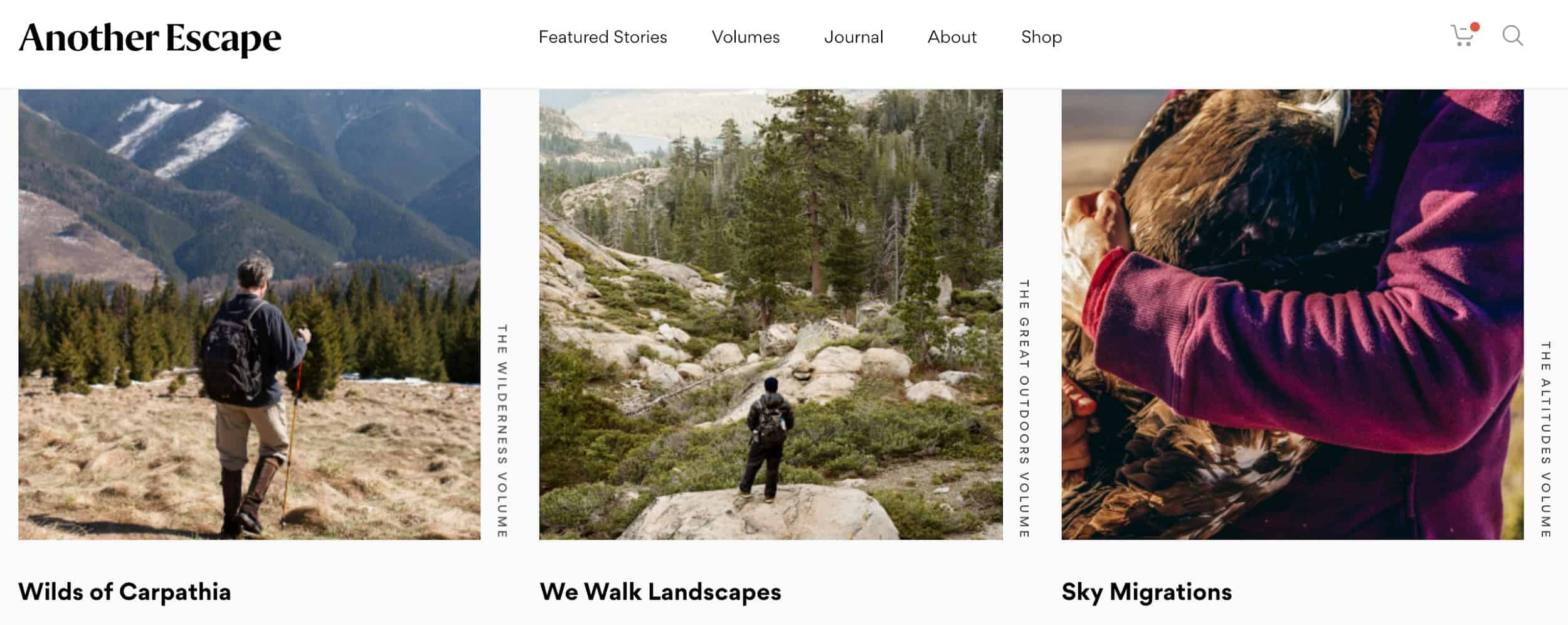
Another Escape
Another Escape boasts an incredible hook – images that make you want to pack your bags and head out on the road immediately.
The website itself is also clean, with plenty of white space that gives these images a chance to shine. Minimalism often works very well for travel websites, as you want your visitors to be able to focus on the imagery and words you’re using to excite them about travel.
Gogin for a blend of white and colorful can draw your visitor’s eye and successfully highlight the stories you’re trying to tell.
The Adventure Junkies
The Adventure Junkies is an incredible resource if you’re looking for an – you’ve guessed it – adventure.
They’re behind a series of books that help beginners get the hang of hiking, outdoor clothing, and other topics, and their library of articles is an incredible online resource. Their articles are written in an incredibly engaging way, giving you all the information you need to get started engaging with the great outdoors.
In other words: always aim to not only provide value but also to package it in an appealing way. The Adventure Junkies have managed to achieve that rare blend of quality content mixed with appealing design, and they make it look effortless.
Visit Finland
The official website of Finland is everything you need when traveling to the country. It offers not only useful resources but also stunning imagery for you to imagine yourself spending time with Santa and his elves.
One of the most appealing features of this website is the variety of languages it offers. This design element does a lot to boost user experience and to cater to a whole host of different target audience segments.
Try to make it easy for your target audience to find what they are looking for. You can do that with your navigation, available languages, or by effectively organizing your content across different pages and categories.
Not a Travel Club
Not a Travel Club does a great job at minimalism, and you can certainly take a page out of their book on the subject.
Their articles provide plenty of useful information, but what makes them stand out is the “no fluff” design. It’s easy to navigate and easy to read through. Plus, it doesn’t have an oppressive amount of images you need to scroll through to get to the actual content.
You can always do something as simple as this on a travel website. You don’t have to go big or go home – minimalism still works.
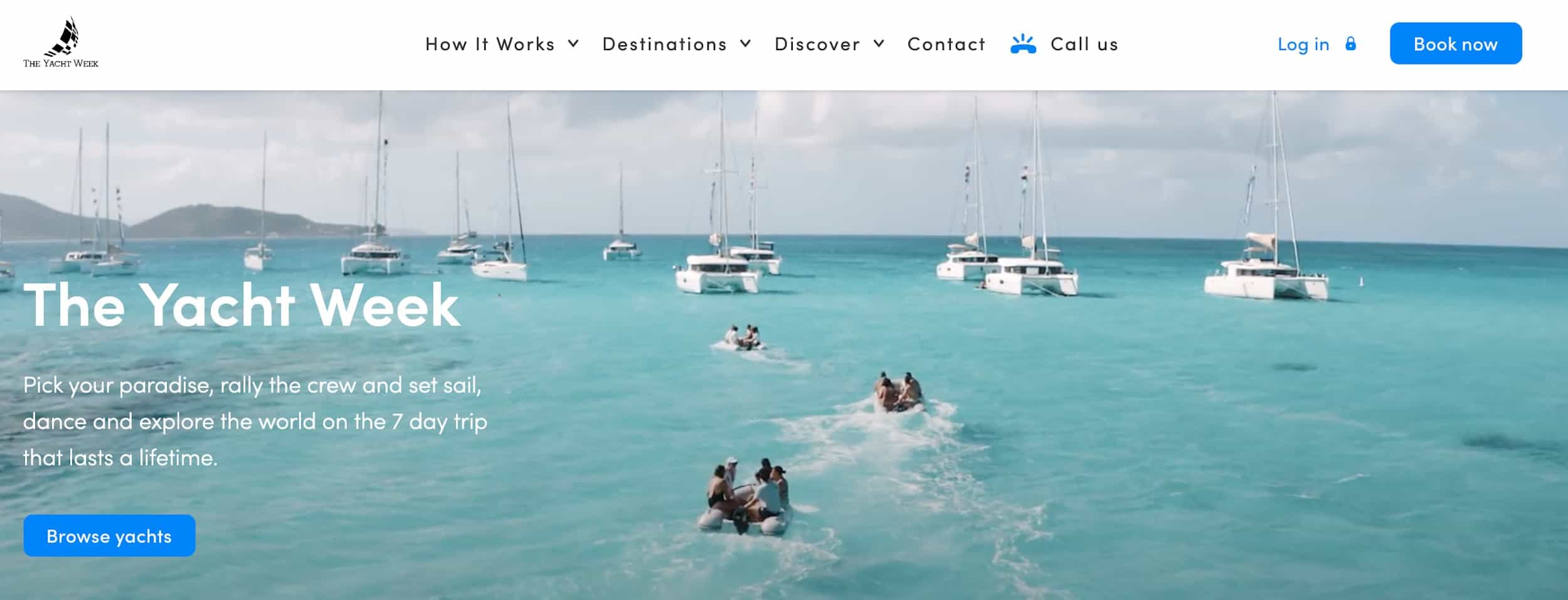
The Yacht Week
The Yacht Week is a website that speaks to those who love to sail. As such, it has selected a combination of blue and white for its design, and this works like a charm, instantly giving you sea and ocean vibes.
Granted, you won’t always be able to employ this kind of clever color choice. That’s especially if your website covers different kinds of destinations across the globe.
However, what you can do is employ some basic color psychology. Choose colors that will evoke the emotions you want your audience to feel when imagining themselves at the destinations you’re writing about.
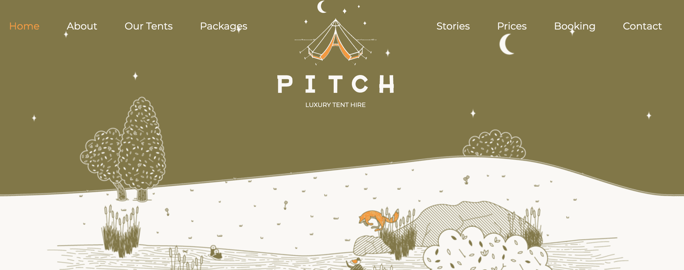
Pitch
Pitch is proof that you don’t need to use custom photography on your website to make it appealing, easy on the eyes, and, well, simply stunning.
In fact, they hardly use photography at all. Instead, they’ve opted for illustrations that are unique, perfectly in line with the brand, and evocative of their products (which happen to be camping tents).
This serves to show that you can easily forgo the expensive custom photography and hire a designer who can come up with solutions that might work even better.
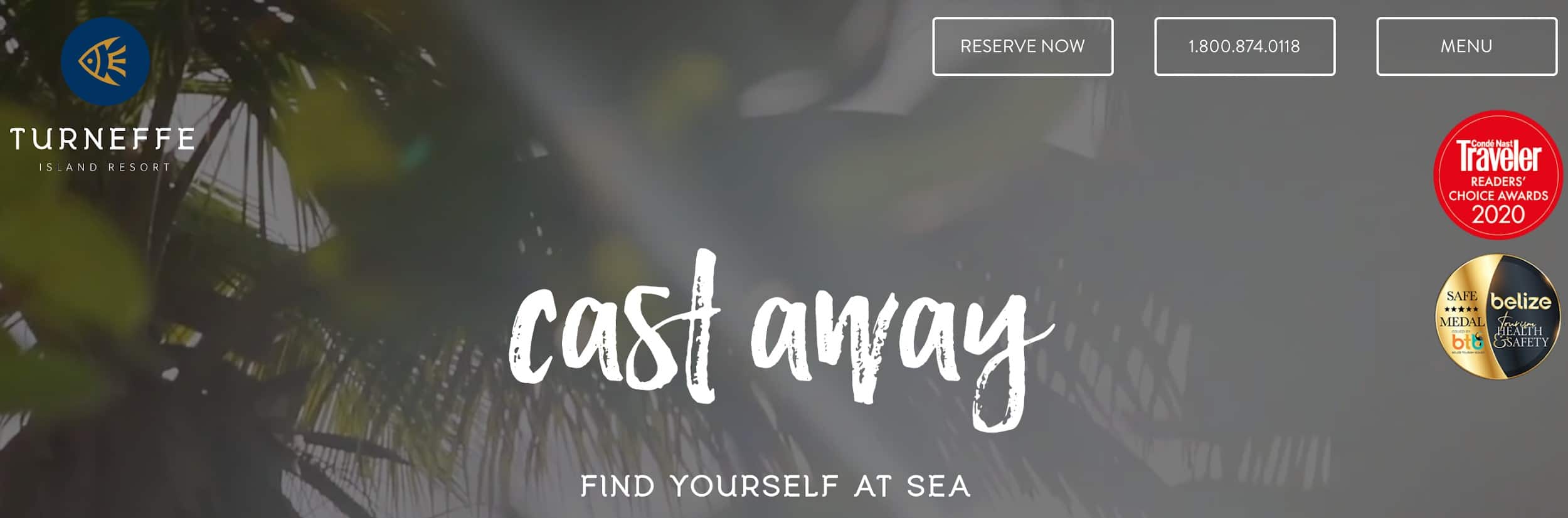
Turneffe Island Resort
Finally, one of the best ways you can hook your travel website audience is to showcase actual experiences.
The Turneffe Island Resort does this with their images, which is ultimately the best way to do it if you want to tell a story of experiences. Images are the best way to showcase activities, sites, and amenities available.
If this is the design route you want to take, you should definitely ensure the images you use are of the highest quality. More importantly, ensure they appeal specifically to the kind of audience you want to attract.
TIR does this with their adventure and activity photos. They showcase some of the incredible nature to immerse yourself in, along with guests and staff enjoying some of the available activities.
Final Thoughts
Designers commonly believe that travel websites need to focus on images, and they’re certainly correct. You want to show people what’s waiting for them and why they should visit a certain destination.
However, there is more to designing a travel website than just adding plenty of images. They need to be in line with the brand and the emotions you are trying to evoke.
Consider your target audience before you begin to (re)design your website. What would appeal to them the most?
Don’t forget that user experience is also incredibly important, so ease of navigation and a straightforward layout are other design elements to be mindful of.
Take a look at our examples, and model your own website on those you like best.