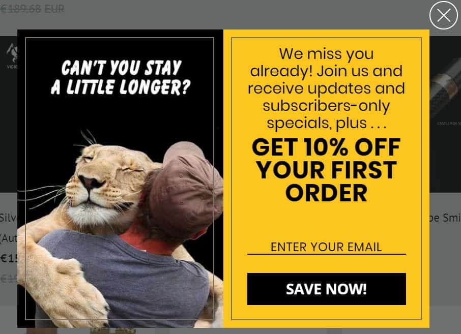
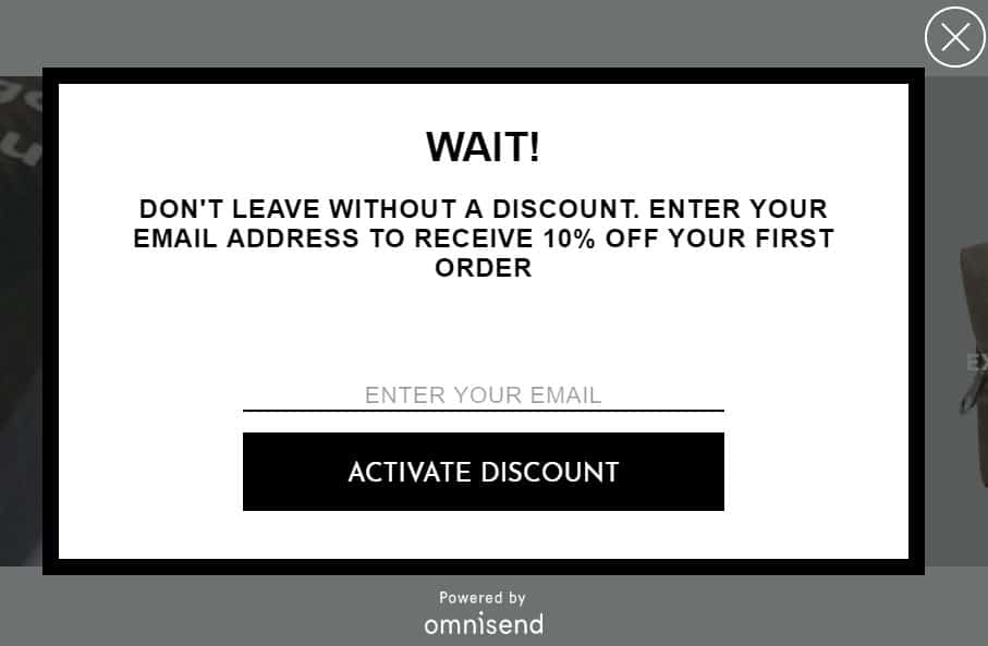
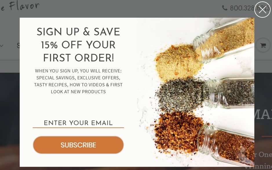
Let’s talk about exit-intent popups.
In general, this lead gen strategy gets a lot of bad press. Yet, as our experiments show, exit-intent popups is an incredibly easy-to-implement and effective conversion optimization tool. Our last experiment achieved a nearly 20% increase in order rates!
Implementation is everything
Typically, a popup will get a bad rap if it shows up in the wrong place at the wrong time. Unfortunately, that happens more often than we’d like to think.
Implementing an exit-intent popup that drives micro conversions and increases order rates requires a perfect balance between the right timing and the right messaging.
Let’s look at a few examples to see what this means in reality.
Imagine that a visitor lands on your site, browses around but finds nothing compelling – he’s about to leave the page. If, at this moment, you use a popup to invite him to sign up to your newsletter, the chances are high that he’s going to ignore that. Since he wasn’t impressed with your site, why would he want to receive emails from you?
Now, a different scenario. Someone clicks through one of your social media ads and lands on a product page. They click around a few times, maybe even save the product to their wishlist… but they’re about to leave. If you use this moment to serve a limited-time offer – free shipping for the next 12 hours, for example – this might be enough to get the person to act on their impulses.
A targeted popup can actually add value to a person’s buying experience, and it’s the only sort of popup you should aim to implement.

Ideas on how to use exit-intent popups on your site
Alright, so you want to test the effectiveness of an exit-intent popup on your store. Here are a few strategies worth exploring:
Cart abandonment
Studies show that roughly 70% of online shoppers abandon their baskets at checkout. And while there are many legitimate reasons why this is happening, you could try to reduce your cart abandonment rate with a last-minute offer or a suggestion to save the items to their wishlist.
Product page
Stop users from leaving without buying by throwing in a sweet offer (e.g. discount code).

Limited-time offers
Run special limited-time offers to create a sense of urgency. If someone’s leaving the page, you have more chance of getting their email address in exchange for a special discount than forcing them to buy.
Landing page
When your landing page copy fails to convince the visitor to take action, an exit popup gives you a second chance.
Price & availability alerts. Offering alerts is a great way to stay in touch with visitors who don’t convert, especially in industries where prices or availability change often (or very rarely) – think flights, job positions, properties or branded products.
All of these exit-intent popup strategies have two things in common – they target users that have shown a clear interest in your product, and they use that interest to construct a compelling offer. The biggest challenge here is actually coming up with those powerful ideas that can change the visitor’s mind.
Having reviewed and tested hundreds of popups, we have identified three key aspects of a high-converting exit-intent popup:
- An eye-catching visual
- A bold statement or question
- An irresistible, relevant offer
And here’s how one looks in real life:

Real-life case study: testing the conversion rates
When Organic Aromas approached us for help with optimizing their signup forms and increasing conversions, they were getting around 250 signups per month.
They relied on two basic signup forms to add more subscribers to their store:
• The default Shopify signup form in the footer
• An always-visible Sumo.me bar at the top of the page
The forms weren’t doing so well, as conversion rates were low, hovering around 3%.
The store owners felt they could do better without throwing too much money into their marketing. And they were right – by the time we were done with them, the store’s conversion rate shot up by 150%, driving the average number of subscribers to 660 per month.
The best part about it? It only took us around 15 minutes to set it all up!
How we did it
The experiment was simple – we would run a different popup every week for one month. Each popup took us about 15 minutes to set up, and we tested the following:
- Immediate popup
- Delayed popup
- Passive signup box
- Exit-intent popup
Week one: the immediate popup
We set up the immediate popup to show up as soon as a visitor lands on the site.
Without knowing the user’s intent and buying patterns, we could not personalize the popup to match their expectations, and that’s not ideal.
However, it gained Organic Aromas 135 new signups during the week it was live. More interestingly, though, 7.4% of the people who signed up went on to buy something.
Week two: the delayed popup
In week two, we tested the delayed popup. We adjusted the settings to serve the popup after a new visitor clicked around the site three times.
That’s because our data show that after three clicks the visitor can be considered as engaged.
Although we saw fewer signups overall, the conversion rate jumped up – 14.1% of subscribers purchased in that week.
Week three: the passive signup box
The passive signup box is a little widget that visitors need to click on to open the signup form.
This popup was somewhat similar to the Sumo.me top-bar signup form that Organic Aromas were already running on the site.
The results were similar, too – fewer than 1% of visitors subscribed.
Week four: the exit-intent popup
The exit-intent popup proved to be the frontrunner and outperformed the other types of popups by a large margin.
While we’ve seen from our past experiments that exit popups consistently deliver outstanding results, we were still pleasantly surprised with the results.
Not only did the exit popup help the company boost the number of subscribers by 150%, but it also gained them a 19.03% order conversion rate!
This means that almost 20% of new subscribers went on to purchase something based on that one popup alone, which is significantly better than their previous conversion rates.
Wrapping up
You’ll believe it when you see it; we can guarantee that.
Remember that the success of a high-converting exit-intent popup rests on two key aspects – the right timing and the right messaging. Whether you want to run product page popups or aim to implement price alerts, stick to the same rules, iterate and watch your subscribers (and sales) grow.
Good luck!
