As an industrial company, you have special considerations to keep in mind when reaching site visitors and the public in general. Your audience is highly targeted, and the information you provide needs to thoroughly address any concerns and issues this target audience might encounter.
The needs of an industrial website are vastly different than the needs of an e-commerce site, for example.
The US government lists over 100 industry pages, but for this article, we’ll look at six specific improvements and examples of excellent websites in different industries. One of the best ways to figure out what your website should have is to look at what others are doing.
1. Limit Menu Choices
Depending on your industry, you may offer thousands of different options. Users landing on your site for the first time can become overwhelmed easily. Instead of offering too many choices, narrow your main categories down to a handful. You can always utilize a mega menu or further subcategories to break down topics a bit more, but the initial choices should be clear and to the point. For example, if you manufacture cleaning products, your categories might include window cleaners and soaps.
2. Ensure the Logo Redirects
Make sure the logo redirects to the home page when the user clicks on it. This advice is applicable for any website in any industry. Over the years, users have come to expect the logo to be interactive and serve as a home base. If they go off down a rabbit trail on your blog or a random page on your site, they can simply click the logo as a navigational method and go directly back to your main page.

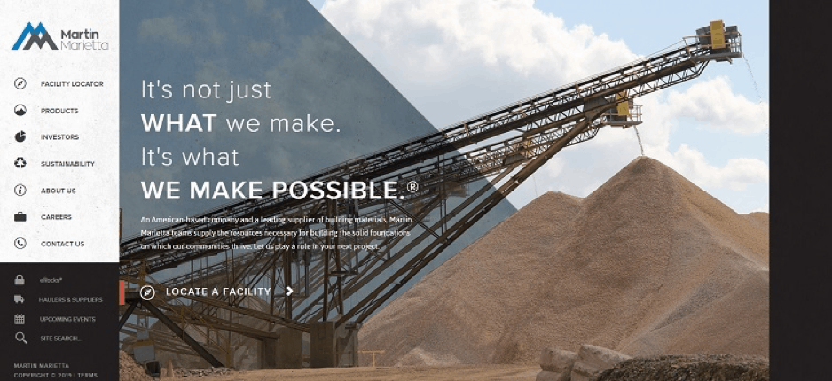
Martin Marietta makes building materials for the construction industry. Note how their logo is placed in the top left of every page on the site. When clicked on, it redirects you back to the home page. They also highlight the logo by placing it on a lighter background than the rest of the site.
3. Add a Project Gallery
Many industrial companies work on huge scale projects that are impossible to show on a smaller scale. However, a project gallery showcases projects during the beginning, middle and end phases of each part of the process. It allows potential customers to see what your company is capable of.

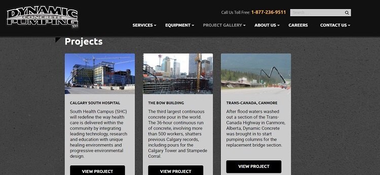
Dynamic Concrete Pumping has a gallery on their site that highlights their best projects. Note how they showcase different types of projects to clearly show the numerous scenarios they work in pouring concrete. The various projects show they’re capable of working on tall buildings, bridges and even airports. Highlighting successful projects in this way helps you attract new business while keeping current customers.
4. Provide Geographical Navigation
Any industrial company that serves different areas of the country or the world should provide a geographical map showing your various offices and the places you serve. A map makes it clear that you’re able to meet the needs of customers in that area and that a nearby office understands the unique geographical challenges presented in the area.

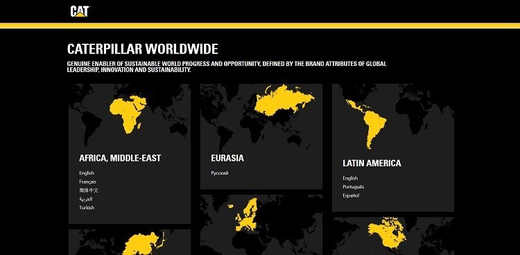
Caterpillar features maps on their worldwide industrial site that shows the different continents served, including Africa, Eurasia, Latin America, and North America. Each choice also offers an option to view the site in the region’s language, such as French or Spanish.
5. Create a Strong Call to Action (CTA)
The CTA button drives customers from site visitors to subscribers or buyers. Part of the conversion process for any site involves a CTA that pulls customers in and encourages action. If your CTA lacks charisma, you risk losing the customer as they bounce away to a competitor.
However, a good CTA is about more than just the words you use. The button must also contrast with the other colors on the page, be the right size and have the proper placement. Testing to see how your customers respond to different types of CTAs is the best way to perfect yours.

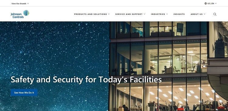
Johnson Controls uses a bold hero image to show what they do as well as a clear CTA to “See How We Do It.” For the curious at heart, this invitation encourages readers to dig into company-related facts and learn more about their business.
6. Go Mobile
No matter what type of business you run, it’s important to make sure your site is mobile responsive.
More and more people access the Internet via their mobile devices — mobile Internet traffic is at 61.2% and growing.
If you haven’t optimized your site for mobile viewing, you’re missing out on a vast percentage of potential traffic.
Industrial Website Tips
These are just a few of the tips to help your industrial website stand out from your competitors. You’ll also want to follow good design practices such as using a solid color palette and investing in relevant and unique photos. With a little extra effort on your part, you’ll meet the needs of site visitors while converting them into solid leads.
