Understanding the rules of graphic design allows you to create something unexpected. Until you fully grasp the do’s and don’ts, it’s difficult to know when to break the rules and create exciting new designs and when you should stick to the tried and true.
There are approximately 217,810 graphic designers employed in the United States, with thousands more around the world.
It’s imperative to put your particular stamp on every project you create. Follow these do’s and don’ts to get started.
Do: Pay Attention to Font Choices
You’ve likely heard people groan when you mention using Comic Sans font. Some are used so frequently that they cease to be effective, while other common options stand the test of time. Know when to use a serif or sans-serif font and think about its personality compared to your design.
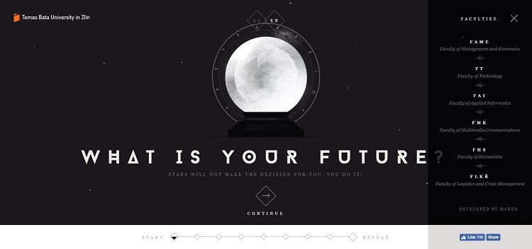
Tomas Bata University in Zlin uses a futuristic-looking type but only in the headline, sticking to standard fonts such as Lucida for the rest of the page. By using the decorative font only for the heading, the design gives a hint of futuristic elements without overwhelming the site visitor.
Don’t: Copy Other Designers
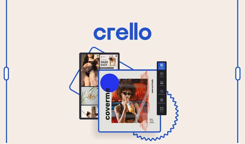
While it’s important to study other designers and learn new techniques, use the process for inspiration. You may not even mean to copy someone else’s design, but inadvertently do so because the idea stays with. If you’re looking for design ideas to boost your creativity and guide you in the right direction, sites like Canva or Crello might be exactly what you’re looking for.
Make sure you keep an idea book with careful notes. Jot down any techniques and credit them to the right designer, and then highlight ideas you have as you study the works of others. This will show you at a glance if your approach is unique or you are simply copying what someone else did.
Do: Think Outside the Box
Once you understand the rules of design, it’s time to think outside the box. How can you push the boundaries and come up with something new that meets the expectations of users? While in the initial phase of design, test new concepts. Then, get some feedback from your target audience, keep what works and lose what doesn’t.
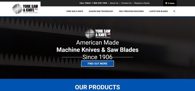
York Saw & Knife does something unique, adding a message to users within the design. The logo has an expected layout that follows good rules, with an image that represents what the company does and its name. However, it also adds an American flag into the mix to show that their products are made domestically.
Don’t: Ignore the Customer’s Requests
No matter how brilliant your design, if you don’t listen to what your customer wants, you’ll wind up with a dissatisfied client. Take the time to really listen to the customer’s preferences. While you might not be able to deliver exactly what they want and still stick to good design concepts, you should be able to find a happy medium that hits their needs.
Do: Adapt for Print Designs
So much of design work is digital these days that printed material can get lost in the mix. If you’re designing a brochure or ad for a print publication, keep in mind where your bleed lines go and the resolution of the image. What looks great on your computer screen might look fuzzy in print if you don’t use the right format and make sure the resolution is high enough. Talk to the printer about their specifications.

Hubspot’s highlight of Glacial’s ad shows the resolution of an image and how it looks crisp and clear on the printed page. Think about how a magazine ad works. You have a bleed to one side of the page or the other, depending upon the ad’s size and the publication’s layout. You must consider where the product fits on the page. If Glacial had placed its bottle on the right side, then it might have disappeared into the fold.
Don’t: Be Inconsistent
Every brand has a specific image, and your design should match their guidelines. Don’t rework the logo if they use a particular representation in various places. Stick as close as possible to their established company color palette.
Every business has its own personality, so try to match your design to the one the brand already has.
Do: Use Plenty of White Space
You’ve likely heard this advice before, but it bears repeating. White space helps highlight the elements you want users drawn to, whether online or offline. The value of white space is in the items that you place within it. The negative background gives the eyes a break and keeps the focus on the goals of the design piece.
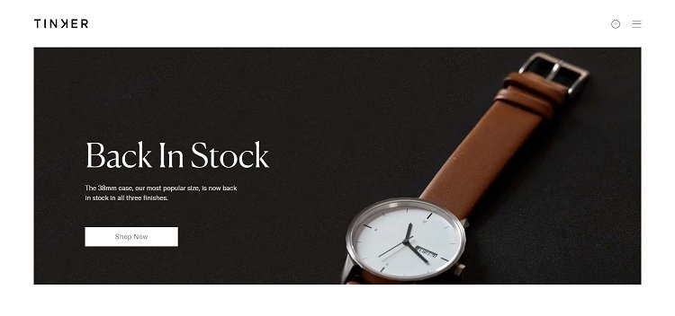
Tinker shows how you can use negative space without the color white. It used a black background and placed its product on top, which makes the watch pop. It then chose white for the text, which offers a sharp contrast.
Don’t: Use Colors that Jar the User
Trends come and go. It’s tempting to jump on board and use bright neon yellow or other trendy elements, only to discover readers are turned off by the aesthetics of your design. Some colors simply don’t translate well online or in print, so always check carefully in a variety of browsers and on different screen sizes.
Trust Your Instincts
You can study dozens of do’s and don’ts for design, but you must learn to trust your instincts or you’ll only grow confused. Know the basics of good design, don’t be afraid to try new things and listen to your voice as a designer. If you combine all those elements, your designs will thrill your clients and stand out from competitors.