How do you create a customer-centric landing page? Putting the focus on the user’s needs and wants helps you improve conversion rates and better meet the needs of your target audience. There isn’t a one-size-fits-all approach to landing pages. Each business is unique.
Understanding average conversion rates and how your pages stack up can help you see where you need to make adjustments. The 2021 Conversion Benchmark Report shows the highest conversion rates of 9.8% in the restaurant sector. Real estate sees a mere 2.6% and e-commerce around 5.2% on average.
Here are our top tips for creating user-centered landing pages that perform well.
1. Create a Navigation Hierarchy
From the moment people land on your page, they try to orient themselves to your website. While some people recommend zero navigation on a landing page, it really depends on the purpose of the page. If you only have a single offer and no possibility of someone wanting another service landing there, nix the navigation.
However, if people sometimes land on a different page, you need a clear structure to take them back to the home page. Even if you only add a logo with a link to your primary area, you need a hierarchy they can intuitively understand.
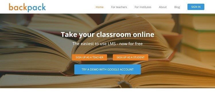
Backpack puts the focus on their call to action (CTA) button, inviting the user to try a free demo. However, they also understand they have different types of audiences. They account for it in their nav bar at the top of the page, offering a Home button as well as areas for teachers and institutes.
2. Share Contact Information
Would you do business with someone you couldn’t reach? What if there’s a problem with the order and you need help? Make sure you include contact information on your landing pages to give users peace of mind and show your trustworthiness.
You can include a toll-free phone number in the navigation bar, a live chat, or email information. The more ways people can contact you, the more secure they’ll feel when parting with their hard-earned money.
3. Know Your Target Audience
You’ve heard over and over to know your audience and speak to them, but creating an amazing landing page requires a bit more information about your typical customer. What are the pain points driving them to come to your page in the first place?
Look at the search phrases most used by people looking for a product or service such as yours or use the Squarespace poll to engage and learn even more about your audience. Talk to your customers about the problem they faced when they found you. Answer those questions up front, and you’ll have a higher success in converting site visitors into leads.
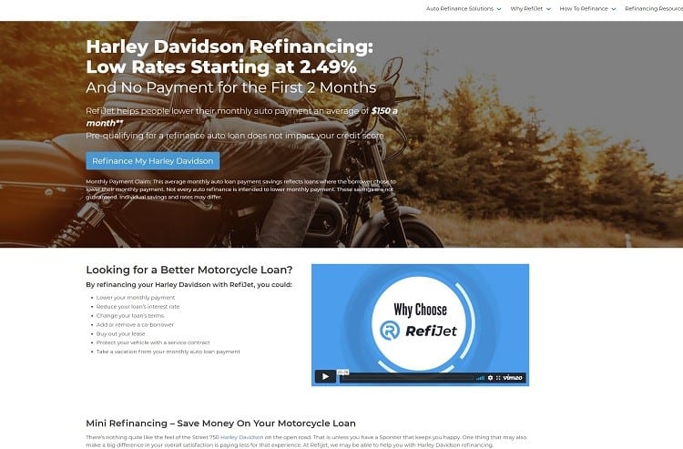
RefiJet knows people coming to their pages might be looking for a lower rate on their motorcycle loan. They mention some of the reasons people search for refinancing, such as lower monthly payments, better interest rates, and buying out a lease.
4. Pad Links
Mobile devices make up over half of all internet traffic. According to Statista, 54.8% of website visitors are from smartphones. Smaller screens make it more difficult to tap on buttons and links.
One way of combating the issues people face with mobile devices is by expanding the target area for tappable features. Create white space around buttons and links and include the negative space in the target.
5. Include Video
According to WyzOwl’s State of Video Marketing report for 2021, about 73% of consumers admitted to buying a product after watching a video. If you don’t already include videos on your landing pages, you can take advantage of an opportunity to make an impact on site visitors.
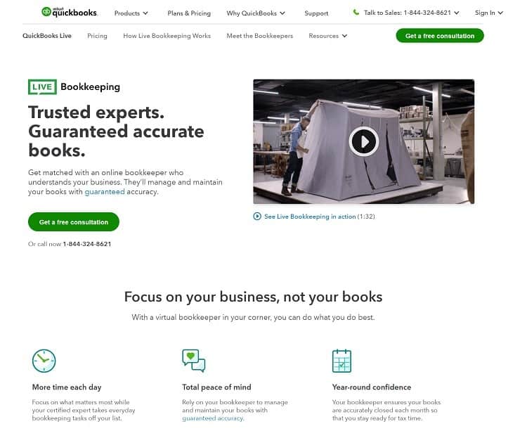
QuickBooks features a video of one of their clients on their landing page. You see the person creating their tents and then going to the computer to enter income and expenses. As you scroll down the page, you find video testimonials and details about the service.
6. Cut the Clutter
Although you want simple navigational features and enough information for users to make up their minds, you also don’t need so much information that users feel overwhelmed. Ask what your main goal for the page is. Cut anything not meeting your objective.
Think about the space surrounding the most important elements on your page. Your CTA button should have plenty of negative space around it, for example. How can you make specific features stick out to the user and encourage them to enter your sales funnel?
7. Place Directional Cues
Do you want users to move smoothly from one section of your landing page to the next? You can add directional cues without coming right out and saying you want the user to click on the CTA button.
Use animated arrows to highlight the clickable areas, for example.
Another idea is to place people on your page and have them look toward the thing you wish to draw attention to. A person looking to the left and toward the call to action, for example, encourages users to look at the same element.
Conduct Testing
If you want your pages to be truly user-centered, you must take the time to test everything. Get to know your audience and their preferences and change anything not meeting their needs. Try two or more versions of your page and keep the one that performs best. With a little testing and legwork, your landing pages will gain you plenty of leads and help your business grow.
Author Bio:
Eleanor Hecks is editor-in-chief at Designerly. She was the director at a marketing agency before becoming a freelance web designer. Eleanor lives in Philly with her husband and dog, Bear.