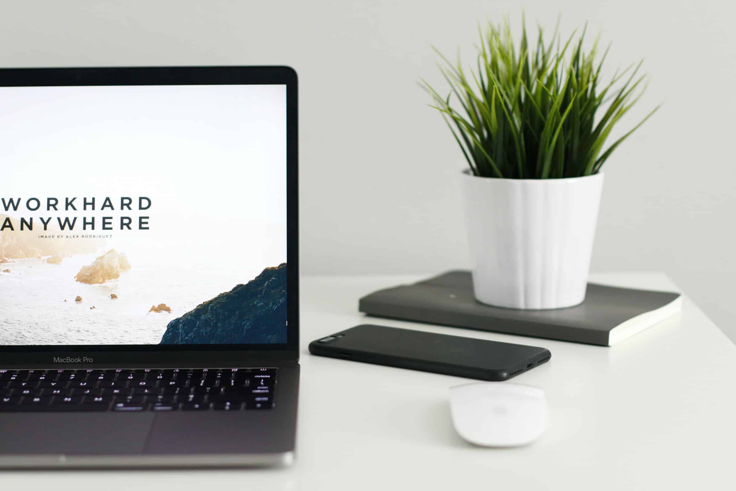
Having a website isn’t impressive anymore, just as using advanced webinar platforms is no longer a big deal.
In fact, you have to have a website if you want anyone to take you seriously.
Websites are almost like a new business card. Even people that don’t have businesses might have websites to showcase their resume or work.
To make your website stand out, you need to look into cool web designs you can use for your own new design. Continue reading this article to learn a few great website design ideas.
Why Is Website Design So Important
If you’re still not sold on upgrading your website, keep in mind that your website is often the first impression people get of you. They might have been searching for your products or services online and found you but haven’t heard of you before.
Your website should allow you to put your best foot forward. So even if you paid thousands of dollars for your website, it’s good to keep it fresh with an upgrade every once in a while.
1. White Space
When you’re looking for the best web design tips, one of the things you should think about is the ease of implementation.
One of the hottest tips is also one of the easiest things you can do. And that is giving your viewers more white space.
Minimalism is hot everywhere, and that includes your website. So why have more information and graphics on your website than you need? There’s no need to take attention away from things you want people to focus on.
2. Dark Mode
Have you noticed that your favorite apps have a lot of dark mode going on? If a popular app doesn’t have dark mode yet, you better bet that they’re working on it.
Dark mode is great for people to use when they’re viewing their devices at night, but it also looks nice. You can bring words to life by putting white text on black, or you might even opt for bright colors to get more attention.
If your brand is a little more on the dark side of things, you might want to give this a try and see how your audience responds.
3. Art
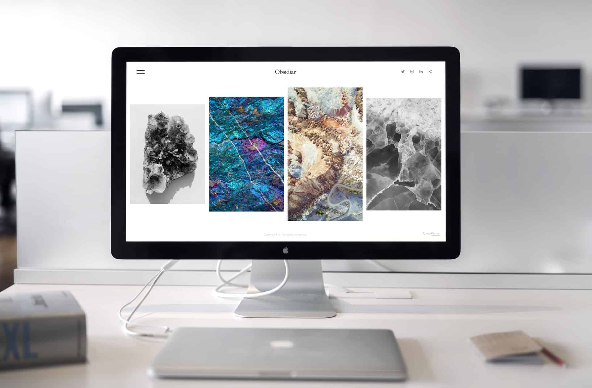
You’ve likely noticed a few websites that have illustrations on them. They are eye-catching, and they can add a lot of value to the user.
If you or someone you know can draw some interesting art, you might want to consider giving it a shot on your own website. And if people in your space aren’t using art on their website, it could be an easy way for you to stand out from the crowd.
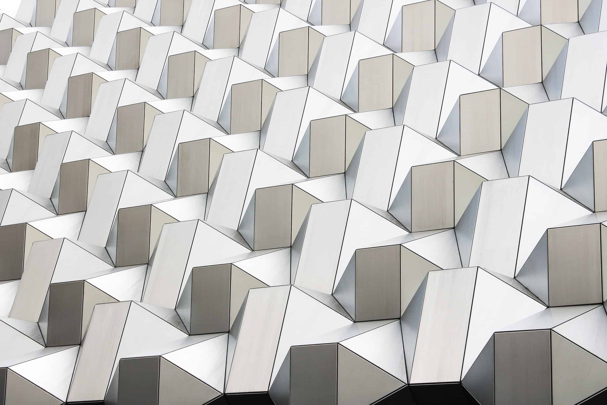
4. Overlapping Layers
When you overlap photos and other elements, it gives the website a little more depth. When you give your website more depth and dimension, it makes it a lot easier to keep the visitor’s attention.
When you’re layering content, make sure everything flows well together. As you’re scrolling, check to see how it looks. If it catches your eyes in a bad way and looks clunky, you might have to redesign it.
5. Switching Up Typography
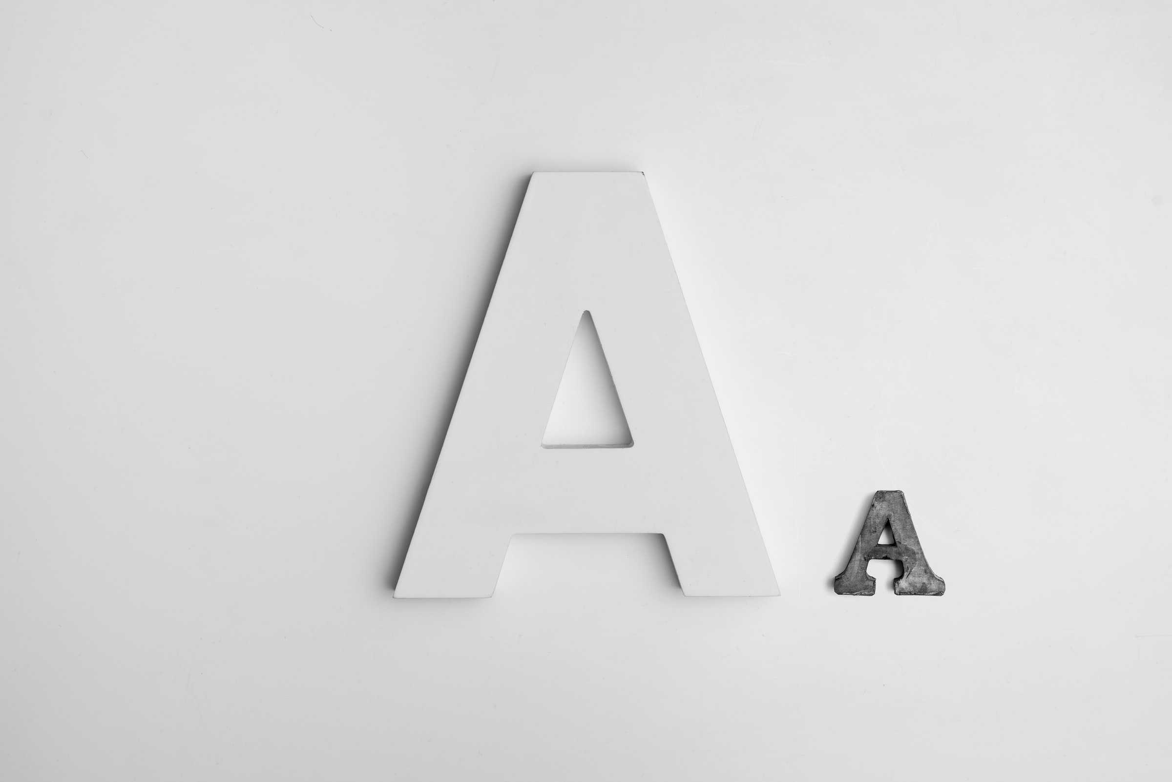
It’s the year to break all of the typography rules. Switching up letters, putting them upside down, mirroring letters, and more are all perfectly fine.
Keep in mind that if you’re going to do this, you shouldn’t try to fancy up the text you need people to read. If you’re giving them navigation instructions or telling them about your company, you should use text that is easy to read.
When it comes to your logo or even your slogan, it can be fun to make it look interesting instead of having it in a font that might look a little boring.
6. Quieter Navigation
When websites first came out and were widely used, most people didn’t know where to go or what to do. Website navigation needed to be big, loud, and let people know what they had to do.
Now, it’s perfectly fine to hide half of your navigation in a hamburger menu that people have to click. The fewer distractions people have when they land on your website, the better it is for your conversions.
Having a big list of navigation cues might send people to areas of your website that you didn’t really care for them to go. But when you focus on the most important menu items, you can direct people to where they need to go.
7. Fun With 3D
3D can be a lot of fun for your website viewers. When you use 3D on your website, people will really feel like they know about your products and services.
There are some pretty amazing 3D designs that you can model and make your own for your site or you can have a professional do it for you.
Just imagine your product looking like it is right there in front of the user on their screen. Great, right?
8. Gradient Colors
Gradient colors are a lot of fun, but many designers have shied away from them for years. Now gradient colors are back, and people are ready to have some fun with their designs.
Whether your designs are bold and loud, or they’re silent and subtle, you can use gradient designs to add an interesting look to your website.
Using the Best Cool Website Designs

Now that you know some cool website designs, it’s likely that you picked a few that are going to work best for you and your website. Whether you’re doing a redesign or getting a totally new website, these designs can help you stand out and get the attention you need.
Do you want to learn more about website design, marketing, and other top issues that are important to you? Continue reading our blog for more great information.