Security-by-design isn’t only about what happens on servers. It’s about what people see and understand while using your web app. In membership platforms, client portals, and SaaS dashboards, the safest system in the world still feels sketchy if users can’t tell what’s protecting them. This piece shows how to make HTTPS, encryption, backups, login safety, 2FA, and privacy messaging visible and friendly for non-technical users—so trust grows naturally without adding friction.
Making security visible with HTTPS, lock icons, and “why this is safe” snippets
First impressions shape trust in seconds, so your interface needs clear safety signals right away. HTTPS and lock icons are familiar, but many users don’t fully know what they mean, so pair them with tiny, human explanations. A short line like “Your connection is private and protected” under a checkout button does more than a hidden policy page. Add “why this is safe” snippets near payments, uploads, or profile edits, and keep the tone calm. You’re not trying to scare people into compliance—you’re reassuring them that their data is handled responsibly.
Explaining encryption in plain language inside the UI
Encryption sounds technical, but your UI can translate it without turning into a classroom. Think of it as giving users a comforting mental model: their data is scrambled so outsiders can’t read it. Tooltips and inline notes work best when they appear exactly where users share sensitive info—login boxes, billing forms, message centers, or file uploads. Avoid alphabet-soup terms like TLS or AES. A simple sentence such as “We encrypt this so only you and our service can read it” is enough. When people grasp the idea, they worry less and engage more confidently.
Backups as a visible promise of reliability
Backups are an invisible security feature until the day someone needs them. If users never hear about backups, they may assume their work could disappear. A brief reassurance removes that anxiety: “Your data is saved automatically and stored securely,” or “We keep protected copies so you can recover anything.” Place these messages where loss feels possible—near save buttons, draft areas, or import flows. The key is framing backups as a benefit to them, not a technical brag. Reliability is trust, and trust is retention, especially in platforms tied to money or important records.
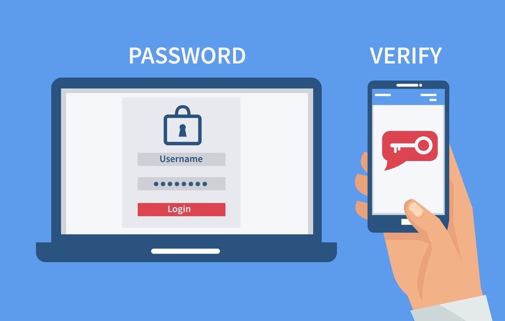
2FA prompts that feel like protection, not punishment
Two-factor authentication should feel like an upgrade users welcome, not a speed bump they resent. Introduce it with benefit-first language: “Add a second step to keep your account safe, even if someone learns your password.” Show setup in a short, predictable flow with progress cues. Ask at smart moments—after onboarding, during first payment, or when users access sensitive sections. Don’t ambush them mid-task. Also explain recovery options alongside setup so people don’t fear getting locked out. If 2FA feels like a seatbelt instead of a hurdle, adoption rises naturally.
Login flows that feel secure without being painful
Login is your front door, so make it simple, steady, and obviously protected. Keep steps minimal, label fields clearly, and let password managers work smoothly. If you add risk checks like device verification, explain them in the moment: “We don’t recognize this device, so we’re confirming it’s you.” That tiny line turns friction into reassurance. Error messages should guide, not scold—“Try again” plus a helpful hint beats “invalid credentials.” A secure login flow isn’t about piling on complications; it’s about making every step feel intentional, consistent, and user-friendly.
Recovery flows that reduce panic and block fraud
Password resets and account recovery are where trust can crumble fastest. Users arrive stressed, so the process must feel safe and humane. Show a clear step path (“1 of 3”), explain why checks exist (“We’re verifying to protect your account”), and confirm success immediately. Don’t hide the destination; tell them exactly what will happen next. If you offer multiple recovery routes—email, SMS, authenticator—present them equally clearly so people don’t feel trapped. A recovery flow that balances strictness and empathy proves you protect users when they’re most vulnerable.
Where to place security and privacy info so users actually see it
People don’t go hunting for safety details. They absorb trust cues when those cues appear next to the action they’re taking. Put short security reminders near payments, exports, admin changes, or integrations. Place privacy choices at signup, profile edit, and data-sharing moments—not buried in footers. Use a layered approach: a two-line summary everyone reads, plus an optional “Learn more” for those who want depth. This avoids dumping walls of text while still being transparent. When safety info is visible at the right time, trust becomes part of the workflow.
Human-readable privacy messaging that sounds like a real person
Privacy statements shouldn’t read like a legal riddle. Use plain words, direct examples, and clear limits. Tell users what you collect, why you need it, and what they can control. Replace vague lines like “we may share information” with specific meaning: who gets what, for which purpose, and whether users can opt out. Tone matters. If it feels sneaky, people assume the worst. If it feels respectful, they relax. Clear privacy messaging also helps reduce support tickets and churn because users feel informed, not tricked, and that’s a competitive advantage.
Security microcopy that quietly builds confidence
Microcopy is the small text that shapes big decisions. Short, well-placed lines can prevent mistakes and calm fears: “We’ll never ask for your code,” “Only you can see this,” or “This file is protected during upload.” These messages work best when they’re specific and timely, not generic warnings. Keep them conversational, not threatening. You’re guiding users into safe behavior without making them feel incompetent. Great microcopy also reinforces that security is always on their side. It’s a low-cost, high-impact way to make protection feel real.
Trust lessons from regulated spaces (anchor example included)
Some industries are required to prove safety clearly, and their habits are worth borrowing. When risk is high, trust comes from visible safeguards plus understandable explanations. That’s true in finance, healthcare, and also in gaming platforms where users demand proof before spending. Regulated industries often have to go further in explaining safety; for example, guides that compare the highest paying online casinos usually point out licensing, encryption and fairness testing alongside payout data, showing how technical safeguards and clear messaging can work together to build trust. The same combo works anywhere users need reassurance.
Measuring whether users feel protected
You can’t assume trust just because security features exist. Measure what users experience. Track where they abandon 2FA setup, how often they fail recovery, and what kinds of safety questions hit support. Run simple usability tests and ask, “What here makes you feel safe?” If people can’t explain your protections in their own words, your UI isn’t communicating enough. The numbers you watch should include perception, not only technical success. Security-by-design succeeds when users notice they are protected and keep moving without hesitation.