If you want a bigger audience for your business, then you need to have a website. Ideally, it should look great and should attract a lot of customers online. That way, you can find another revenue stream for your business.
In this post, we are going to discuss the eight web design tricks that can help boost your site traffic:
1. Optimize the site speed
Google takes in a website’s speed and performance seriously. So should you.
Remember that your business is only as strong as your site. If web visitors are exposed to painfully slow loading times, they will leave immediately. Regardless of if your brand is well known or not.
According to research, 75 percent of internet users judge your site’s credibility solely on how your website looks. By the time your website goes beyond the 4-second loading time mark, you have already lost about 25 percent of your prospective visitors.
There are several ways to improve the speed of your site:
- Minimize the time it takes to create a page on the server.
- Decrease the data that is being transferred from the server to the browser.
- Make the Document Object Model (DOM) as simple as possible.
- Ensure that you optimize and minimize the photos and other media on your site.
Also, make sure that you place brand-specific graphic elements. Then, make the site navigation a breeze.
That’s why it is essential that you work closely with your website designer. Tell them that quick loading times are your top priority.
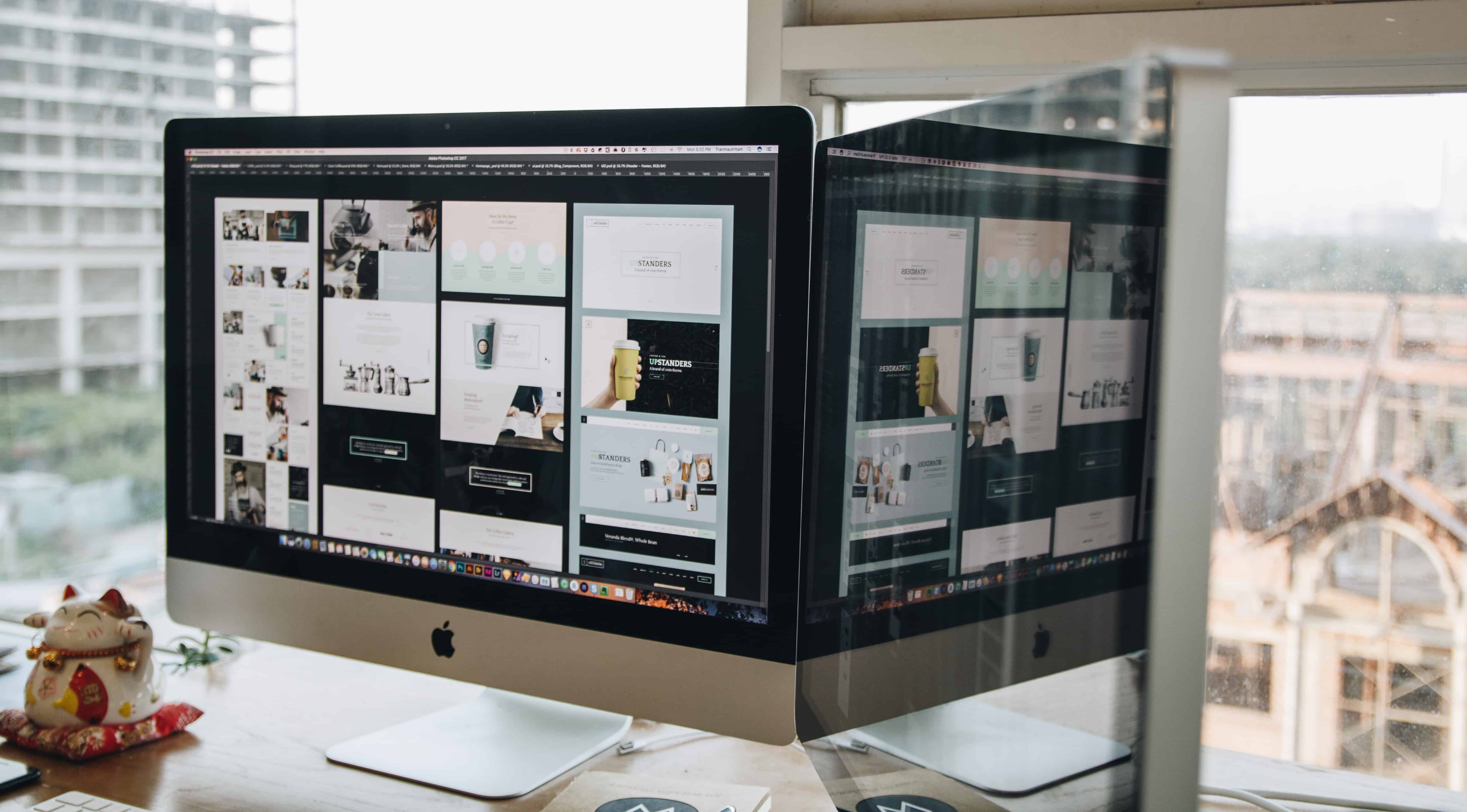
2. Design for small screens
Do you have a site that is highly responsive to mobile devices? Optimizing your site for mobile devices is arguably the most crucial web design tactic that all businesses must do.
As of November 2016, mobile devices have become one of the most popular ways people are accessing the internet. No doubt, mobile usage has now outpaced desktop usage. More and more people will be visiting your site using their mobile phones and tablets. That’s why you need to have an excellent mobile web design.

As much as you can, your site design and development should be as mobile-responsive as possible. That will help you boost your brand visibility on Google, as well as to mobile users.
What we mean by responsive is that your site will be able to adjust no matter what screen size it will appear. Not to mention, they should also be intuitive, and easy to navigate.
According to Sytian Productions, a Philippines web design agency, “Making your site mobile responsive will help it gain a better place in search engines, and eventually, boost the number of your site visitors.”
So, see to it that you are working with a highly talented and professional web designer and developer who will help you build a mobile responsive website.
3. Put videos up on your site
Creativity does not have any boundaries. In fact, you can achieve excellent results when it is used in the right way.
A fantastic way to show off your creativity in marketing the products and services of your site is through videos. As we know, videos already have a lasting effect on your visitors.

Most businesses could attest that after using videos to promote their brand has helped them gain the trust of prospects, as well as their existing customers.
Animations and GIFs create a higher demand, as well. These add an element of humor and fun, which helps develops a strong bond with the audience.
4. Simplify the navigation for visitors
Navigation will always be key when it comes to designing your site. Why? Because it serves as a map of the places on your site that your users can visit.
There is nothing worse than coming across a site that is disorganized or a navigation interface that is complicated. When it comes to enhancing your site navigation, you should see to it that web users can easily find whatever they are searching for.
Ideally, you should aim to have a navigation hierarchy, highly responsive design, and content that is streamlined.

If users could not find whatever they are looking for, there would not be any reason to stay in your site anymore. They will eventually bounce and will find a competitor that offers them a better user experience.
5. Proper placement of CTAs
The most common mistake a lot of businesses make is focusing on the design and the ease of use. However, they forgot to take calls-to-action into consideration.
Ideally, the main purpose of a CTA is to encourage users to take action. So if you do not have at least one CTA on every page of your site, you could be potentially missing out on conversions.
CTAs help you improve your conversion rates, but placement is also the key when it comes to maximizing its effectiveness.
One of the most effective places to put a CTA is in the middle of the content or the bottom of the page. Aside from that, CTAs are also effective when placed on a blog page’s sidebar.
Most experts recommend that CTAs should be on every web page. There should be multiple CTAs, as well.
For instance, you can place one big CTA button that asks visitors to contact you.
6. Consider the use of “white space”
Unknown to some, white space is often the most overlooked and underrated elements that make up excellent web design.
White space is often seen by some like a blank space. However, the truth is, whitespace is one of the most valuable elements in your overall design.
It is an essential element for design and for a good reason. When used properly, it can transform and give many benefits to your site. After all, it is essential that you create layouts that are easy to the eyes, so that people will keep on reading.
White space creates a sense of balance. Too little of it creates confusion, unreliability, and disorganization. You do not want those qualities to be associated with your brand, right?
On the other hand, too much of it shows that you lack content. Therefore, you need to learn how to balance your designs. Use it as an excellent tool to separate chunks of your content. That will provide your site with enhanced user experience and accessibility.
7. Take advantage of visual hierarchy
Every page should have a visual hierarchy.
In its most basic sense, visual hierarchy is the arrangement, color, size, and contrast of different visual elements. It helps describe the importance, as well as the sequence of elements in a particular composition. It helps your audience grasp the entire message that you want to convey.
Excellent web design has the power to attract the audience with the “whole” and then lead them to different “parts” by using intuitive flow and different levels of priority.
When there is no visual hierarchy on your site, two things will happen. First, the audience will try to take everything in, leaving them more confused than ever before. Meaning, they’re not digesting the entire information. The result? They will just bounce around from one “part” to another without getting to the whole.
Second, because the audience thinks that everything you are putting out there is the utmost importance, they do not even try to figure out what you want to tell them. What they do is to just pass up the “parts.” They cannot get to the “whole” because nothing is informing them where to start or how to get around.
8. Give Social Proof to Boost Your Customer’s Confidence
Everyone wants to belong. After all, humans are programmed to be social creatures.
When we see a person leave a certain opinion about things, it encourages us to share our opinions as well.
So when designing your site, it is crucial that you leave enough room for testimonials and reviews. Testimonials and reviews made by your current customers and clients give other customers the confidence to take the plunge.
Here are some design considerations when placing reviews/testimonials on your site:
- Put them in the most prominent spots of your website. While they should not overshadow your CTA, users should easily find them on your site.
- Whenever possible, include a picture of the customer or client who reviewed your products or services. Just remember to ask for permission first.
- Finally, make sure that the font that you choose is easy to read. Fancy fonts are great, but it still has to be legible.
Over to You
Web design has a significant effect on your business, such as doubling your online sales. By implementing these design tips on your website, you can potentially get larger gains with minimal effort.
So, apply these excellent web design tips on your business site to help you gain more organic search traffic. Also, these web design tips can help improve your users’ entire browsing experience. As a result, you can increase your revenue.