If you’re new to website design, or you don’t feel confident with DIY coding, a framework could be the answer to your problems.
")
Your website is the first thing many customers will see when they research who you are – first impressions are vital. As a result, your website needs to show who you are, but it also needs to be high quality and professional.
Why Website Design And Frameworks go Hand in Hand
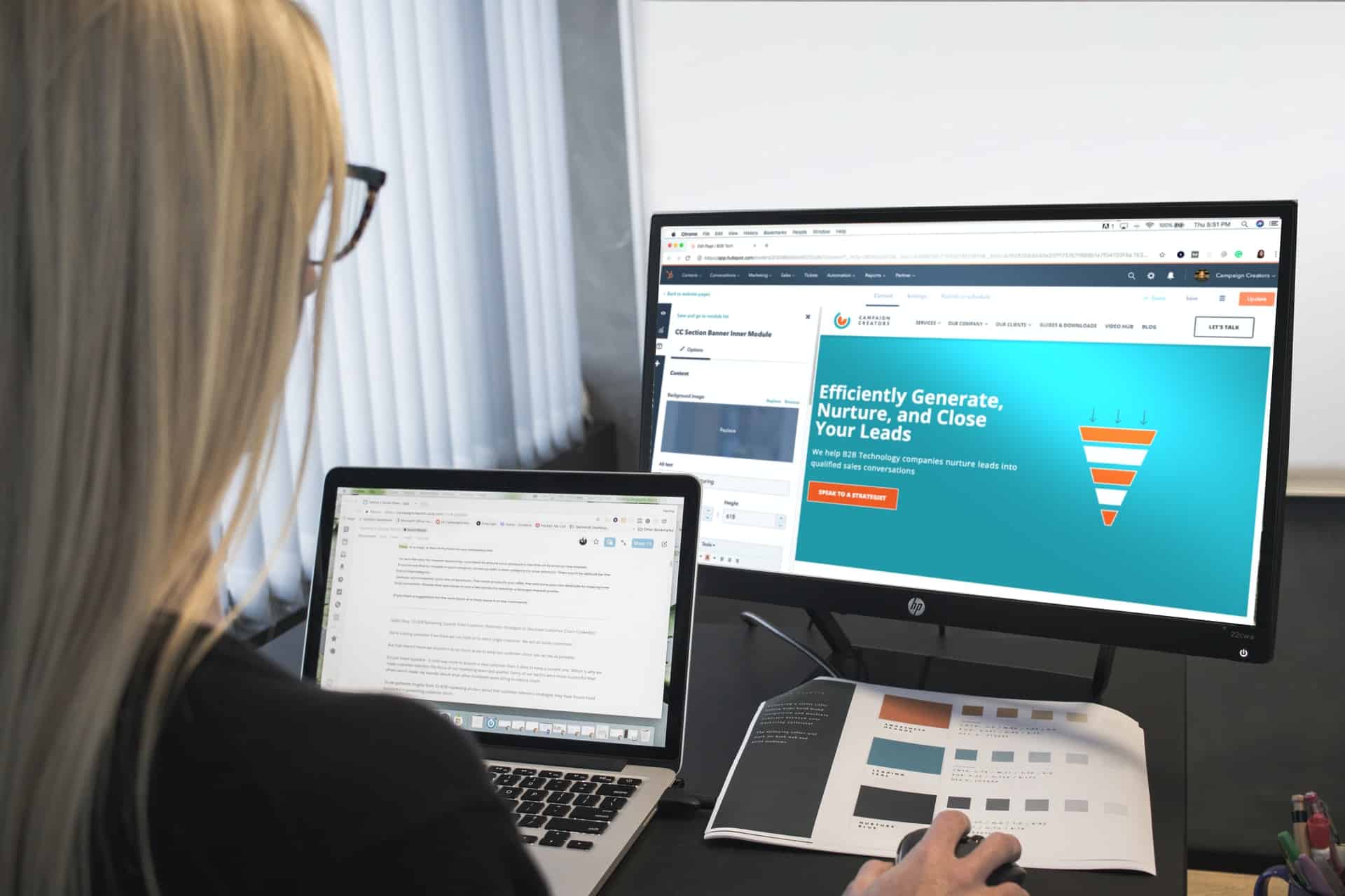
Frameworks make website design far easier. It is a set of components that are built into your website design and allow the site to do various things. Of course, these components can be edited over time, giving you a completely bespoke website experience.
When building a website, you will need to make use of many different files, including HTML, CSS, etc. These are included in the framework and reduce the workload while increasing the efficiency of the website. You can move components around, change them, and edit to create any outcome required by the website owner.
Coding can be complicated when you don’t have in-depth knowledge, so using a framework reduces the time it takes to design a website while making the whole web design job more comfortable too.
Of course, there are disadvantages as well. The main ones are that the framework you choose might not do the tasks that you want it to do. That is something that can only be achieved by creating your site from scratch, using your coding.
Some frameworks can also slow down the speed of the website, due to too many unnecessary files; this reduces your website performance over time. For that reason, it is crucial to choose your framework carefully.
Create a Responsive Website

Creating a responsive website is essential on many levels, however, when it comes to website design, it means the development responds to the choices and behavior of the user, therefore giving a better user experience. When this occurs, the user is more likely to continue using the website, thus giving you custom and word of mouth marketing too.
The types of user behavior the website responds to include the required screen size, e.g. whether the site is viewed on a mobile device or a laptop screen, and the orientation of the screen. All of this is customizable and helps to boost the experience of the user overall.
https://r11.solutions says that a framework is therefore useful in this endeavor because you don’t have to code it yourself. It has a set of instructions and tools already built into the design, which helps to select the right type of content and layout of the website. Responsive website design includes CSS frameworks quite commonly, which respond with the browser and select the correct option.
Here Are Some Framework Examples

There are many frameworks out there, and when looking to design the ideal website for your needs, it’s a good idea to search around and find the best one for you. Some of the most popular include:
- Foundation – This is a trendy choice, and it can be used on a wide range of different devices. This framework will allow you to build a highly responsive website whilst also helping to create a wonderful tool to boot.
- Bootstrap – If you search for frameworks, this is one of the first that will appear. Bootstrap is a front end, an open-source framework that has a grid layout, therefore helping to build responsive and high-quality websites. It also includes interactive elements, such as drop-down menus and alerts.
- Skeleton – This is a very lightweight framework, which means it won’t slow down your website or interfere with the user experience. It includes a mobile-ready format, forms, and has a grid system which makes the site highly responsive.
- Material UI – This particular framework has links with Google, so you know it’s high quality from the get-go. It has a grid-style layout, and it helps you to build a quality website in almost no time at all. It is responsive and has effects that enhance the appearance and experience for the user.
Conclusion
When learning about website design for the first or fifth time, you’ll no doubt come across frameworks. These are a far more natural way to create a high-quality, responsive website that gives your users the experience they deserve. In these days of digital marketing importance, your website really should be at the forefront of your importance list.