Why are rounded font logos so much friendlier? Why is arched text so ceremonial, as if it’s meant to go on a seal or a medal? And why do companies turn to spirals, loops, and waves when they need to feel modern and dynamic or slightly rebellious?
Curved text speaks in a visual language. Our brains have been decoding since birth. In 2025, when attention spans are microseconds long, understanding how shape communicates feeling can make the difference between a passive scroll and a real connection.
Let’s explore how the shape of your text can influence perception—and how to use it effectively in your visual content, especially with Pippit’s arched text generator!
Roundness and reassurance: why circles feel safe
We see curves, and our minds unwind. No sting of a sharp edge, no danger. Just smooth, natural continuity. That’s why brands often use circular text in a subtle way when trust is paramount—be it skincare or sustainability.
Design with unity in mind
- Circular seals for credibility: Consider nonprofits, organic labels, or heritage brands employing text that wraps itself around a circle. It embodies completeness, wholeness, and tried-and-true credibility.
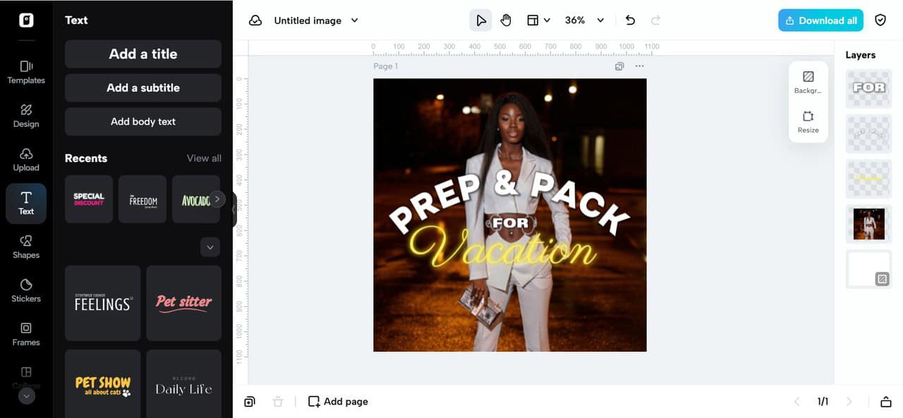
- Product labels that are artisanal in feel: Small companies tend to employ arched text on jars, candles, and packaging to be more hands-on and handmade.
- “Family feel” promotion: Parenting-oriented or wellness brands embrace soft arches to visually guarantee care, safeguarding, and balance.
Curved type replicates the gentle, welcoming shapes of nature—pebbles, ripples, faces. Should you desire to be trusted at first glance, round out your message.
The emotional arc: curves that tell a story
Typography is not merely a matter of what you write—it’s about how you make others feel. And curves are emotional by their very nature. Curves guide the eye in directions linear lines can’t, evoking motion, growth, and development.
Arc-shaped storytelling tactics
- Upward arcs = hope and progress: Text that flows upward on a product title or video overlay imparts a feeling of rising and aspiration.
- Downward slopes = softness or intimacy: Consider a soft “thank you” placed under a logo—it’s a bow.
![]()
- Circle continuity = wholeness: Apply looped text on infographics to suggest process, cycles, or comprehensive care.
Matching these curve arrangements with motion, such as Pippit, a free AI video generator, intensifies the impact, making your message not only viewed, but felt.
Mood boards of movement: wavy text as a mood setter
Each curve has a different narrative. Utilize them well, and your work won’t only be comprehended by your audience, but they’ll experience it before they read the first word.
Choose your curve, dictate your tone
- Waves = freedom and playfulness: Wavy text appears disheveled and spontaneous, like writing in the sand at the beach. Perfect for youth brands, fashion, or coastal vibes.
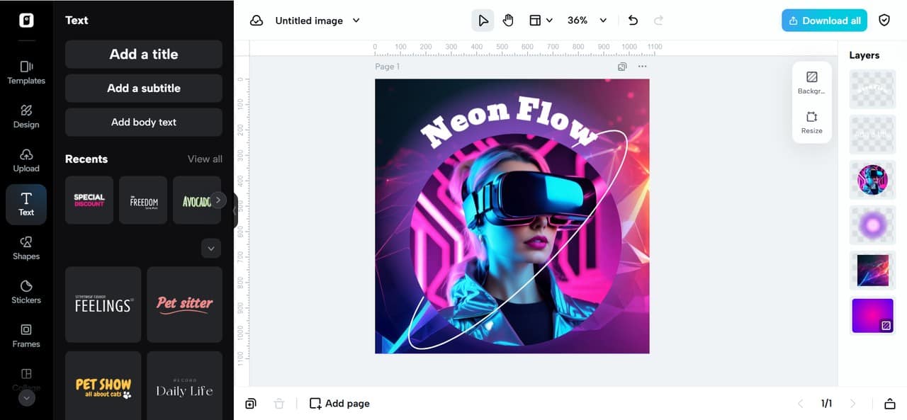
- Spirals = complexity and intrigue: Spiral groupings encourage inquiry, frequently employed by innovative tech, wellness, or art brands.
- Mirrored symmetry = balance and duality: Curving two lines into a mirrored curve embodies balance, suitable for wellness, couples’ products, or mindfulness content.
- Corner curves = playful accents: Even minor text curves set diagonally can turn static graphics into whimsical, dynamic compositions.
With an arched text generator, you can access all these styles—no design degree needed.
Curve = comfort: what neuroscience reveals about rounded type
Aside from looks, our brains are programmed to respond differently to shapes. In various studies, audiences uniformly rated logos and text with curved characteristics as more pleasant, trustworthy, and soothing than their pointy counterparts.
Psychological observations of curvy characters
- Circles biologically attract: Babies distinguish circular shapes better than squares. This preference follows us throughout our lives.
- Curves lower cognitive load: They are more intuitive, and thus they’re simpler to digest at a glance, a success factor for retaining content.
- Curved shapes elicit emotional warmth: While strict rectangles or triangles might suggest danger or urgency, curves do not. They are intimate.
This is particularly useful in social content, where the typical viewer gives you 1–2 seconds. The correct shape will give you an extra second and convert interest into engagement.
Scrolling in curves: the way forward for arched text layouts
Intelligent brands understand that great content doesn’t yell—it navigates. And curvaceous typography assists in guiding the eye of the viewer with purpose.
Practical uses within 2025 content
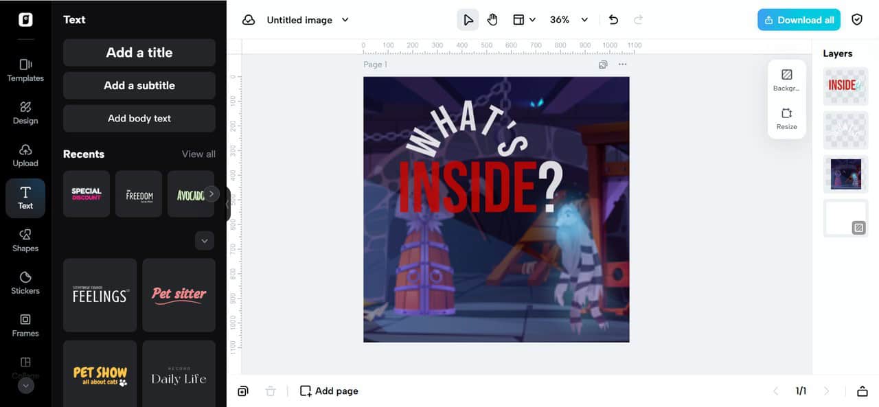
Carousel introductions with arched questions: “What’s inside?” or “Guess what drops tomorrow?” Arched over the top of the slide, one creates curiosity.
- Curved hashtags on Reels cover: It serves to emphasize brand identity or slogans without overwhelming the thumbnail image.
- Round highlight icons on Instagram: Creating your story highlights in circular text appears uniform and deliberate.
- Call-to-action rings: “Shop Now” or “Try Me” in the form of turning arched captions around moving products in action-packed videos boosts clicks—particularly when combined with animated features from a free AI video maker.
It’s not about simply getting the message out anymore—it’s about shaping how the message feels.
Curve it with care: brand-aligned suggestions
Arched text is not a one-size-fits-all affair. It’s a tool—and, like any tool, it excels when it reflects your brand personality.
How to align the curve style with the brand type
- Playful brands (toys, Gen Z fashion): Employ loose S-curves, wavy headers, or turned bubble fonts. Make it bold and kinetic.
- Luxury or elegance brands: Employ flawless circles or smooth rising curves with serif or clean fonts. Less is better.
- Tech or innovation businesses: Employ spirals or geometric curves that convey movement, process, and transformation.
- Trust-based services (finance, healthcare): Go with symmetrical arches or full-circle designs. Strive for consistency and poise.
- Alignment is the key: let the form of your text support what your brand is already saying.
Conclusion: curves that tell a thousand words—without saying one
Typography is not just a font. It’s a feeling. It’s remembrance. It’s trust, established in an instant. In 2025, static rectangles seem clichéd—curves are what bring contemporary design.
With resources such as a curved text generator, anyone—marketer, creator of content, or entrepreneur—can begin creating content that feels warmer, more in motion, and psychologically engaging. And when combined with visuals created from an AI video maker, you’re not just designing—you’re creating an experience that resonates and moves.
The next time you write a caption, then, ask yourself: could this message curve a bit? Your audience may just lean in!