Finding inspiration for your web designs is sometimes challenging. It seems as though every site has similar components, such as a navigation bar, relevant images, headlines, and CTAs. While that’s true, there is still a lot of room for creativity and individualized designs.
A physicist named Tim Berners-Lee published the first website in the summer of 1991. Nearly 30 years later, there are about 1.72 billion in existence. To say the idea took off would be an understatement. Meaning that today, you’re competing for the attention of users against a lot of other distractions, both online and off.
If you’re looking for trends to incorporate into your work, use tools like flux 1 to seek out amazing designs that captivate the imagination and speak to the human spirit.
We spent a ton of time looking at different websites in various industries. To find the absolute best examples, we narrowed the list down to seven sites that are captivating us right now. Here you’ll find a mix of the best e-commerce websites as well as informational ones.
1. Take Typography to a New Level
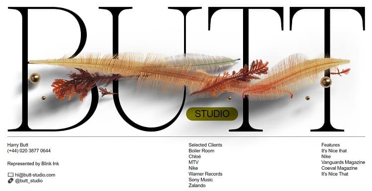
This year is all about finding unique types and using them in various ways. That is why Butt Studio present their name in a huge typeface that is tall and elegant. Feathers and beads weave between the letters, showing the studio’s creativity but still keeping the focus on the type.
The focal point of the landing page is the name of the studio. They’re letting their reputation speak for itself while using a typeface design not seen elsewhere.
If you want to out focus on a headline or your brand name, blowing up the typeface into a larger scale works wonders.
2. Focus on Beautiful Photography
When you’re selling a home improvement product, the focus should be on the finished results. That is why commercial photographers know how to present you in the best light possible. In fact, understanding event photographer prices in London can give you a perspective on budgeting for professional photography to enhance your marketing materials further.
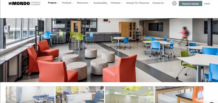
Mondo Flooring does a stellar job of highlighting the way their floors look when installed.
Their landing page features floors in different settings, such as a hospital, lab, and school. They use professional photos to highlight the type of flooring best for each project. And every selection brings additional images showcasing the benefits of their materials.
3. Add Transitions for a High-End Look
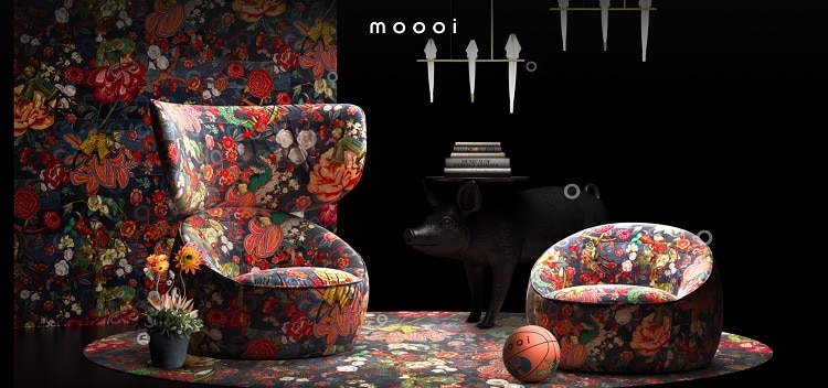
We are in love with Moooi’s creative website, filled with transitions. It starts with an image of a floral jungle complete with clothed monkeys. As you move into the buyer’s journey, the image morphs, and the material shifts and becomes armchairs.
Animated transitions add a sense of life and motion to your site. They show that you have something interesting to share with visitors. Since the visitor has to scroll or click to move through the phases, they stay engaged.
You may use something a bit more subtle than these transitions, but adding in some animation creates an entirely new layer to your design.
4. Get Simple With Negative Space
Utilize negative space to draw the user’s eye where you want it to go!
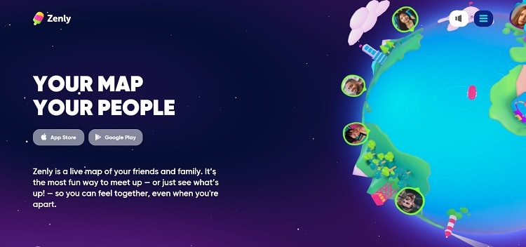
There are thousands of examples of sites using white space, but we particularly adore how Zenly uses positive and negative elements to move the visitor through the sales funnel.
They set the background to an outer space look that’s a deep blue with some gradient toward the right. An animated globe shows you how to stay in touch with family and friends using the app. Then the user’s attention shifts to the text and links to download the app.
All in all, the design is simple and brilliant. If you scroll down, the page transitions to a new section, keeping with the animated theme.
5. Make Navigation Sticky
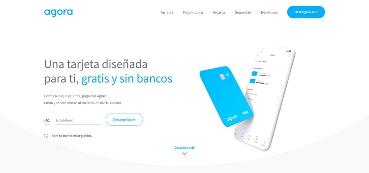
Your navigational hierarchy is the backbone of your site. That is why we wanted to find some great examples of navigation, but there are so many different choices, it’s hard to limit it to one. But after much thought, we decided to highlight Agora’s sticky menu bar.
Navigation moving with you down the page is one example of something you could go with. Other options include scroll-triggered, right sidebar, and mouse overlay navigation. The key is to find things that speak to your site visitors and conduct A/B tests to see what performs best.
Note how the navigation on this site blends perfectly with the color palette for their brand. Also, as you scroll down, the bar follows you, so it’s always at the top of the page.
6. Forget the Grids
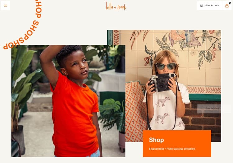
Grid design has its place, but if you’re looking for creative solutions, try layering and less structure. Stack images on top of one another instead of side by side.
Bella & Frank does a fantastic job of sharing commercial photos of child models wearing their designs. They stock the photographs in a collage of sorts. Even the call-to-action to shop is over one of the images instead of under or above it.
Notice the way their CTA word “shop” runs in an animated loop in the upper left corner of the page. A circle in the corner is another way the design thinks outside the box and creates something unique and entertaining.
7. Remember the Footer Space
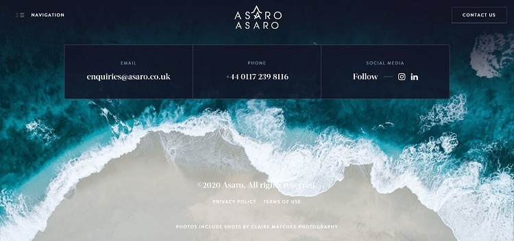
Some designers forget the importance of the site footer. If the visitor makes it down to the footer, that means they’ve either jumped to the end to find information or are genuinely interested in the product or service.
Notice Asaro and the presentation of their footer. Look at the beautiful background image that speaks about everything they do for yacht owners. They then place information within three boxes with white text on a dark blue background. This grabs the eye and provides the essential information users need.
Browse the Internet to Find Innovative Designs
People create new sites every day, and trends change frequently. So stay on top of who wins the awards in the design industry and study their work. You never know where you might find inspiration for the next big project.
Also, ask your clients which website designs they love and try to come up with something similar to what they already appreciate — but better than they ever imagined.