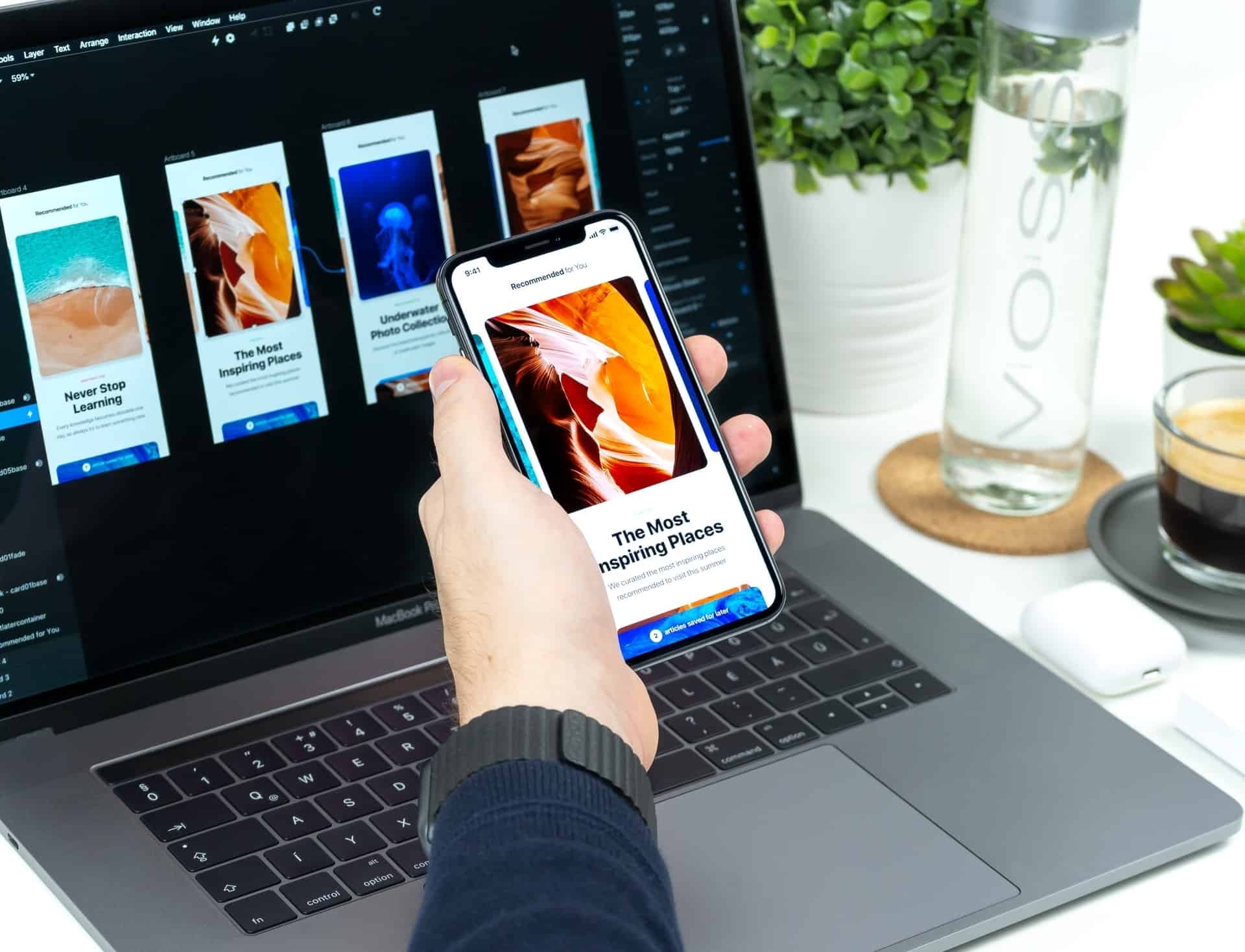
The world revolves around smartphones. Various gadgets and mobile apps make it easy to access any site on the planet. If users want to visit your page is 50% of the matter, then to provide them a user-friendly platform is the other 50%.
Content analysis showed that content consumption from smartphones or tablets had become one of the main scenarios for using these devices: people read articles, upload photos, communicate and make purchases. Your task is to create the most convenient and mobile-friendly website.
Website Optimization: A Mobile App or Responsive Design
Internet access from mobile devices has become as natural as visiting sites from a desktop, so more and more attention is paid to the topic of adapting pages to viewing from smartphones and tablets. There are two main categories of website optimization implementation: mobile apps and responsive design.

The mobile website version is a version designed specifically for smartphones. The content of such a site may completely differ from that presented on the desktop version.
A separate mobile site or mobile app creation is a good solution for a business that has already had a large and highly visited website, and there is no great desire to do a global redesign, but the need for a mobile version is increasing. In this case, you should just consider the mobile-first design, which solves all the tasks of a mobile audience. In the future, both sites will be supported in parallel.
If you are a small and medium business owner, there is no reason to create a mobile app. You need to optimize the site for different devices only. Firstly, it’s much cheaper than creating and maintaining a separate version of the site. Secondly, there is already a special responsive design technique for this.
If you really want a separate app, choose a no-code app builder that will alow you to create one even without development experience.
Responsive design is the most popular website optimization solution today. Its essence lies in the flexible arrangement of elements on the page which changes depending on the screen size. Thus, you will essentially have several website versions, but with one domain and one control panel.

8 Tips on How to Make a User-Friendly Interface for Mobile Devices
Users are more likely to purchase from a smartphone than from a computer, according to recent research. So those who do business online should especially think about content and website optimization.
1. Simplify a Navigation Menu
Mobile screens are noticeably smaller than laptops or PCs — keep this in mind when designing menus. Nobody wants to scroll through pages and scale buttons; elements should be concise and fit on the screen.
Each tab should have a clear purpose. Estimate your current website and try to simplify the menu for mobile users if you haven’t already — your visitors will appreciate it.
2. Optimize Your Content
Content needs to be created not to view it on small screens only, but for mobile users as well.
Follow these rules:
- place the most significant information on the first screen/page and then in descending order;
- use short headings that can be read quickly;
- break the text into short but meaningful paragraphs;
- adapt video content. Use only the best MP4 compressors to open videos on any device without long load;

- provide visitors with an opportunity to send the material by email. Not everyone has time to finish reading an article or watch a video till the end. Such a useful function will make it possible to read the material of interest later;
- adapt tables and optimize images for mobile viewing. Use special plugins, scripts, or horizontal scrolling elements (for tablets).
3. Usability
When designing your website navigation, first of all, think about the users and their convenience. Any page should be accessible in a couple of steps — without complex filters and lists. To make a one-click call, correctly write the number format with the country and city codes.
Provide one-click sign-in via social networks. In a word — try to minimize any actions of visitors.
The smartphone uses a finger instead of a mouse cursor, so all elements must be of sufficient size. A person doesn’t have to enlarge the image to click on any element. Moreover, don’t forget to improve readability. The user should desire to stay on your site and not leave it because of the colorful and ridiculous design as soon as the page loads.

4. Page Speed
Regardless of the changes you make to the site, remember page speed. Analysts have found that 53% of users will leave the mobile version, which takes more than 3 seconds to load.
The best way to reduce load time is to compress content and simplify your design. User-friendly websites load much faster and have a higher conversion rate.
5. Pop-Ups, Notifications, All Kinds of Subscription Forms
If you have ad units on your site, you should reconsider their placement in the mobile app or smartphone version.
For site visitors from a personal computer, multiple pop-ups won’t be a problem. But if they come to you from a smartphone, there will be difficulties. Get rid of numerous pop-ups on your mobile site. People generally dislike them, but persistent subscription forms cause real anger on a mobile device. Such forms not only cover half of the screen, but it’s also a challenge to close them.
Therefore, it’s better not to use lots of banners but to spend time on content analysis and work out options to improve the content.
6. Site Search
Anything can be placed on the website, but finding the exact item or info (especially on a smartphone screen) can be quite difficult. The search line helps with that.

An accented search field motivates you to search for something specific — a gadget, an article, or a category. This option is required to reduce the bounce rate.
7. Test
When it comes to testing mobile UX, some people get lost, not knowing how to do this very mobile testing. If the site has up to 200 pages, it’s better to check all of them because 100 pages can be displayed correctly, and a video won’t be optimized on the 101st.
However, if you have thousands of pages, then testing each one is really time-consuming. Then it’s worth checking significant pages only (selling pages, pages with high traffic, etc.), and 10-20 pages in each section of the site (product catalog, articles, etc.).
8. Feedback
Users will always have difficulties no matter how much time you have spent on website optimization or redesigning a mobile app, changing buttons, or improving the interface. Don’t worry. No successful project is complete without it. But the key difference here is to enable the user to quickly and efficiently contact you and solve a problem or get an answer to a question.
Make sure that information about you, contact information, inquiry forms, online chat are in a prominent place. After all, this is an essential component of website optimization and user-friendly interface creation.

Mobile website optimization is an advantage over competitors. Today, not all site owners understand the importance of having a mobile version of their page. You can take advantage of this and create the perfect site for viewing on any device, thus getting a higher rating from your target audience.
