Building a mobile landing page with a high conversion rate might become quite a task. The entire process is completely different from the development of standard landing pages, which is why you need to be very careful.
")
Applying these pieces of advice practically, you will be able to «raise» above your competitors, getting more leads, conversion and increase the volume of sales. All the examples represented in the texts are broken down into categories: functionality, offer, and design.
Functionality
Be mindful of the time
It should be remembered that mobile users are always in a hurry. Make sure that your landing page loading is fast. According to the data of Kinsta, 74% of mobile devices users shut a page down at once if it takes more than seconds to load.
It is possible to increase down speed following the simple advice below:
- clean a code;
- keep to a minimum usage of HTML and CSS;
- use GZIP reduction;
- decrease the number of redirects;
- change the location of scripts;
- decrease the number of plugins WordPress;
- upgrade your hosting;
- change image size and use zip tools;
- use Content Delivery Network (CDN) for image position.
Ring as CTA
You can turn CTA into a «Call Us» button. Thus, it will be easier for your potential customers to call you. By the projections of an expert Search Marketing Expo, sales with the help of such a button will reach $ 2 trillion by the year 2019.
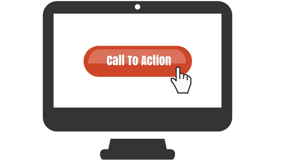
For companies, which need more incoming calls, CTA as a call might become a perfect solution. Even now you may feel free to test this idea out and see if it brings you more leads.
Geolocation
HTML5 will allow you to use Geolocation API. Due to this option, your landing visitors will be able to notify a system about their location. Therefore, they will receive more relevant propositions, which is going to have a positive effect on user experience. Geolocation option defines a person’s location with the help of GPS. However, permission of a user oneself is required.
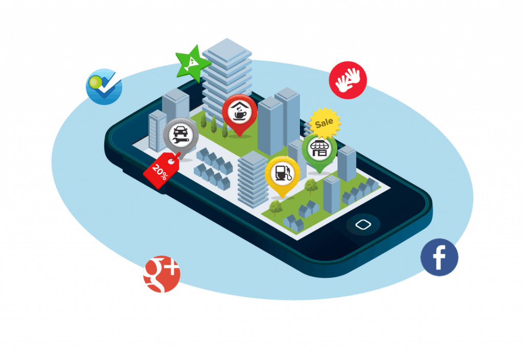
According to Search Engine Watch, 50% of mobile device users hope to find the local companies proposals search results. 61% of such requests end up with a purchase. Given this, there is no need to lose an opportunity to increase a conversion rate with the help of geolocation.
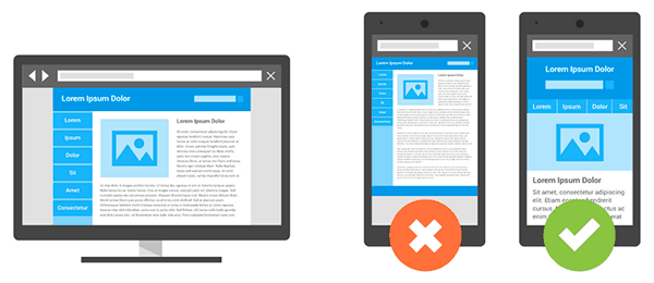
Different types of devices
Use Google Analytics to find out using what devices people usually visit your website. Receiving this information, you are going to know what exactly is to change on your landing page. For example, it may be a screen resolution or a website productivity.
SEO for mobile landing page
Use such tools as Varvy in order to define what problems with search optimization your landing page has. All you need to do is to simply enter your website’s domain in special window and press «Check» button.
You are about to see the following data:
- to show mobile friendly;
- whether the website is available for Google indexation;
- down the speed of the website on mobile devices;
- redirects;
- HTTP headlines for mobile version;
- etc.
«Suspend an item» option
Many online stores have such an option but for PC version only. It is possible to move to a mobile landing page— visitors, adding items to favorites, are more tend to conclude a purchase.
In order to make the user experience more effective, add an option to your website to conclude a purchase later and suspend an item. It is especially relevant for an e-commerce area.
Feature-form on the screen
When you think where to place the buttons on the page, take into account a motion trajectory and a Tommy Thumb location. In this observation, specialists were observing children interacting with their mobile phones. The test people were not required to input any data. Besides that, in accordance with the results of Steve Huber, 49% of users hold their cell phones in the right hand.
A user experience
Test your landing with the help of such kind of tool as Mobile Phone Emulator. Testing can be conducted in either portrait mode or landscape one. It will help you to understand how accessible pages of your website are for users.
Mozilla Developer Network specialists recommend checking on the following parameters:
- color – color contrast should correspond to WCAG 2.0 AA level requirements;
- visibility – make sure that invisible elements are hidden from the users’ eyes;
- focus – all the active elements, such as links, buttons, leed-forms, are to be found easily;
- text equivalents – create test equivalents for non-text elements. It is especially relevant for mobile applications.
Besides that, you need to use HTML5, jQuery, JPG and GIF for a mobile version of the website. However, you need to give up using frames, Flash-animation, and out-of-date plugins.
Keyboard usage
If a visitor of your landing page is to complete a form, you need to make it as easy as ABC. Add an option of a virtual keyboard. If however, you request a postcode, a phone number or any other information alike, the keyboard is to have a number format.
A customer-oriented approach
In order to reach out to each customer, you need to make your unique selling proposition personalized. You can reach it finding out your audience needs and «problem issues», let alone defining a user location in a conversion funnel.
Life cycle or conversion funnel:
- a potential customer does not know of your company’s existence;
- s/he heard of you but not interested;
- a potential buyer heard something from you and a little interested in your offer;
- s/he compares your items with competitors;
- s/he becomes your customer.
In a perfect world, there has to be a separate landing page for each conversion life cycle.
Segmentation and traffic origin analysis
If you begin to segment and analyze traffic from different sources, your advertising campaign will become more effective. Also, you need to think about users to travel through different traffic channels. Besides that, there is special traffic called PPC-thermometer.

Thus, people entering your website from search engines or social networks have different intentions and act differently. It should be taken into consideration while working on a mobile landing page as long as in this case the size of a screen is smaller, and the duration of a user attention concentration is lower.
«Cold» traffic: coupons, check-lists, a suite of programs, calendar, podcasts, courses, learning files, infographics, statistics;
«Warm» traffic: quizzes, coupons, video-courses, online demo versions, tickets, eBooks, T-shirts, webinars, tryout version;
«Hot» traffic: consultation, purchasing, demo version, trial period.
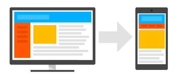
You should also take into account the fact that the user experience on mobile devices is different from others. Make sure your proposition displays correctly on a small screen.
Exclusiveness
This idea is going to be especially useful for online stores owners. Perhaps you have already noticed that people like to check information represented in the mobile version on their computers. Besides that, they tend to conclude a purchase using PC version.
In order to avoid this, create exclusive propositions for those who conclude a purchase by means of mobile devices. Use urgency effect as well let alone apply a shortage principle.
You save 20% using a mobile version. We will send you a promo code, which gives a discount buying through a mobile phone.
This company also uses SMS-marketing tools in order to attract more visitors.
Value of your proposition
Apart from the fact that you need to be laconic describing your proposition, you need to do your best in order to convey its value to the customers. You are to expose briefly but in-depth all the advantages of your item for potential clients on a mobile landing page. What is unique and valuable about your proposition and how your services will help a landing visitor top improve life?
Laconicism
Needless to say that there is less space on a screen of a mobile phone than on a computer’s. Due to this, avoid using more words than necessary. Your text needs to be short and reflect the essence of your proposition in a few words. Answer the central question of your potential clients: «How will my life improve if I avail myself an offer?»
Short headlines, action-oriented
A headline is one of the first elements a user pays attention to. It has to be clear, concise and press to act. Based on the Conductor research findings, headlines, containing digits and facts, resonates with the audience the most.
User preferences concerning headlines and landing: In order to save precious space on a screen of a mobile device, you need to get rid of «otiose lines» like the devil. For example, avoid such epithets as «insuperable», «perfect», «the best». Apart from that, they take up space, it usually is hard to believe that a brand or an item is so nice and neat. Essentially, it is about picking a headline, which would describe a page content to the full extent without filling it with rubbish.
No «otiose lines»