In 2018, tech companies hold 130 spots on Forbes Global 2000 list, ranking the world’s top public companies. No matter what kind of business you own or operate, there is much to be learned from the way tech companies market themselves. Even giants like Apple, Samsung, Google or Facebook, tech companies have to hustle hard to stay ahead of the never-ending competition barking at their heels. One thing you can be sure of, is that tech companies analyze every single aspect of their businesses, from their service providers to their delivery services all the way down to the landing pages on their websites.
Know Your Target Market and Target It Aggressively
Apple and Samsung are perhaps the two biggest names in mobile phones. While they are in one sense in vigorous competition, they each target their own very specific and differentiated market share. Perhaps, nowhere is this more clear than in their respective landing pages.
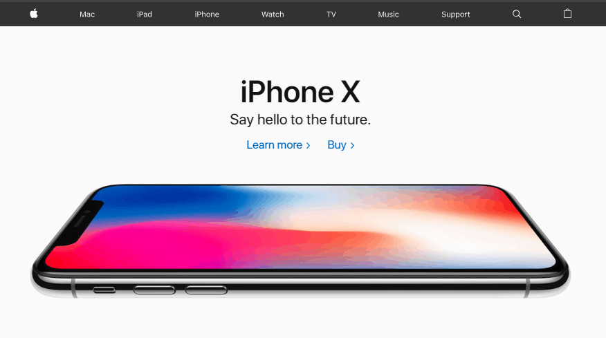
Apple is well known for their smooth, clean lines and rigid attention to detail. Apple users are often strong type-A personalities. They are immaculately groomed while riding in the back of their immaculate, luxury vehicles listening to classical music. Apple’s landing page perfectly reflects this ideal with a single image of their flagship phone and a distinct lack of any type of fluff or filler. Their landing page is immaculate – just like their consumer base.
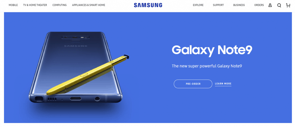
Samsung, on the other hand, is a phone for people that don’t like rules, discipline and externally imposed order. Samsung users ride motorcycles and wear a lot of leather. They want to put their icons where they want them. While Samsung also proudly displays their flagship model phone on their landing page, their page is busier, louder, with a lot more going on. Just like their consumers.
You Don’t Have To Be Fancy
Microsoft is one of the largest tech companies in the world, not to mention one of the most well-known brand names. Something you might never guess if you somehow managed to visit their landing page without knowing anything about them or what they do. Microsoft’s website looks like it was designed straight from a template – and not even a good template at that. In fact, it could be argued that many of the templates on sites like Squarespace are actually better designed and more sophisticated than one of the biggest names in tech.
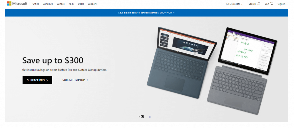
That, however, is not without its genius. Think of the Commodore 64 or vintage Nikes. One could easily argue that Windows is an old brand just like Nike, Atari or Coca-Cola. While they can easily afford the same smooth, streamlined, sophisticated look like Apple, they chose not to. Instead, they chose a landing page that looks like it might have been designed by a high school kid tinkering around in his garage. Bold move!
Your Mission Should Be Crystal Clear
If Apple is the master of stripped down, smooth and streamlined, Google is the Jedi master. For more than a decade, Google has staunchly, stubbornly, defiantly refused to litter their landing page with advertisements or even any clues about who they are or what they do. Google is something like the Madonna or Cher of the tech world, which pours more than enough confidence to only use a single name – and you either know it, or you live under a rock.
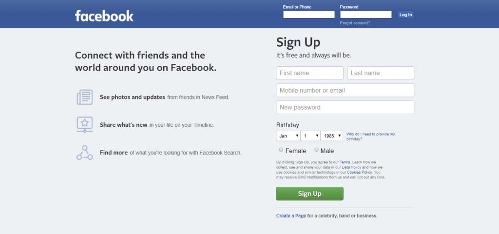
Similarly, Facebook also creates similar confidence. A visit to the main Facebook landing page offers little to no information about who they are or what they do. Just a simple set of fields to sign up. Like Google, you either know, or you have been living in a cave. Facebook’s landing page also reflects its mission, however. To get more users. You land on Facebook’s landing page, you get two options: sign up or move on. While you may not be able to get away with that kind of ultimatum, both Google and Facebook make their mission very clear by stripping away everything from their landing page but their primary mission.
A Picture Is Worth 1,000 Words
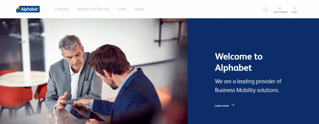
One thing that should be clear by now is that even the busiest of landing pages (Samsung) is still relatively smooth, streamlined and uncluttered. Even more importantly, they are all simple. Like Microsoft, Alphabet (one of the top 10 leading tech companies in the world) also offers a webpage that looks like it came straight from a template. One thing that all of these landing pages have in common, however, is that they all lead off with a bold, striking image.
Intel, in fact, takes it to a whole new level with their entire window being filled with a single colorful image featuring their flagship chip, the Limited Edition Core i7-8086K. While you may not have the clout or brand recognition to have a page as pared down as Google or Facebook, you can go the next best route and draw users in with a single, bold, striking image.
Wrapping Up
Perhaps the one overarching lesson to be learned from tech company landing pages is that they don’t have to be high-tech. Tech landing pages all feature clean, smooth lines, a daring amount of white space or a single, bold image. They don’t use flash graphics, videos, animations or any of the million other attention-grabbing options available to them. Needless to say, they all have the budgets to design whatever they want, so looking at what they don’t use is just as important as looking at what they do.