If you’re running a business, you probably know how important it is to have a good online marketing strategy. With the help of the internet, your business can expand, evolve, and become something you never thought it would. But to fully maximize your business’ potential, you need to create an enticing and useful landing page first.
Hopefully, this short guide will help you understand how to create a super-converting landing page that generates quite a lot of leads for you. So, without further ado, let’s get straight to it.
Understanding Your Target Market
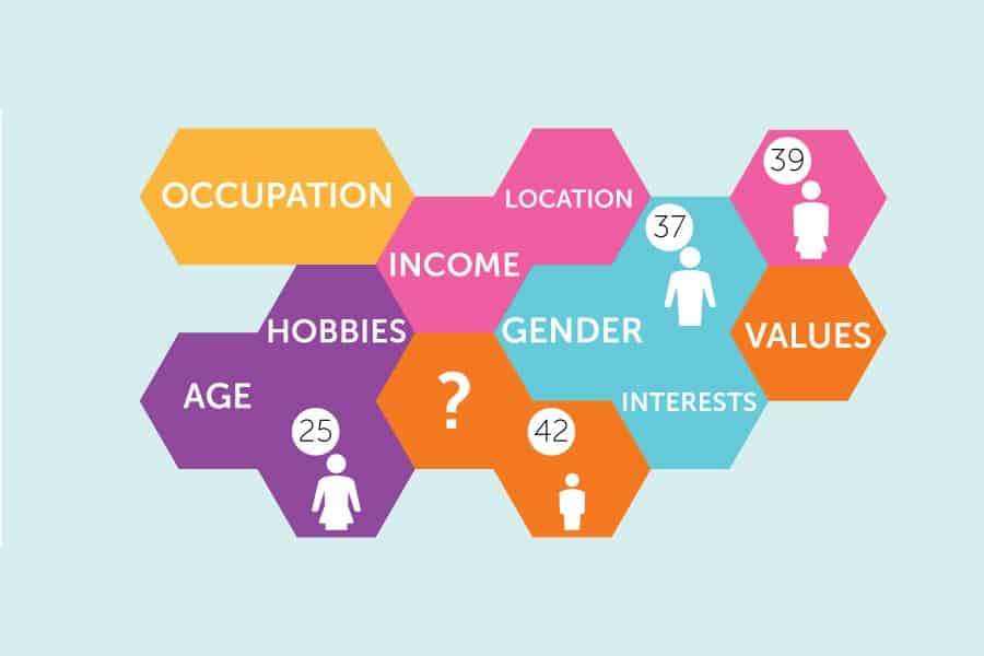
When you have the answers to your clients’ problems, you have already managed to develop a relationship with those clients. To get there, you must first understand both your clients and their problems. You must do a lot of research with your audience to understand them. This means you need to make a lot of interviews and surveys; you must learn what your customers and clients like, what are their online habits, and most importantly, how do you fit in that picture.
There are some questions you need to ask; for example, who are you? What do you do? How are you using our product? Is your life better for it? You need to understand that once you make your landing page, it will be the first impression of your business. It’s not a gimmick you use to show how creative you are; it’s a way to show real value and communicate with your customers in the fastest possible way. Your landing page must connect to your target audience and make them feel like they’ve just started an exciting conversation with you—whether that means guiding them to book a service, purchase a product, or explore a SaaS landing page for conversion.
Once you understand your target market, you can approach it in the best possible way and ensure high conversion rates.
Headlines are Important
In the world of written web content, headlines are as important as the content itself. When it comes to headlines and subheadings, you must understand that these elements are what get the visitors’ attention. If you want your audience to become interested in what you have to say on your landing page, your headlines and subheadings must be done with great care.
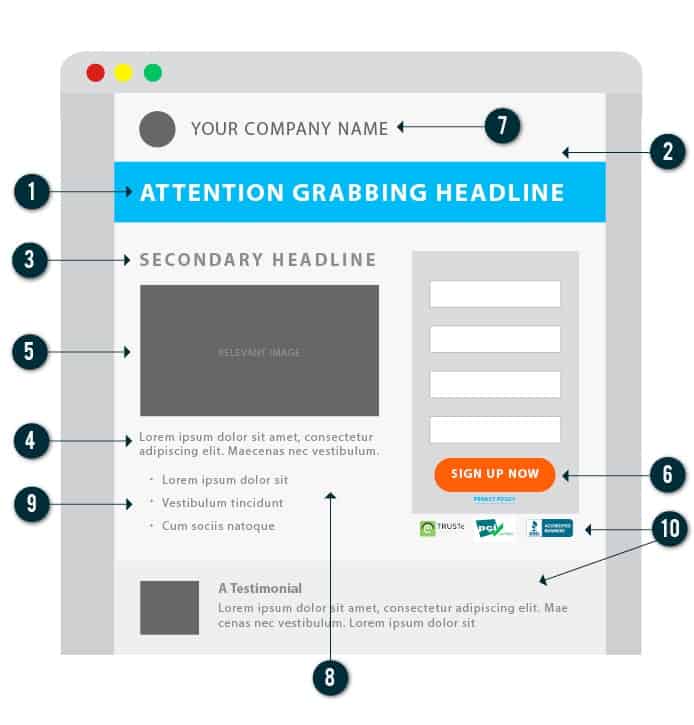
Perfect headlines are usually short, with quite compelling power words combined with some form of the attention-grabbing element. Numbers in headlines have also proven quite useful. However, using too many adverbs turns people away. Try to make your landing page headlines enticing and engaging, and your conversions will start growing in no time.
Focus on Strong CTAs
Probably the most important element of your landing page is your call to action (CTA). Your CTAs are the final few words you get to say to push your visitors to become leads. You need to make a compelling CTA so that your visitors feel the need to follow on it.
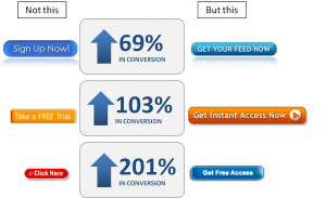
Another significant thing when it comes to CTAs is that they have to stand out. There are countless ways to fit the perfect CTA on your landing page, but you must find what suits your design and your needs in the best possible fashion. Make sure you thoroughly test your CTAs and adapt it to reduce potential bounce rates. Different colors, shapes, and other elements of the CTA can all be adapted, so you get the best possible result.
Powerful message combined with the proper optimization can do wonders for your conversion rates. Use it to your advantage. Of course, you can always opt for an UnderConstructionPage, offered by Web Factory Ltd, where you won’t even have to lift a finger.
Match Your Ad Message to the Landing Page
If you want your campaign to be effective, your ad message should match your landing page content. This makes your visitors and clients connect the dots quickly, you create a sense of continuity and consistency, and it also affects your SEO.
It helps with the paid search campaigns as well, as most of the social media networks like Facebook or Instagram push ads that have the lowest bounce rates. With ads that match their message with the landing page, bounce rates are usually quite small. Make sure you deliver what you’ve promised in the ad, but do it right from the landing page. This way your reach and your conversion rates will skyrocket.
Use Reduced Forms Fields
If you talk with almost any professional web design company about landing pages, you will probably get the same answer, when it comes to generating leads or gathering information. Use smaller forms fields and integrate them into your landing page. Using different forms can be very useful for both your marketing and for conversion rates.
With small integrated forms, you can get quite a lot of essential information about your target audience, but you can also start developing a relationship with them as well. For example, if your customers register, they get a free eBook, or they get some special offers. This is what makes integrated forms quite useful.
However, the longer the form, the less is the likelihood that your conversion rates will grow. That’s why you need to keep forms short, simple, and focused on the specific information you need to make your landing page, and your business better.
Wrapping It Up
Creating an engaging landing page that has sky-high conversion rates can be quite challenging. You have to understand how people navigate the internet, and what they are looking for from you and your business. You must develop a relationship with them and create a trust to achieve what you’re aiming for. You need to provide some incentive for them to answer your CTAs, and you must give them the information and knowledge they are looking for.
All of these tips and pieces of advice should help you understand how to approach the design and optimization of your landing page. Also, try to watch out and avoid 5 common landing page mistakes. So, don’t wait any longer and start planning your perfect landing page today.

I am glad to see your info. Nice Research on landing page design optimization 🙂
Thanks For Sharing it is Very Helpfull for Everyone …
Plz Posp More ..