Web design is an art that involves the careful selection of visual elements to create an engaging and functional website. Color is one of the most crucial aspects of web design. Colors can influence how users perceive a website and even impact their decision to engage or convert. In this article, we’ll explore how to use color psychology in web design and provide tips for choosing the right colors to boost user engagement and conversions.
What is Color Psychology in Web Design?
Color psychology studies how colors can influence human behavior and emotions. In web design, color psychology refers to using color to create a certain mood or feeling on a website. Different colors can evoke different emotions and can be used strategically to influence user behavior. When designing a website, web designers need to understand the impact that colors can have on visitors’ experiences. This is why you should use professional web design services that incorporate color psychology principles into their designs, ensuring that the chosen colors align with the desired user experience and brand representation.
The Importance of Color in Web Design
Colors can significantly impact a user’s perception of a website. They can connect emotionally with users and influence their decision to engage or convert. Here are some of the reasons why color is important in web design:
- First Impressions: The color scheme of a website is one of the first things that users notice when they visit a website. It could produce a good or bad first impression.
- Branding: Colors can be used to reinforce a brand’s identity and create a recognizable visual identity.
- Emotions: Colors can evoke certain emotions and create a mood on a website. For example, blue can create a sense of trust and calmness, while red can create a sense of urgency or excitement.
Good Example: Apple Website
One example of a website that effectively uses color in its design is the Apple website. The predominant color used is white, which creates a clean and modern feel. The color white is also associated with simplicity, reinforcing Apple’s brand identity of producing products that are easy to use. Apple also uses accent colors such as black and gray to create contrast and draw attention to important elements on the page. For example, the black text on the white background is easy to read, and the gray color used for the navigation bar provides a subtle contrast that helps to differentiate it from the rest of the page.

Bad Example: Unorganized E-commerce Website
On the other hand, an example of a website that uses color poorly is an unorganized e-commerce website with a cluttered layout and multiple colors used haphazardly. Such a website can overwhelm users and create a negative user experience. For instance, if the website’s color scheme is too bright or vibrant, it can be difficult for users to focus on specific elements of the page. Similarly, the website can look dull and uninteresting if the color scheme is too dark or monotonous. In such cases, users may be less likely to engage with the website and purchase.
In conclusion, the Apple website is a good example of a website that effectively uses color to create a visually appealing and user-friendly design. In contrast, an unorganized e-commerce website with a cluttered layout and multiple colors used haphazardly is an example of a website that uses color poorly and can negatively impact the user experience.
Understanding Color Meanings
In many cultures and situations, colors can have a variety of connotations and meanings. In web design, it’s important to consider the meanings and associations of colors when choosing a color scheme. Here are some common color meanings in web design:
- Red: passion, excitement, urgency, danger
- Orange: warmth, friendliness, energy, creativity
- Yellow: happiness, optimism, warmth, caution
- Green: growth, health, nature, money
- Blue: trust, calmness, professionalism, security
- Purple: luxury, creativity, royalty, spirituality
- Pink: femininity, love, calmness, sweetness
- Black: sophistication, power, elegance, mystery
- White: purity, cleanliness, simplicity, innocence

Tips for Choosing the Right Colors in Web Design
Choosing the right color choices for your website can be challenging. Here are some tips to help you choose the right colors to boost user engagement and conversions:
- Consider your Brand: The color scheme of your website should reflect your brand’s personality and values. Utilize hues that complement the identity of your brand.
- Use Contrast: Contrast can help create visual interest and draw attention to important elements on your website. Use contrasting colors for buttons, links, and calls to action.
- Keep it Simple: Stick to a simple color palette of two or three colors. For users, having too many colors can be overwhelming and confusing.
- Consider Accessibility: Make sure your color scheme is accessible to all users, including those with color blindness or visual impairments. Use tools like WebAIM’s color contrast checker to ensure your colors meet accessibility standards.
- Test and Iterate: Test different color schemes and monitor user engagement and conversion rates. Iterate and make adjustments based on your findings.
Using Color to Influence User Behavior
Colors can be used strategically to influence user behavior and improve conversion rates. Here are some examples of how color can be used to influence user behavior:
- Calls to Action: Use contrasting colors for calls to action, such as “Buy Now” buttons, to make them stand out and increase the likelihood of users clicking on them.
- Navigation: Use consistent colors for navigation elements to make it easier for users to navigate your website.
- Trust and Security: Use blue and green colors to create a sense of trust and security on your website, especially for e-commerce websites.
- Urgency: Use red or orange colors to create a sense of urgency and encourage users to take action, such as purchasing or signing up for a newsletter.
- Branding: Use your brand colors consistently throughout your website to reinforce your brand identity and make it more recognizable.
Combining Colors in Web Design
Combining colors in web design can create a visually appealing and cohesive website. Here are some tips for combining colors:
- Use a Color Wheel: You can select complementary colors that go well together by using a color wheel.
- Stick to a Color Scheme: Choose a color scheme and stick to it throughout your website. A unified and expert appearance will result from this.
- Use Contrast: Use contrasting colors to create visual interest and draw attention to important elements on your website.
- Consider the 60-30-10 Rule: Use one color as the dominant color (60%), a second color as a secondary color (30%), and a third color as an accent color (10%).
Here are real examples for each of the four tips mentioned:
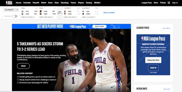
Use a Color Wheel:
An example of a website that uses a color wheel to combine colors is the National Basketball Association (NBA) website. The NBA website uses a monochromatic color scheme based on its brand colors of red and blue. The color wheel is used to create different shades and tints of these colors, which are used throughout the website for headings, buttons, and links. This creates a cohesive and visually pleasing design.
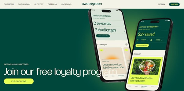
Stick to Analogous Colors:
An example of a website that uses analogous colors is the website of the restaurant chain Sweetgreen. Sweetgreen’s website uses shades of green and yellow, analogous colors on the color wheel. The colors create a fresh and healthy vibe, reinforcing the company’s brand identity of promoting healthy eating. The analogous color scheme also creates a harmonious and balanced design.
Use Complementary Colors for Contrast:
An example of a website that uses complementary colors for contrast is the website of the fashion brand Gucci. Gucci’s website uses a combination of green and red, which are complementary colors on the color wheel. The green is used as the dominant color for the background and text, while the red is used for accents and highlights. This creates a bold and eye-catching design that is consistent with the brand’s identity as a luxury fashion brand.

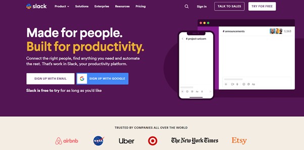
Experiment with Triadic Colors:
An example of a website that uses triadic colors is the website of the software company Slack. Slack’s website uses a combination of purple, green, and orange, triadic colors on the color wheel. The colors are used to create a fun and playful design that is consistent with the brand’s identity as a communication tool for teams. The triadic color scheme also creates a balanced and dynamic design that helps to draw the user’s attention to important elements on the page.
These examples demonstrate how different color combinations can be used to create visually appealing and effective designs. Using a color wheel and sticking to analogous, complementary, or triadic color schemes allows web designers to create harmonious and balanced designs that reinforce the brand identity and improve user engagement.
Real-life examples of color psychology in web design
Real-life examples of color psychology in web design can be found across various industries and sectors. Here are a few examples from 2023:
- E-commerce Websites: According to a study by HubSpot, orange is a popular color for call-to-action buttons on e-commerce websites because it creates a sense of urgency and encourages users to make a purchase. For example, Amazon’s online retailer uses a bright orange “Add to Cart” button on their product pages.
- Financial Websites: Green is often used in financial websites because it is associated with wealth and money. For example, the website of the investment firm Vanguard uses a green color scheme to reinforce its brand as a trusted financial advisor.
- Education Websites: According to a study by The University of Hong Kong, red is an effective color for attracting attention and promoting learning on education websites. For example, the website of the online education platform Udemy uses a red color scheme to highlight its course offerings and encourage users to enroll.
- Travel Websites: According to a study by the University of Rochester, warm colors such as red, orange, and yellow effectively promote excitement and adventure on travel websites. For example, the website of the travel booking company Expedia uses a warm color scheme to evoke a sense of adventure and inspire users to book their next trip.
These examples demonstrate how color psychology can influence user behavior and improve user engagement and website conversions. By understanding the meanings of different colors and using them strategically, web designers can create effective and visually appealing websites that resonate with users.
Color Trends in Web Design
Color trends in web design can change from year to year. Here are some current color trends in web design:
- Bright and Bold Colors: Bright and bold colors are becoming increasingly popular in web design. They can create a fun and playful look on a website.
- Pastels: Pastel colors are also popular in web design. They can create a soft and calming look on a website.
- Gradients: Gradients are a popular way to combine multiple colors on a website. They can create a visually interesting and dynamic look.
- Neutrals: Neutrals like beige and gray are also popular in web design. They can create a clean and sophisticated look on a website.
Conclusion
Color psychology is an important aspect of web design that can influence user behavior and improve conversion rates. You can create a visually appealing and effective website by understanding color meanings and using colors strategically. Remember to test and iterate your color scheme to ensure it achieves your desired results.
FAQs
Can color alone increase conversions on my website?
A: While color can impact user behavior, it is not the only factor affecting conversions. Other elements like website design, content, and functionality also affect user engagement and conversions.
Can I use too many colors on my website?
A: Using too many colors on your website can be overwhelming and confusing for users. Keep your color scheme minimal, using no more than two or three hues.
How can I ensure my color scheme is accessible?
A: Use tools like WebAIM’s color contrast checker to ensure your colors meet accessibility standards and are accessible to all users, including those with color blindness or visual impairments.
Should I use the same colors as my competitors?
A: While being aware of your competitors’ color schemes is important, you should focus on choosing colors consistent with your brand’s identity and values.How to Use Color Psychology in Web Design
Can I change my color scheme later on?
A: Yes, you can always change your color scheme later on. Make sure to test and monitor user engagement and conversion rates after making changes.