You’ve gotten the first part down — visitors are clicking through to your website. Not everything is going right, however. Maybe you’ve started to notice that a lot of those visitors aren’t converting — or perhaps you’re wondering how you can ensure even more click-throughs turn into sales or subscriptions.
Here is how you can encourage leads through your sales funnel once you’ve secured that first click.
1. Make Your First Impression Count
You only get one first impression. The page your visitors land on first: whether it’s a blog post, landing page or just the front page of your website, it should provide a good overview of your brand’s tone and style. It should also focus on the product or service you offer.
These landing pages should anticipate the needs of your visitors. The next step of the sales funnel — your storefront, a pricing page, a quote generator and so on — should be accessible from the page you steer visitors to almost every time.
2. Keep Your Design Simple and Clear
Simplify your landing pages. Many have a few attention-grabbing elements and emphasize just one or two different directions customers can take. Simplifying the design of your front page can help keep customers from becoming overwhelmed, getting lost or being left to wonder how to move forward in the purchasing process.
3. Break Down the Process
If how your service works exactly isn’t clear — what you’re offering, what the customer needs to do, the features you offer and so on — you can include text or design elements that give people a better sense of what they’re paying for.

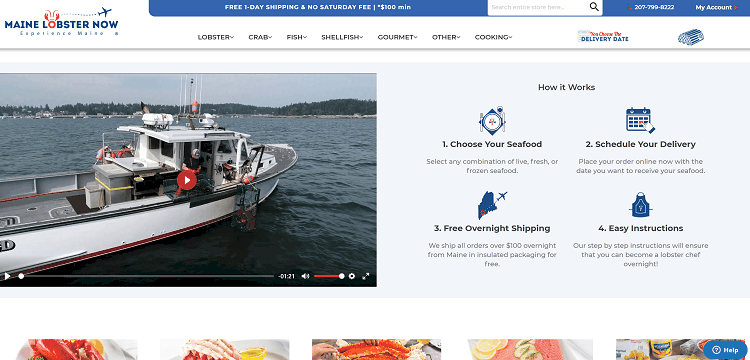
Maine Lobster Now‘s home page features a “How it Works” section that shows has brands can anticipate some of the concerns its audience might have. It includes information about the range of products it sells, as well as delivery scheduling and speed. It also highlights bonus features — in this case, cooking instructions that will help even the most amateur of chefs prepare their delivered seafood like a pro.
4. Make Pricing Simple
Pricing is hugely important for customers, but it isn’t always simple or easy to communicate. This is especially true for B2C companies offering services where pricing changes based on the customer’s needs. Fortunately, there are ways that you can improve your pricing communication.

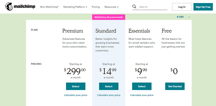
Mailchimp‘s pricing page is an excellent example of strong and simple pricing communication.
The page breaks down four main pricing categories, including the free version of the service. It then offers a pricing calculator to help businesses predict how much they will pay based on their number of contacts. The design is responsive, highly visual and quickly breaks down how much customers can expect to pay — reducing uncertainty and encouraging conversion.
5. Field Visitor Questions With Live Chat
Consider using a live customer agent or even a chatbot that can answer quick questions about your service.
Collected chat logs can provide information about aspects of your web presence that visitors find unclear, and factors that may be keeping them from moving through the sales funnel. If people are consistently asking the same questions — like how to purchase a specific service or how a certain feature works — you may want to include an explanation somewhere visible, like the front page.
There are other ways you can let customers ask questions, but live chat is one of the methods people prefer the most.
6. Demonstrate Your Service
Show, don’t just tell, to really drive a point home. A demo of your product can do all the talking for you.

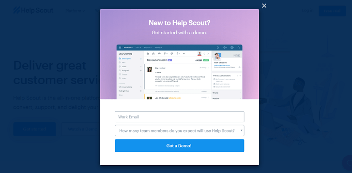
Help Scout puts a link to a demo video of its platform front and center — a good technique for enterprise- and business-oriented companies that bundle a wide variety of features and functionality. A video can use visual demonstration to break down complex topics and product uses much quicker and more clearly than an explanation that relies on text.
Other businesses can emulate this strategy by first describing their platform in broad strokes on landing pages and in other marketing material. Then, they can steer interested viewers to a demo video that breaks down how the platform can be used.
You can go even a step further and create interactive demos that handhold users and engage them with the product. This is a much more effective strategy because instead of being passive watchers users experience the benefits of the product firsthand. To simplify demo creation, use interactive demo tools such as Demostack or Demostack competitors.
7. Offer a Trial
In other cases, it may be simpler or more productive to offer a trial version of your platform so businesses can see how your service can make their workflows more efficient.

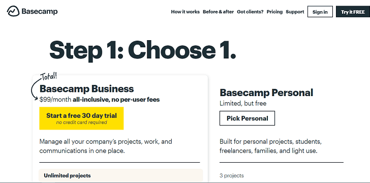
Basecamp highlights the trial version of its software in two different places on its landing page. Then, on the pricing page, the website clearly defines what the trial version will and won’t get you. This way, customers will know what they can get if they decide to upgrade later on.
This page also takes the chance to steer customers toward the paid version of the product so they don’t go looking for a Basecamp alternative.
8. When All Else Fails, Retarget
Visitors who click away aren’t gone for good. Often, you can recoup some of these visitors with retargeting ad campaigns. They take advantage of tracking tech, like cookies and tracking pixels, to target people who have already visited your website.
Track visitors who don’t convert, then retarget them in an ad campaign to bring them back into the sales funnel. When applied with other strategies, retargeting can be a great way to make sure you are funneling as many visitors forward as possible.
Encouraging Leads Through the Sales Funnel
Getting visitors to click through to your website is crucial, but if you want them to keep moving through your brand’s sales funnel, you’ll need careful planning.
There are a few different strategies you can use to encourage leads. You can design your website to make the next step of the funnel clear and offer options like a free trial, a feature breakdown or a pricing calculator. All these things will ensure visitors continue to move through your sales funnel.
