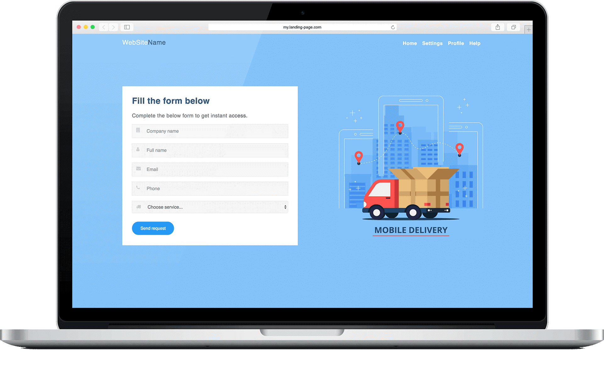
This is the age of the Internet which means that a lot of your business comes from your website rather than your company office/store especially if you are a B2B company.
Since the landing pages are an integral part of your website’s sales funnel, working on their design can help with better conversions a lot. For instance, you can add call-to-action statements and headlines that are benefit-driven, keep the design simple, and use top-notch content to see more and more website visitors converting into paying customers.
Cover all Brand Elements
If you haven’t created a brand bible yet, then that’s the first thing you need to do. It’s essentially a rulebook that dictates the colors, fonts, language, etc. that you should use in your websites, blogs, social media accounts, or rather anywhere your business exists.
Once your brand’s manual is ready, you can create the perfect landing pages by following its guidelines. However, remember that consistency is the key to successful branding. So, make sure that the landing pages have similar visuals and tone, and speak in the brand’s voice.
Use an Attractive Logo
You can’t build a brand without a logo as it’s what that allows your company to stand out from the competition and attract the customers easily no matter how crowded the industry is. So, make sure that all your landing pages have a unique logo that encompasses your mission statement, vision, and values that make your company special.
The good news is that you don’t have to worry about the logo design as there are plenty of platforms like Upwork and Freelancer where you can find freelance graphic designers that can help you for a reasonable price. Otherwise, you can use a logo maker, Tailor Brands is one of the best and you can try it for free before you make any decision. Another good option is the free logo software from GraphicSprings.
Use Copy That Compels
You can attract web traffic with exemplary visuals of your landing pages. However, to retain this traffic, you also need to use copy that’s polished, original, and compelling. It should also be in-line with your brand’s ideologies.
So, make sure that the digital marketing agency or copywriter you join hands with is reputed and has enough experience in the industry to understand what your brand’s all about and is able to convey the same through the content. Furthermore, when the work is provided, be sure to check for grammatical mistakes as these are one of the major examples of bad web design which should be avoided at all costs.
Add a Practical Footer
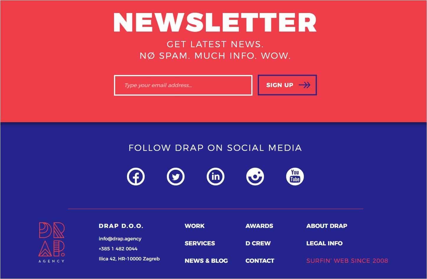
Adding a footer to the landing pages can help in maintaining consistency apart from providing the visitors with important details about your company such as privacy policy, terms of service, etc. However, the key to designing the perfect footer is simplicity and neatness.
You don’t want to clutter the footer with like 20 links of your products and every single social media handle. Instead, you should just put the basic contact information viz. phone number, email and physical address, links of copyright notice and terms and conditions, and perhaps a call to action (no longer than one sentence). If you are adding social media links, then limit them to only those that you are most active on.
Add Multiple Call-to-Action Buttons
Most web designers focus on creating landing pages that inform the visitors about the various benefits of a product or service through bullet points, infographics, videos, etc. so that they feel inclined to hit a call-to-action button. However, just one button may not be ideal for every website. This is because some people like to scroll down to the very end of the page before they make any decision and you don’t want to inconvenience them by forcing them to go to the top to find the button.
The takeaway point here is that it’s better to add at least two buttons- one above the fold i.e. the scroll point, and another after the fold. If the page is longer, then you can add even more buttons.
One thing to keep in mind when you add multiple call-to-action buttons is that while the language for each button may change (you don’t want to come off as unimaginative), the actual “call-to-action” should be the same everywhere.
Branding Done Right Translates to Results
Branding is important, there is no question about it. However, if you are inconsistent in your approach, then you may not get the desired results. So, apart from focusing on the big picture i.e. your PR, marketing channels, product development, and customer service, etc. you should also ensure that the smaller but important areas like the landing pages are also branded properly.


