A persuasive call to action can help you drive sales, boost your subscriber numbers, and ultimately contribute to business growth. However, knowing what kind of a CTA to use on different pages and for different purposes can be a bit tricky.
That’s why we’ve rounded up nine awesome strategies you can use to craft effective CTAs. So let’s check them out!
1. Have more than one
Having just one CTA on a page may not be enough. If you place it too high, the people who have scrolled all the way down a page won’t reach it, and vice versa. Aim to have a CTA strategically placed at key locations:
- Above the fold – in the hero section of the page
- In the margin – if you have room in the margin of the page, a nice widget with a CTA can be neatly placed there
- Above the footer – just before the page ends
- After each key point you make – if the page is long, it’s useful to place a CTA along with each sales point
2. But know when to stop
On the other hand, having too many will just crowd your page, so stop when it feels right. You don’t want to come off as annoying or pushy.

This can be a difficult balance to find. Aim for no more than one CTA on screen at any given time, and use a larger screen as your example.
3. Keep them similar
CTAs that do the same thing should also look the same. So, for example, if you have a CTA that leads to a purchase and a CTA for signing up to your newsletter, you need to make these two different.
Similarly, if you place the email signup button on the page twice, use the same design for both. This will eliminate confusion and provide a better user experience.
4. Prioritize them
Prioritize your CTAs according to what you want a visitor to do on that page. For example, an informative page you’ve crafted to boost your email subscriber counts should mainly focus on that action and have CTAs that inspire it.

You can also add a CTA to sign up for a service or make a purchase on the same page, but make the previous one more prominent.
And now for some examples that will help us illustrate the rest of our strategies:
5. Make them stand out
Your CTAs need to stand out on the page, not blend into it. You can achieve this with the use of different or larger fonts, clever colors, color contrasts, and so on.
For example, you can go big and bright with your CTA, ensuring that everyone spots it immediately.

6. Showcase your main selling point
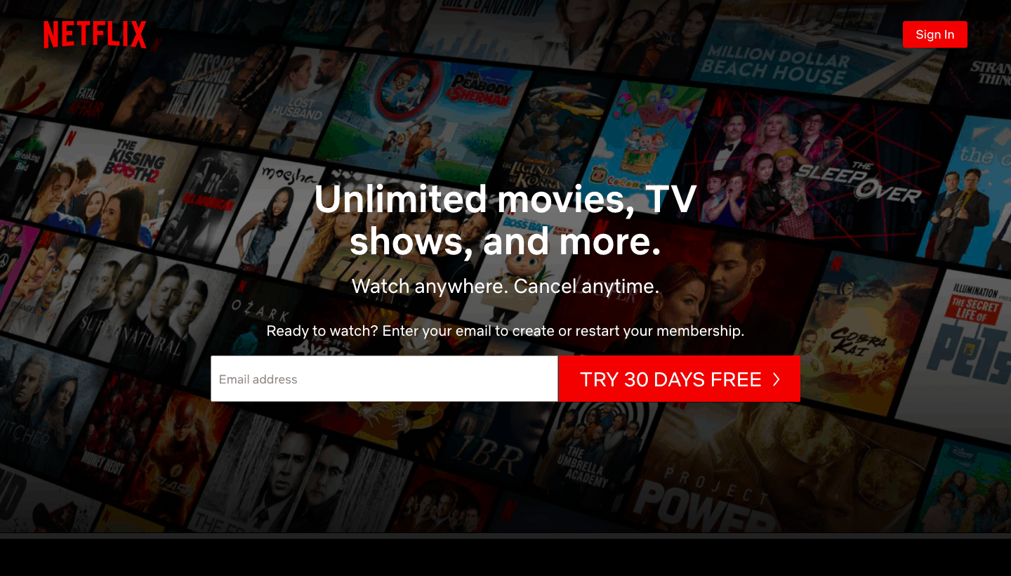
If you offer a free trial, specific discount, or you have a special deal going, make that very clear in your CTA. Since it’s already bigger and bolder than the rest of your page, it will instantly draw attention. If it can also communicate your main selling point at the same time, your chances of converting someone will be on the rise as well.
Here is an example that you will be familiar with, offering a 30-day free trial, no strings attached. Even if you read nothing of the copy on the page, it’s clear what you’re getting and you can make an instant decision.
7. Brand it
You can also include the name of the brand or product in the CTA. This will serve to underline brand identity, and it can work really well for certain kinds of audiences. You don’t have to brand every CTA, but something like “Get BRAND NAME now” or “Get product name now” can be a great way to inspire more sales.
For example, you can just brand some of the buttons that lead to different sections of your products, targeting different audiences.

8. Make it brand-specific
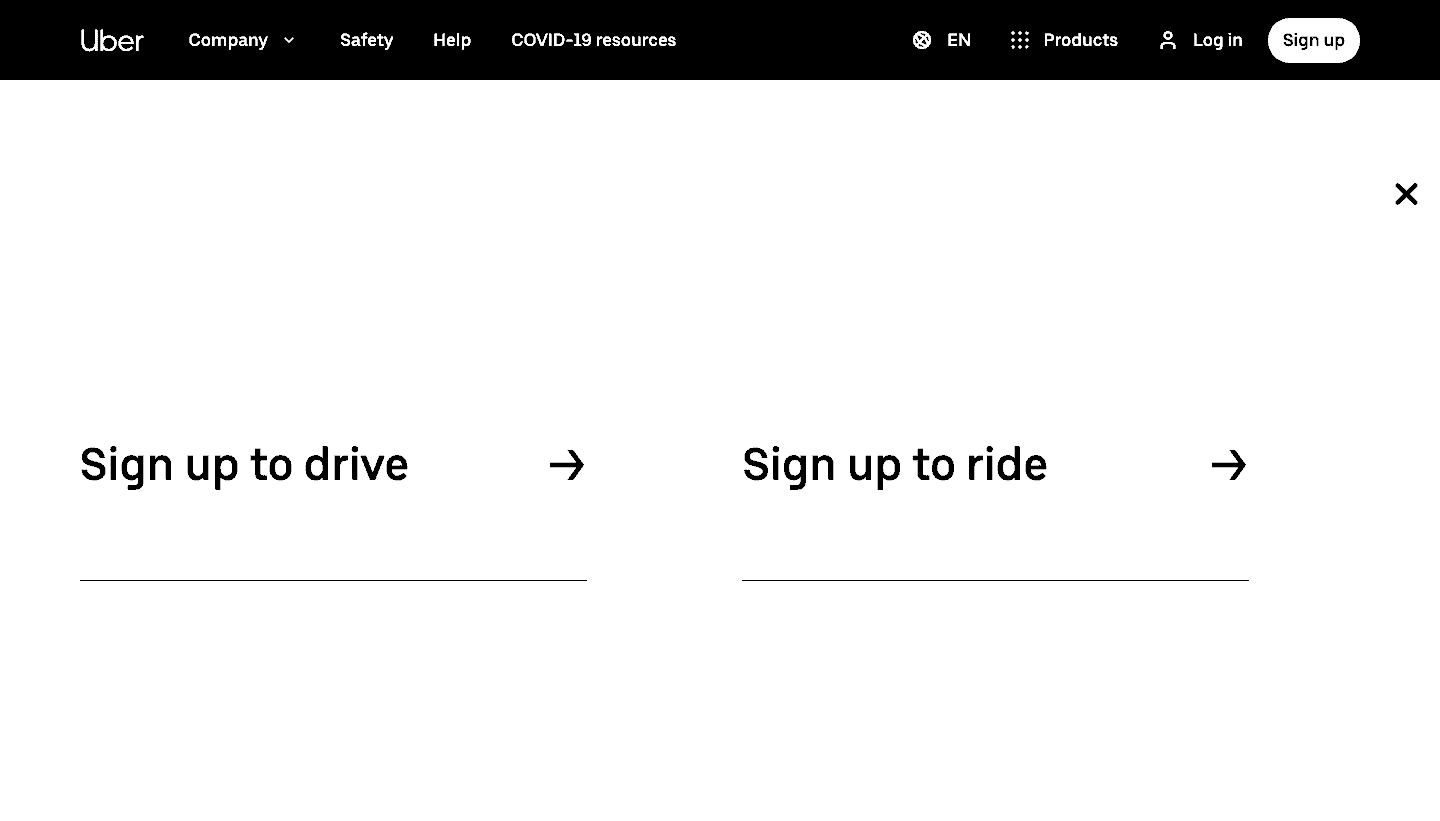
Even if you don’t use the actual name of your brand in the CTA, you can still make sure it’s aligned with your brand. You can use a more relaxed jargon; you can use a pun, a joke, a hint – something your target audience will recognize for what it is, and that will help you establish a bit of a connection with them.
Here is a very simple example, with the “Sign up to drive” and the “Sign up to ride” option – perfectly clear and easy to understand by everyone, but still a bit on the branded side.
9. Provide the option
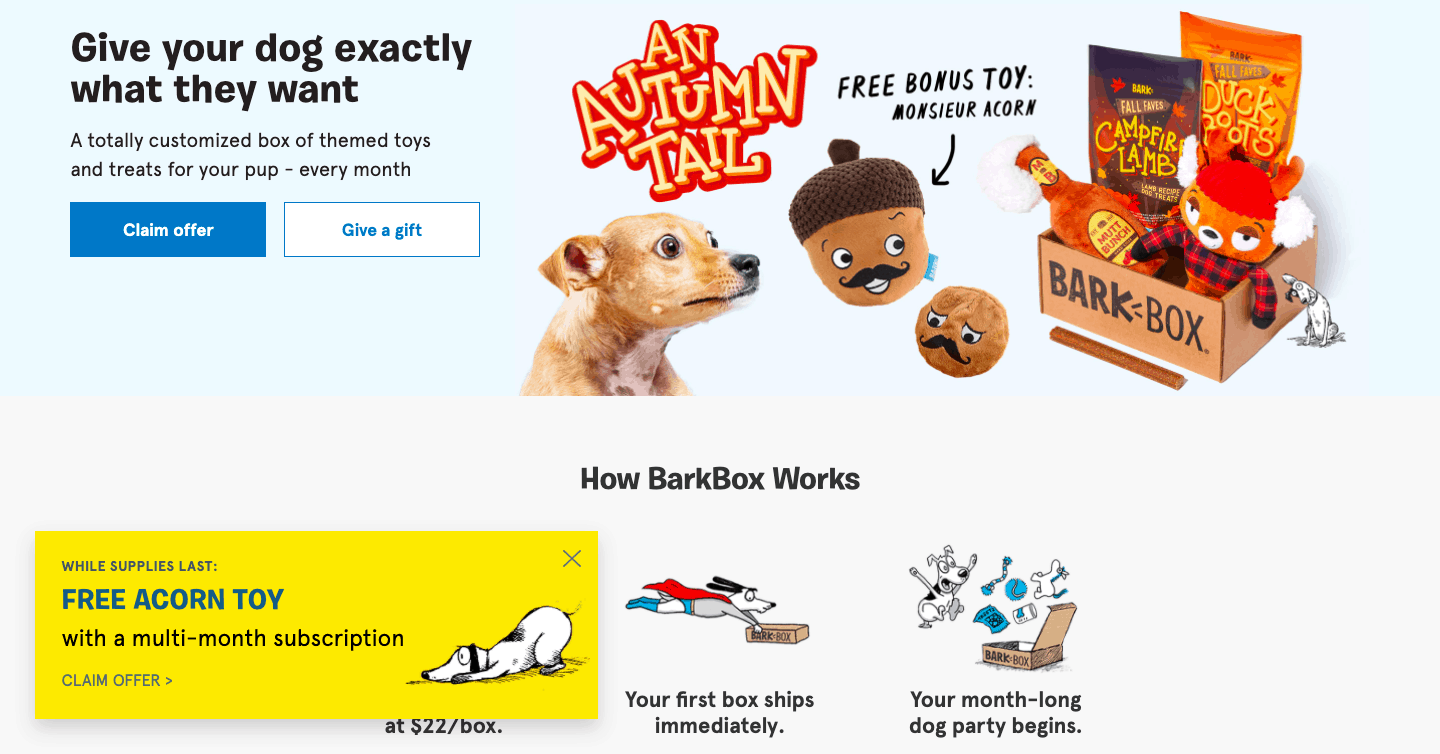
If there’s more than one kind of prominent service or product option you offer, make sure you have a CTA for both. For example, if you offer a service in-store and at home, make sure you have a CTA for each. That way, different kinds of customers can find what they want instantly, without having to make their choice further down the funnel.
Here is a nice example, offering you to either sign up for the service yourself or send a gift to someone else.
To sum it all up
Hopefully, these CTA examples will give you plenty of ideas. Stick to some basic rules we’ve talked about in the first half of this list, study the examples, and do a bit of experimenting with different options. With a bit of effort, you’ll be able to design a CTA that will inspire conversions and help you take your business to the top.
