When you’re looking for ways to make your brand stand out against the competition. The best way to do that is to create a unique web design that is not only captivating but also engaging for everyone that visits your page.
If you’re not sure what current trends will help improve business and site traffic, you’ve come to the right place. Below you’re going to find some of the top web design tips that you can use to create your company site and every creative agency branding will confirm that.
Continue reading this guide for the must-know web design trends that will prove useful to your business.
1. Dark Mode

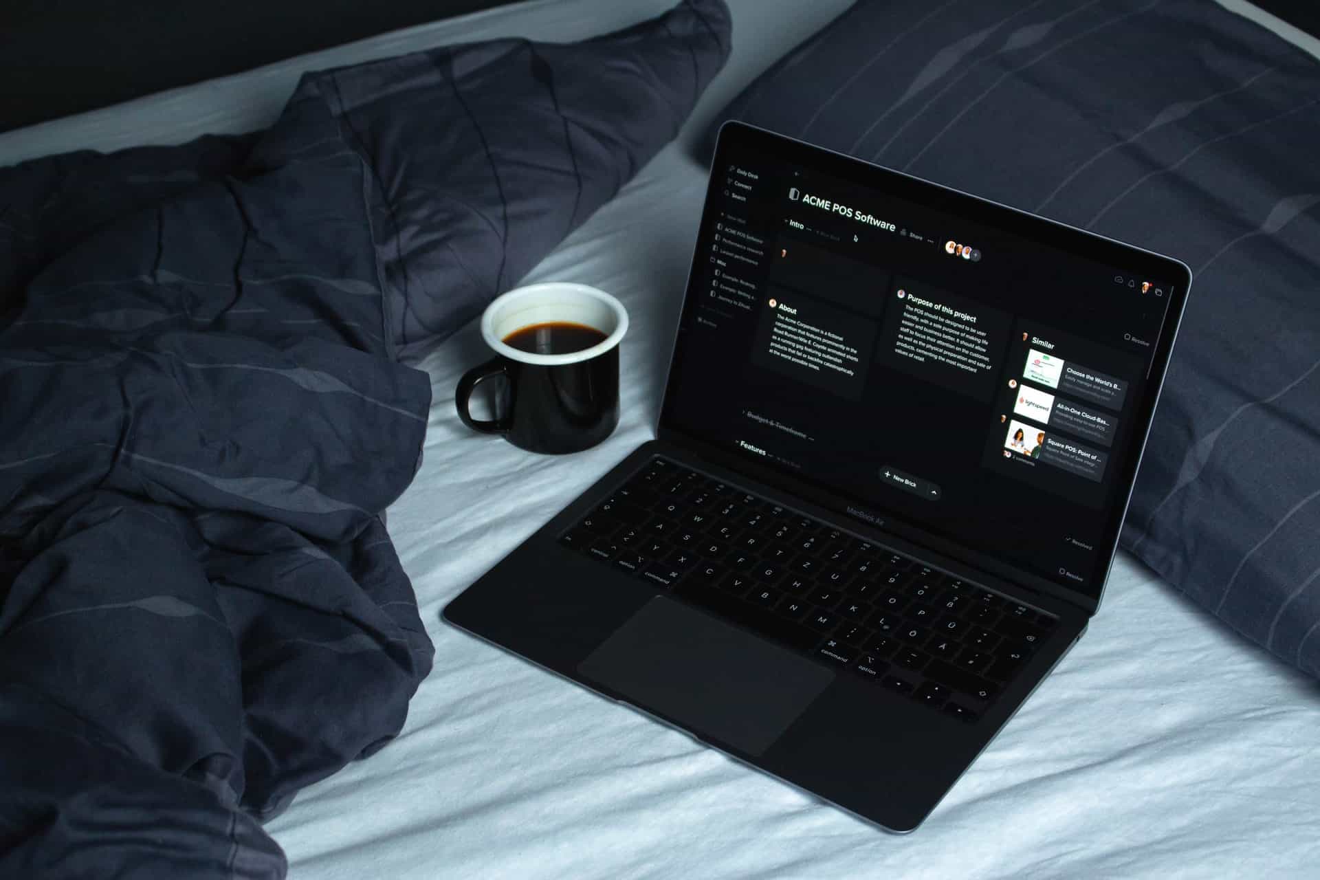
One of the most popular trends currently is to have dark mode used throughout the website. One of the reasons that dark mode is becoming extremely common is because the design is easier to look at in low lighting or during the evening.
And with cellular phones using dark mode, it’s no wonder that websites would start using them as well. The way to increase your use of dark the right way is to use bright colored text and banners to contrast with the dark backdrop.
When choosing the font colors and images to use on the page, ensure that they can easily be understood and read by all who visit your site. Remember, you still want it to be captivating without being challenging to look at.
2. Liquid Animation
Liquid animation can be used in a variety of ways. Whether you’re trying to pull site visitors into the design of the site as a tool to get them to do things like purchase the products and services offered by your business.
You can also use liquid animation to make smoother transitions between blocks of text and videos that you’ve embedded on the site. For example, you can present text on the starting screen, and then when the potential customer decides that they are ready to go to another page, the text will then liquefy and make the page transition.
Not only does liquid animation improve page to page transitions, but it also helps to create a better overall web design for everyone to view.
Before rolling out the liquid animation transitions on your site, you’ll want to run them behind the scenes to ensure that they are as smooth as possible. And if you need to make any improvements to the liquid animation design, you can make them before debuting the design on your site.
3. Uniquely Designed Typography

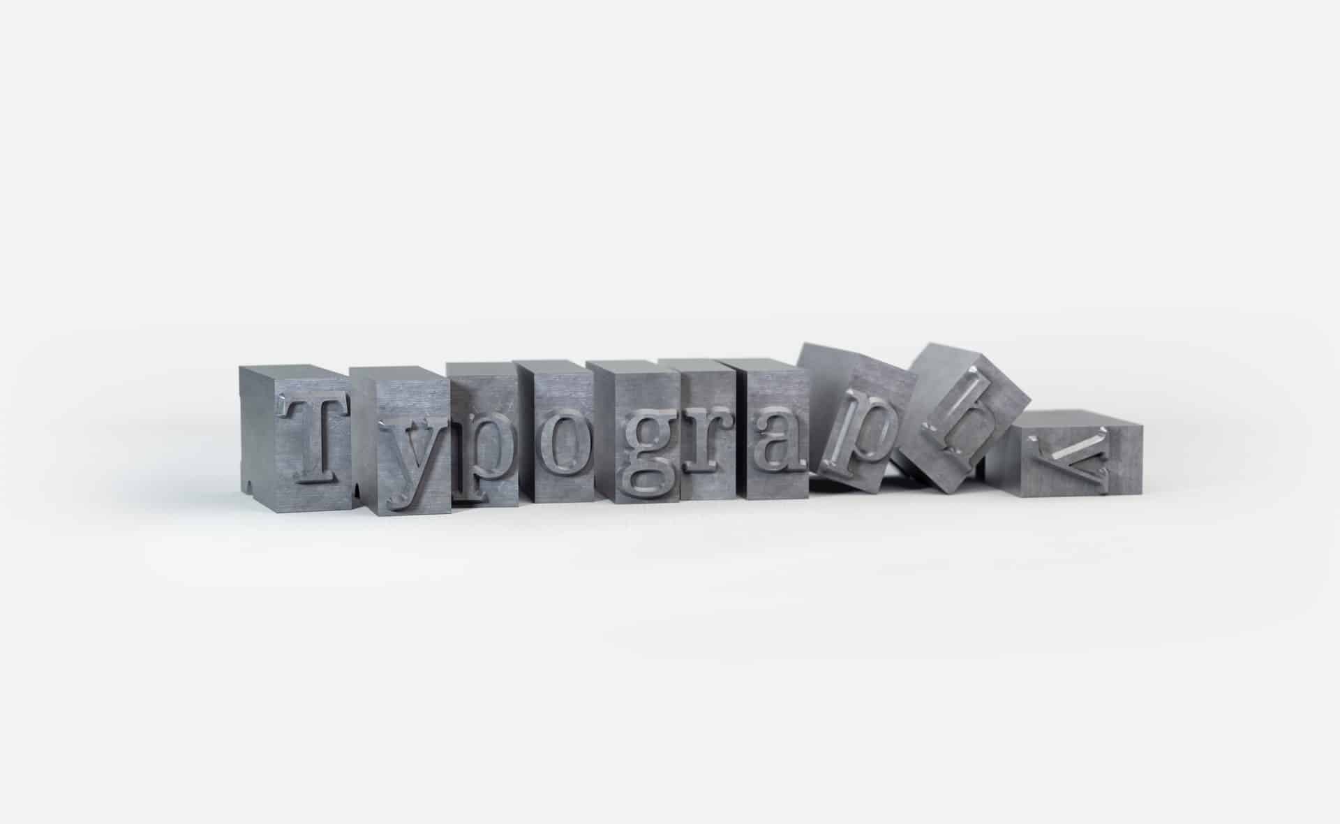
Traditionally when typography is used on a site, it’s done in a uniformed way. But, the latest trend is to play around with different fonts, sizes, and colors. These uniquely crafted forms of typography are then used in various areas of the site. And you’ll find that you can pair the typography with a variety of images.
We do encourage that you carefully choose the typography that you want to use because the last thing you want to do is attempt to use fancy typography and have it affect the readability of your site.
If you’ve got an awesome web design, but site visitors can’t read the things you’ve posted to the page, you would have created the design for no reason. And the design’s purpose, which is to help further business and your brand, will have failed.
Keep that in mind, every design idea you make for your site needs to enhance your brand and tell the story of your company mission and values.
4. Mixed Realism
The point of mixed realism is to take digital and animation images and mix them with live photographs. You have an unlimited amount of possibilities to choose from when it comes to mixing digital art with realism. For example, all the textures you can pair with digital imagery.
Getting good at this type of trend may take some time. But once you’ve mastered it, you’ll find that the design can be highly effective, especially if you’ve got a clothing business.
You’ll mix clothing textures, patterns, and more into a combination that will work well for your business needs. Mixed realism provides interesting image illusions that will make people stop and focus on the message that you’re trying to convey to everyone that visits your site.
5. Minimalism

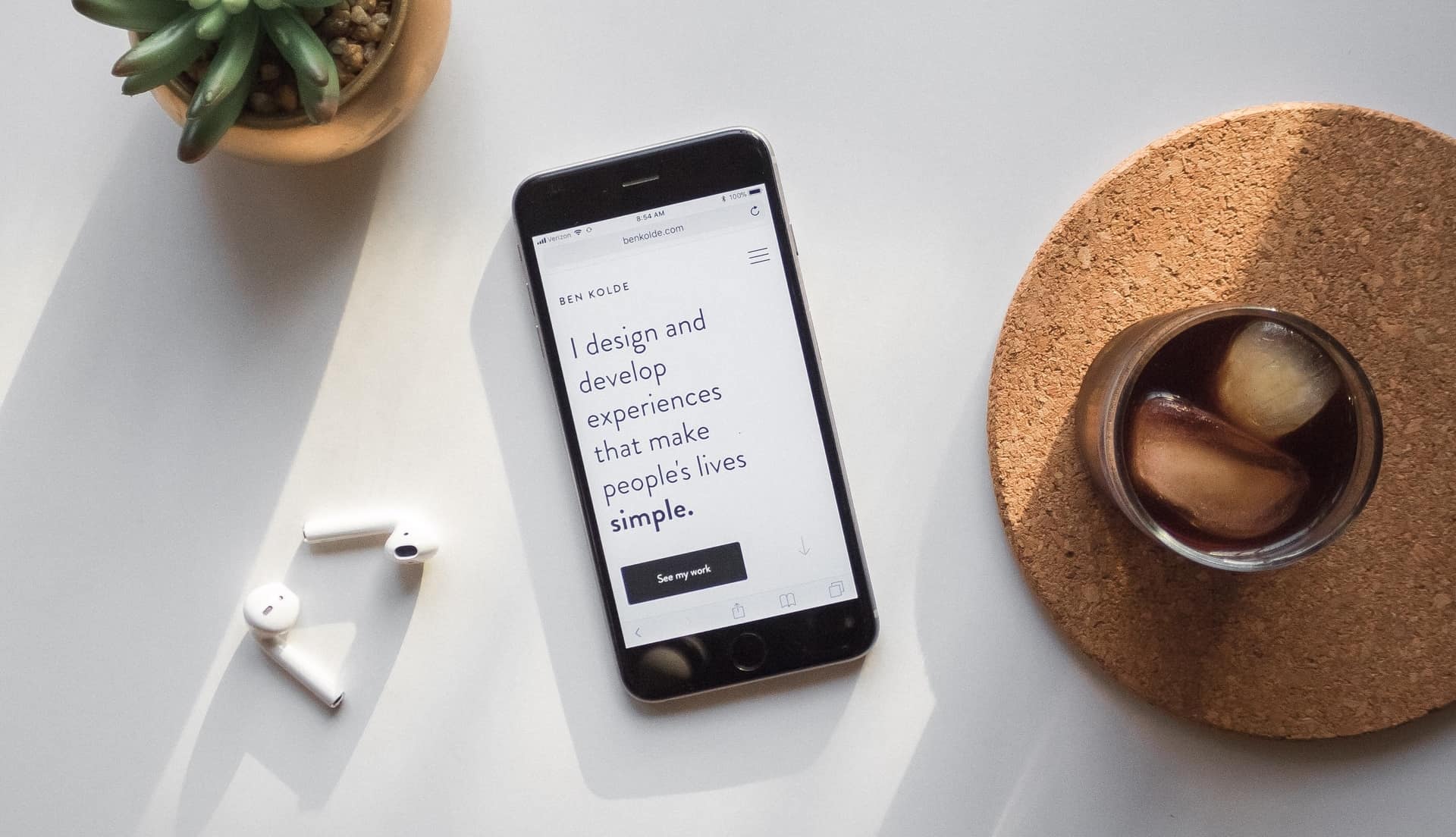
Some companies stick to the minimalist approach when it comes to web design. The reason being is that they want to portray a specific aesthetic for their company branding and use the white space of the page to do so.
Even if you choose to go the minimalist route, you can still play with different typography types. Mixing typography into your site’s various pages will help get and keep the attention of everyone that visits your site.
Going the minimalist route also helps you delete unnecessary details that may keep your brand personality from being fully expressed. The more you delete when taking this modern approach, the better your brand voice will resonate with people seeking to use your products and services.
Unique Website Design Made Easy
When it comes to choosing a unique website design, there are various ones that you can use to enhance the branding of your company. For example:

This post was created to provide you with all of the helpful tips that you were looking for. If they seem a bit overwhelming for you, or if designing simply isn’t your cup of tea, reaching out to a creative branding agency is always a solid option. And if you’re looking for more advice that covers other topics continue to thumb through the posts published in our blog section.
We enjoy providing you with information that you can use to strengthen the strategies that improve business but also enjoyable posts for leisure reading.