Thanks to improved design techniques and more capable technologies — the latest smartphones, for instance, all use high-resolution displays — web developers and UX designers have more space to work with. This has sparked a movement of sorts where a once simple navigation menu becomes incredibly expansive.
Because they are so much bigger, they are difficult to get right. There are no set guidelines for structuring a mega menu, primarily because it’s such a new trend. The best way to find something that works is through trial and error, or at the least observation.
What is so iconic about them, however? Why would any designer choose a mega menu over a traditional dropdown or compact one? To understand, it’s best to consider the following four benefits mega menus can offer when explicitly compared to traditional menu techniques.
1. Nothing Is Left Out
For retailers and suppliers that have a huge list of goods in their inventory, mega menus simply allow them to pack everything neatly into the primary navigation window. Generally, listings are split up by category with sub-menus beneath to keep things organized.
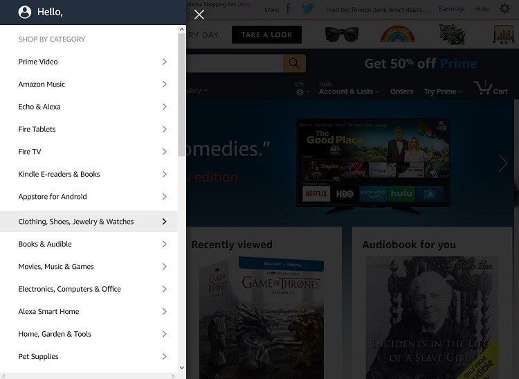
Again, Amazon is the obvious example here just because they are so big. When you open the Amazon menu, you’re presented with a huge list of options, starting with several parent categories like books, pet supplies or electronics. Clicking on a parent entry will open the associated sub-menu, which includes more specific options.
The benefit is that users always have access to every page on a site, and for the most part, there’s nothing they would necessarily have to search for — unless they’re looking for something specific.
It’s also quick if the mega menu is designed well. Users will land on the site, use the navigation menu to find exactly what they want, and then they’re off to the races.
2. You Can Include Images
Because mega menus are so large and take up extra real estate, there’s more room to work with when designing them. From a UX standpoint, this works because it’s possible to include images. Visuals help break up the text, especially the compact text that tends to appear in such large menus. If you’re still not sure where to find amazing photos, just look at Depositphotos, Yay Images, or StockUnlimited.

In addition, it conveys information in a more seamless way to users. Icons and product images both work to liven up the experience. Plus, when someone just wants to quickly jump to a section or sub-menu, the images work like shortcuts getting them there fast. That’s why a lot of retailers, for instance, will include images of their most popular products or categories within the mega menu.
3. You Have Access to New Functionality
Huge navigation menus will span the breadth of a page both to create more room for the options contained within but also to accommodate the device users are browsing from. This really becomes tricky on mobile, unless users are looking at the desktop version. But that’s also where mega menus deviate from traditional ones.
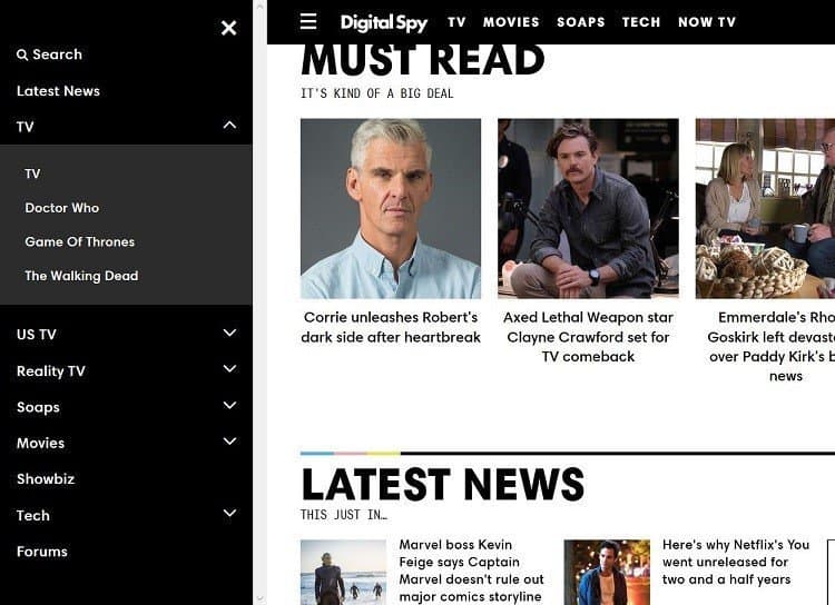
Designers can get very creative with their layout, style and functionality. They don’t have to be across the top of the page, either. Mega menus can pop-in from the side, be positioned at the bottom or laid out even more creatively. Digital Spy has a side-menu that pops out, for example, even on a desktop.
Mega menus can incorporate new methods and functionality that traditional menus can’t, which also allows them to provide both a creative and fresh experience.
4. They’re Better Organized
With a traditional menu, yes, you’ll have parent options with sub-menus beneath each, but they don’t tend to follow any strict categorization. In fact, they’re often structured to enhance the flow of the site. So, a parent page will have sub-pages below that, and sometimes the options don’t even relate. A “contact page” might be placed below an “important links” option, or unrelated products might be lumped together.
Mega menus, on the other hand, are much more organized because they are larger and have more space. You have to keep them clean and easy to follow, so the categories tend to be more exclusive. You might have a category for spare parts, and another separate category for actual devices, for example, where before they would be lumped together because of limited space.
This highlights the point that they’re not just more organized, but they tend to get more into the niche side of categorization. The options are much more specific and deliberate, making the experience that much better for users.
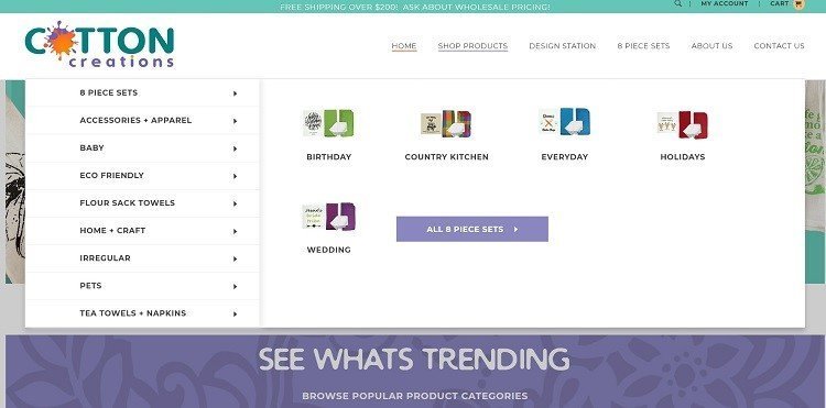
Cotton Creations is a great highlight here because its inventory is so eclectic. It includes a variety of cotton-related items from towels to shirts and apparel, even stuff for pets. Naturally, looking at their navigation menu, you can see how much more helpful the categories are. Imagine trying to cram all the options it has into a smaller, more compact menu?
Mega Menus Are Functional and Stylish
As the world of web design and development constantly evolves, so will the styles and techniques used as you’ve no doubt learned from your own experiences. It just so happens that the mega menu or super menu is one of those evolving techniques. It’s easy to see why it has become popular, with many companies and storefronts offering a robust selection of goods. They need more space and more nuanced menus to include everything.
But at the same time, mega menus tend to be more functional, despite their increased complexity. Users can find what they’re looking for faster, especially when visual elements or images are included.
If you’re having trouble trying to decide how to design your own mega menu, spend some time perusing the web for inspiration. There are lots of sites and designs out there that incorporate this relatively new and fresh concept and in interesting ways, too.