Effective landing pages are a key component of any online marketing campaign. When customers click through from an email or ad, the landing page convinces them to keep moving along toward a conversion.
Landing pages can also be hard to do well. On average, landing pages have a conversion rate of just 2.35%.
Here are eight methods you can use to determine if your landing page is helping you work toward your business goals:
1. Take Advantage of Analytics
If you aren’t already using some kind of analytics program to track your landing page’s performance, this is where you should start.
Analytics tools can give you hard data that allows you to test your landing page’s effectiveness and see what may not be working. Information like click-through rates, click-away rates, traffic sources, and more show you if your landing page is appealing to your target audience. These points can give you hints about how to improve your landing page.
2. Check for Clutter and Unnecessary Info
The essential components of your landing page should be visible right away if you want to capture the highest number of customers possible. Users develop an impression of your website within just 50 milliseconds — that’s one-twentieth of a second. Most visitors will only hang around on a landing page for a few seconds before clicking through or navigating away.
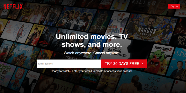
You don’t have a lot of time. You want to ensure your landing page is clear and communicates its message as quickly as possible — like this one from Netflix.

The design is super clean, straightforward, and features a highly actionable call-to-action (CTA) that is front and center. There are also additional design elements — like a sign-in button — to handle any other needs a visitor arriving at this page might have. It’s a great example of a landing page with no clutter or unnecessary info.
Your page may need a little more content than one from a big brand like Netflix — but this is a fitting example of how minimalist you can go with your design.
3. Make Sure Your Landing Pages Line Up With Your Ad Campaigns
Your landing pages should use similar branding, copy, and imagery as the ad campaigns they’re attached to. This uniformity will keep your landing pages consistent with the rest of your web marketing.
It will also ensure any CTA or link lines up with what your landing page is offering.
You don’t want to create a situation where customers click through to your page expecting one thing and get something that’s not quite what they were looking for — or a completely unrelated offer.
4. Optimize Your Landing Pages for Mobile
More than half of all web traffic is mobile. If your website isn’t built for mobile usage, you can easily turn off large numbers of visitors without meaning to.
Like the rest of your web presence and digital marketing, you’ll want to optimize your landing pages for mobile to ensure they reach the broadest possible audience.
5. Evaluate Your Use of Colors
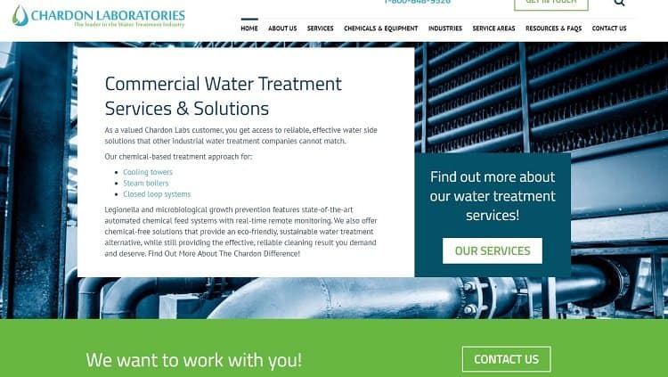
Color plays a major role in how customers will react to your brand, as well as how they’ll feel while on your landing page. For example, see this landing page from Chardon Laboratories, a water treatment company.

The page primarily uses one main color and one highlight hue to reinforce the brand and make the page easier to navigate visually. Cool blues communicate information about the brand and the services it offers, while a highlight color — green — helps the “Our Services” button and footer stand out from the rest of the page.
The page also implements good web design practice — like contrasting text, a well-designed web banner, and distinct design elements.
6. Optimize Load Speed
No one likes to wait, and users will click away if your page takes too long to load. Optimizing your landing pages for fast loading times can prevent some of these site visitors from leaving.
This factor is also part of why optimizing for mobile is so essential. Pages that load well on desktops may take much longer on mobile devices. Optimizing your landing pages for load speed, no matter what device or browser a visitor is using, will ensure the lowest click-away rate possible.
7. Keep Forms Short
A long form can easily overwhelm your visitors. Where possible, you should keep your forms brief and quick to fill out. If you need to get specific information from a user that results in a long form, however, you can use some tricks to keep these forms short.

For example, this Uber landing page only asks for some of the information it needs, keeping the form short and giving it a more manageable appearance.
The rest of the form will show up when the user submits this first part, breaking the overall fields — which could be overwhelming — into more manageable chunks.
Also, each form field doesn’t take up any more space than it needs to. You don’t want them so short that important information will start scrolling, making it hard to review the finished form. However, you also don’t want to provide too much space, which can make the form seem like more work than it actually is.
8. Test Everything
If you’re stuck between two equally appealing options for a major design decision, a simple A/B test can provide useful analytical data with which you can work.
Testing can help you discover which landing page designs will be most effective for your given audience and current ad campaign.
Building Landing Pages That Align With Your Goals
A successful landing page can be tough to build. Fortunately, there are techniques you can use if you want to create one that is both effective and in-line with your business’s goals.
When designing or re-designing a landing page, evaluate your use of color, and make sure the layout lines up with its ad campaign. You should also be aware of common landing page pitfalls — like overly long forms, cluttered pages, and unoptimized loading times.
