One of the best ways to build your credibility is by creating a professional portfolio site. These websites are meant to showcase you, namely the excellent work you’ve done and your experience to help you impress employers all over the world. Call it sort of a virtual CV if you will. And even though a dynamic portfolio is a great way to showcase your interactive skills, CVs are still commonly used, so don’t forget to check examples of resumes as well to ensure that you’re highlighting your work history, achievements, and targeting for the role you want before beginning your portfolio site.
Whether you’re an artist, photographer, or content writer, or almost anything else, a professional portfolio site can help not just get you more offers, but perhaps even boost your value.
What Goes on Your Professional Portfolio Site
The first thing to remember is that you’re building a professional profile, so try to keep the personal stuff at arm’s length. Other than that, you can actually experiment with a variety of things; there is no real ‘one-size-fits-all.’
For example, for writers, your author portfolio site might not need to be too hung up on creative visuals but focus more on showcasing the works you’ve completed. In fact, you can even have a small area discussing works in progress or that are upcoming.
Showcasing your work is key – you need to allow your clients to see what you’re capable of and what you have to offer.
Where CVs are more traditional and limited by the dimensions of the paper you need to print them on, portfolio sites can make you really stand out.
With this, what we mean is, you should have a unique style and online approach. Of course, there are certain areas of expertise that require a portfolio more than some others. I would say it’s crucial for web design/development, graphic design, marketing, and art design. Though if you do work outside of these areas, it is still highly recommended.
Best Ways to Build Your Portfolio Site
There are a number of ways that you can build your online portfolio site. Which you use will depend on your preference and skill set. Thankfully, there are also a huge number of resources that can help you with what you need to build a professional portfolio site.
1. Use a Sitebuilder like Wix
Site builders are common nowaday – they’re basically building tools that allow you to create functional websites quickly. Most are specifically designed to be easy-to-use, so you don’t need any knowledge of web development or coding.
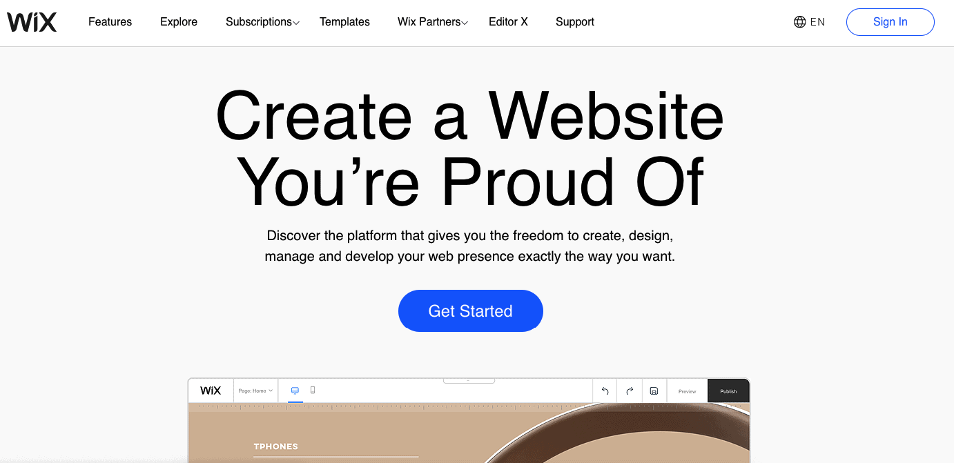
One example of this is Wix. This nifty tool lets anyone build almost all kinds of websites quickly, from personal sites to online stores – or perhaps in your case, a portfolio site. Wix has both a free and premium version, so you can try it out to see if you like it.
Pros of using site builders
- No technical knowledge necessary
- Easy to use
- All-in-one solution
Cons of using site builders
- Can get expensive
2. Use a CMS like WordPress
WordPress is another platform that can be used to create a portfolio site. It is usually thought of as just a blogging platform, but it is so much more than that. In fact, WordPress today has morphed into something like a site builder, so it is far more versatile in terms of designing a site.
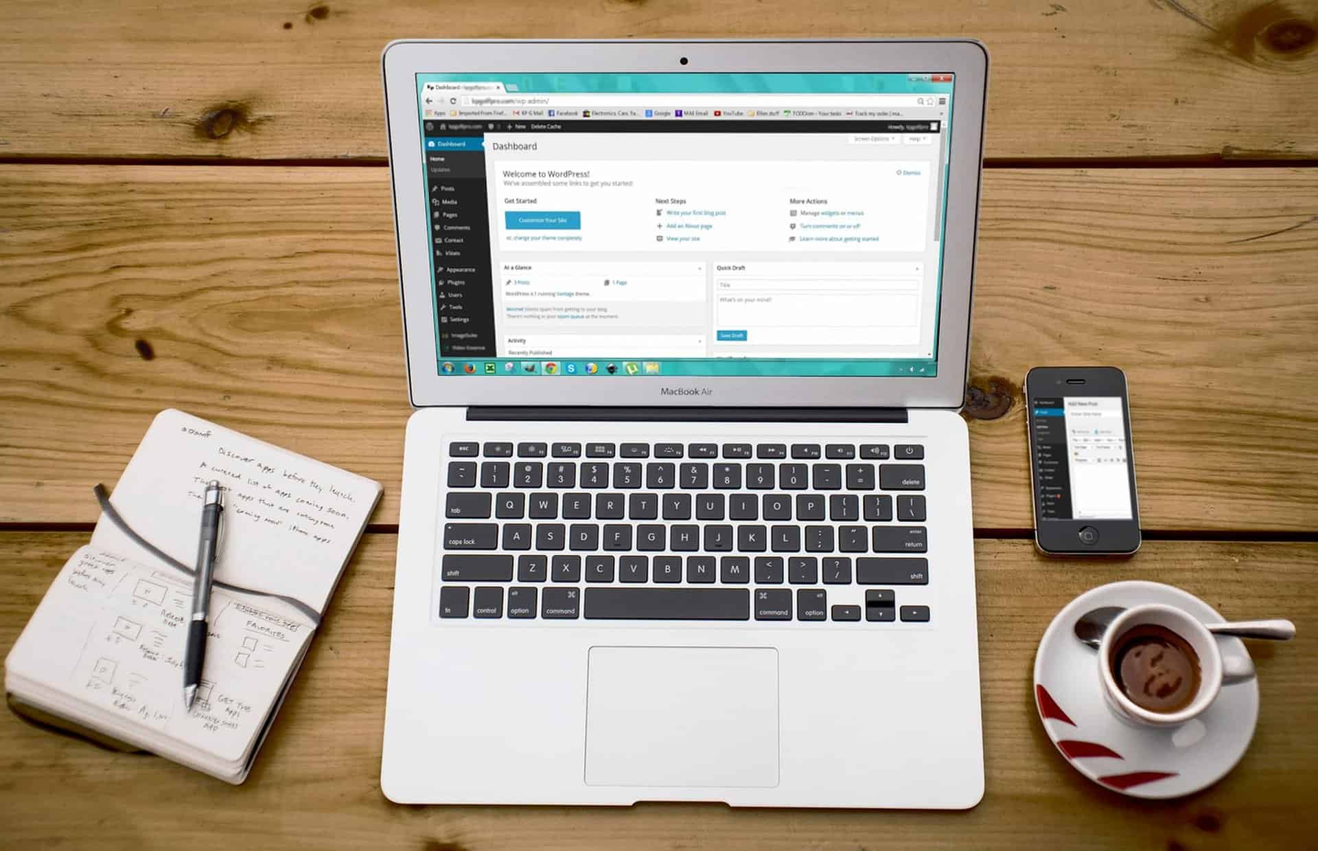
Using a CMS like WordPress will mean having your own web hosting, but it also means you gain much more control over your website as compared to using a site builder.
Pros of using WordPress
- The massive ecosystem of plugins and users
- Commonly offered by web hosts
- Easy to install and use
Cons of using WordPress
- Own hosting needed (it might not be cheap!)
- Requires some maintenance effort
3. Code it Yourself
The options above make use of third party applications, but did you know you can also build your own website from scratch? While the skills involved could take you some time to pick up, coding your own site can also be extremely satisfying.
For the technically inclined, it can also be a way of showcasing your skills since not many people would build their own sites in this way nowadays.

Pros of DIY coding
- Extreme control over every website element
- Potential for great performance
- Total freedom since code is 100% yours
Cons of using DIY coding
- Steep learning curve
- Not suitable for everyone
Your Professional Portfolio Site Objectives
Before you get all excited and run out to start building your site, start planning it out first. Consider carefully what your objectives should be. Your portfolio site should fit your goals and also be suitable for your target audiences.
However, there are generally some overall objectives you should attempt to reach;
Brand Yourself
Think back on any websites you’ve visited (at least the better ones) and consider what your experience on those sites was? If you think about it carefully, the most common objective companies try to achieve with their websites is consistency with their branding.

In the case of your professional portfolio site, you are the brand, so pick a perfect domain and build it around how you want to be perceived by potential employers or even your peers.
Personalize, Not Personal Life
Remember that what you’re building is meant to showcase your personal skills, not your personal life. It can be tempting to include highlights of what defines you as a person, but this can be a double-edged sword.
As far as possible, do avoid telling your life story here. You do need some kind of engaging story, but keep it short and snappy. Not a lot of people will want to go through the nooks and crannies of your life on your portfolio site.
Keep the quality high
When considering quality, you need to expand your field of thought and apply it not just to your work portfolio, but also to the site it’s on.
A fast site normally leads to a much happier user experience, and that is the place you want your guests to be in. Also, avoid sloppiness in your site designs – just because it isn’t for print doesn’t mean you can get away with low quality, blurry images.
Balance Text with Visuals
Back to the issue of your audience, you need to remember that any website )including your portfolio site) depends on search engines to get traffic. These depend heavily on text to understand what your website is about so that they can send the right visitors your way.

Even if you are a designer, work with words to create a happy balance between the two, or you might find your beautiful site having no traffic at all.
Ensure You’re Easily Contactable
Since your professional portfolio is meant to bring opportunity, make sure that visitors have a way to reach out to you conveniently. It is important since your portfolio site is for business purposes. I recommend that you don’t post your contact details or even email address, though, or you’ll attract a ton of spam.
Try to make use of a contact form that users can fill in on your site itself, and then that form will send the information to you. It looks nicer and is a lot safer for you.
Optimize for Seach Engines
One of the first things you hear about when starting a site is SEO. But while it takes a few seconds to know what search engine optimization is, it takes months, and even years until you learn how to make things right. That’s ok if you learning about SEO, but if you’re trying to rank for specific keywords and make sure Google knows about your site, you will want to check more about outsourcing your SEO.
Keep Things Fresh
No matter what type of portfolio you’re building, always be sure to refresh your content periodically. There are a few reasons for this, the first being you don’t want to stagnate on web rankings.
The second is that you also don’t want visitors to see outdated content as that won’t bring the best of impressions.
Refreshing content doesn’t have to be too comprehensive, but at least keep things current from time to time.
Samples of Great Portfolio Sites
To give you some ideas, I’ve taken a look at some great sites, and you can have a peek at them to gain some inspiration
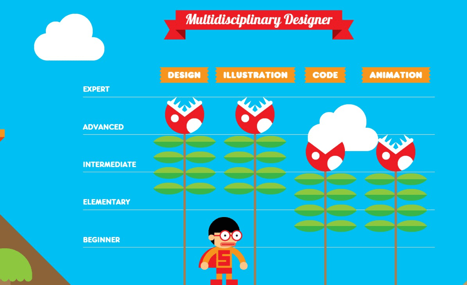
Robby Leonardo
Robby Leonardo is a truly modern age designer who works in a variety of mediums. He incorporates the entire interactive experience in his portfolio showcase in a very immersive yet short and simple portfolio.
Daniel Grindrod
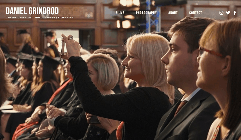
Daniel Grindrod is a professional photographer and videographer who makes use of wide-open space to showcase his talents. His site is heavily media loaded but manages to keep things streamlined enough for a smooth experience.
Rezo-Zero
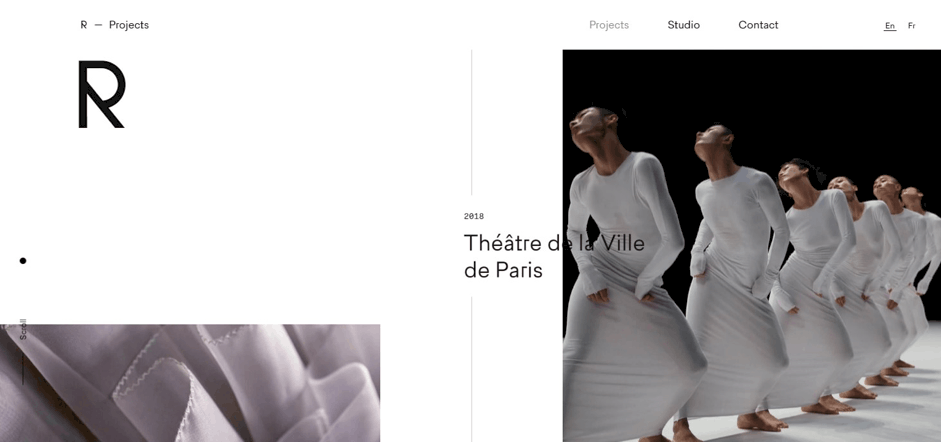
Rezo-Zero is a studio that creates and specializes in brand strategy and digital creation. The site almost feels like a digital magazine, as if you’re browsing through a real one. The attention to detail is immaculate and eye-catching, and the experience all-encompassing.
Final Thoughts
Your professional portfolio should be an opportunity for you to impress potential clients and, ideally, put your peers to shame (although you don’t have to tell anyone that). Use it as the opportunity to express all of your skills and character – the side you wished that everyone you ever interviewed had seen right away.
Remember that while it needs to be uniquely you, try not to stray too far off the beaten path since users might get lost in the weeds. After all, their experience is a large part of what you’re trying to influence.
