Websites are critical marketing tools for all businesses now, and law firms are no exception. Prospective clients will be checking out your patent attorney bios, representative matters, and press mentions online before they even pick up the phone.
If you are thinking about legal website designs and how to make yours better, check out the sites of your competitors. What are they doing to grab the attention of clients? Where do they fall short?
Here are five notable legal website designs that illustrate exciting options for getting potential clients to notice you.
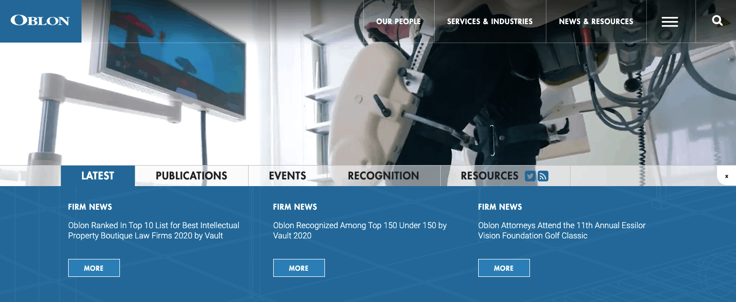
1. Oblon

This law firm specializes in intellectual property, and its website shows the firm’s facility in technology immediately. The images move fast, the site loads quickly, and you can hover over sections to get immediate results.
If you are pursuing a patent in technology or seeking advice in a highly technical field like software, you are going to expect your lawyers to invest in an advanced website that demonstrates their knowledge of the sector. This website accomplishes that with style.
2. TurksLegal

This firm’s brand is more focused on people, and their home page shows this off beautifully with black and white photos of their team. Everyone is smiling, showing interest in their audience. They seem to care.
It can be expensive to redesign a whole website, so some firms utilize fresh imagery to boost their brand at a reasonable cost.
Experts like LawFirmSites.com can offer reasonably priced ways to increase your web traffic through refreshed design, headshots, and SEO, which can all lead to more business for you.
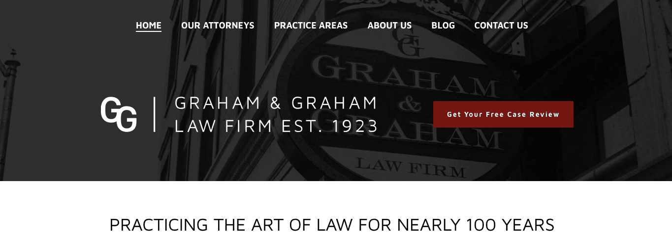
3. Graham & Graham

You do not have to be a big law firm with a huge budget to build an effective website.
Graham & Graham‘s site gets right to the point. Within two seconds, you can see what they do and how to reach them. With one click, you can get a free case evaluation or ask some more questions.
Too many law firms lose out because their websites do not clearly display how to reach them. Live chat is an easy online option that many firms can benefit from.
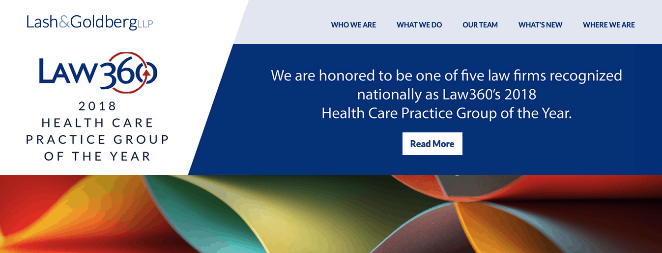
4. Lash & Goldberg

This law firm has jettisoned the traditional law firm imagery of Doric columns and scales of justice. Their home page is a riot of color and abstract art, conveying sophistication and urbanity you want in attorneys handling complex business matters.
They have also prominently displayed a recent accolade by a nationally recognized outlet Law 360. All the great design in the world still needs a substantive copy to give it heft. You need to proclaim your accomplishments and awards where your audience can see it!
5. Ifrah Law

This small D.C.-based firm has a tagline that conveys its tough litigation skills. It also uses imagery that illustrates its niche in the sports betting world, with photos of boxing gloves.
They also make it easy to download their thought leadership on their core area of specialty, and they probably track who downloads their report so they can follow up!
Legal Website Designs: Set Yourself Apart from the Rest
All of these legal website designs show each firm’s special attributes and values. You can boost your business by improving your own law firm web design in easy ways which will more effectively show your clients who you are and what you can offer them.
Keep checking back for more helpful online marketing information!
