Nothing is random in the world of marketing. If you think brands select colors arbitrarily, you should check out this post to learn more about the psychology of colors. Why do we say that? It’s because color represents a powerful communication tool and can be used to signal action, impact mood, and even influence physiological reactions.
If you are running a company, you should know that every element of branding gives a significant contribution to the overall success of your business. As a visual component, colors are the first thing customers notice so rest assured they will react accordingly.
How Colors Impact Marketing Activities
According to the report, over 90% of consumers say the visual dimension is the number one influencing factor affecting their purchase decisions. Another study shows that two-thirds of customers won’t buy a large appliance unless it comes in their preferred color.
These two facts alone reveal the incredible power colors have on conversion rates and marketing in general. You obviously need to pay particular attention to visual effects on your website and landing pages, including elements like CTA buttons, background colors, images, etc.
Last year, Hubspot published results of A/B testing that compared conversion potential of red and green CTA buttons. The analysis found that the red button outperformed the green button by 21%. Although it’s an isolated test that doesn’t necessarily have general implications, it still proves that the well-selected color can drastically influence conversion rate on a landing page.

Traditional color psychology even determined how people perceive colors regarding the brand trust, speed, cheapness, quality, tech advancements, courage, fun, and reliability.
However, it’s almost impossible to choose the right color for your marketing campaign if you don’t understand the story behind each color individually. This is exactly what we want to explain to you below, so keep reading to learn more!
The Meaning of Colors Revealed
Most people don’t realize that each color has a different meaning. As an entrepreneur, you should know better than that and learn how visual components influence human behavior. Let’s check out seven frequently used colors here:
Green
Green is the color of nature that reveals health and cleanliness. It is often associated with environmental groups, but many brands also use it to emit the feeling of tranquility and calmness. This is exactly how you should use green in your marketing activities.
The perfect example is Starbucks, a coffee giant that provides a peaceful oasis in the concrete jungle for its customers. Starbucks uses green to evoke serenity among consumers because it’s the only part of the day when they can really take a break and relax.
![]()
Red
On the other side of the spectrum, red is the color that screams energy and excitement. It creates the feeling of urgency, so it’s perfect for sales and retail business. Red can increase blood pressure and inspire you to take action, which is why energy drink brands use it frequently (who mentioned Red Bull?).
![]()
Blue
If you want to present your brand as reliable and trustworthy, you should think about adding blue to the visual elements. This color will make people trust you more and look at you as the authority in the business. Therefore, it is not surprising to see that IT and finance companies such as IBM or PayPal based their marketing strategies on blue.
![]()
Yellow
If there is one color that perfectly represents optimism, cheerfulness, and vitality, then it has to be yellow. It inspires people to engage with the brand and make their move immediately. There is only one little problem – yellow is so strong that it sometimes chases consumers away. However, it doesn’t stop dozens of renowned brands to use it, including DHL and McDonald’s.
![]()
Black
Black is one of the favorite colors in marketing because it’s stylish and classical. In terms of psychology, it proves the brand’s strength, authority, and exclusivity. This is particularly important in the fashion industry where a lot of brands use black as their primary color. Some of the most famous examples are Prada, Chanel, and Louis Vuitton.
![]()
White
If you want to express a perfect purity and cleanliness, you should think about white as your first branding option. Customers who see this color believe in the brand’s safety and elegance. This is why cosmetics companies such as Nivea or Revlon often use white color in marketing. The same goes for numerous household brands that produce bathroom accessories, taps, ovens, and similar items.
![]()
Purple
Purple is the color of respect and royalty. It expresses classical beauty that leaves no doubt regarding style and quality. This is so obvious that even some sports organizations use purple to highlight supremacy. For instance, purple is the traditional color of Wimbledon – the most prestigious tennis tournament in the world. Besides that, LA Lakers also add purple to their equipment to celebrate the great history of this basketball club.
Gender Color Preferences
Women traditionally prefer certain colors more than men and vice versa. Although findings are ambiguous, many investigations have indicated that there are differences between genders in preferences for colors. The University of Maryland conducted a study to reveal this phenomenon and here is what they realized:
- A majority of both men (42%) and women (29%) claim that blue is their favorite color.
- The second most loved color is different. While women prefer purple in 27% of cases, men like green much more (25%).
- Purple seems to be the next best thing for men (12%), while green takes the number three position among ladies (19%).
- Things change when it comes to the least favorable choice. Only 3% of women think orange is the most beautiful color, while only 1% of men believe pink is the most attractive element of the spectrum.
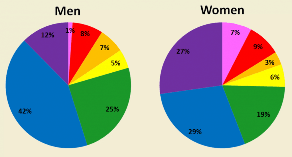
Although the study was limited to the specific area, it seems like gender preferences don’t change drastically among different groups. Authors statistically tested results for age, race/ethnicity, education level, and student status, but the gender pattern was basically unchanged.
Colors and Cultural Differences
The psychology of colors demands even more attention in the case of international brands. Namely, color connotations can drastically differ from country to country so you must know what to use or avoid in a given location.
For instance, red is almost universally acknowledged as the color of energy and passion. However, there are a few countries in Africa where people see red as the symbol of death, while people in Nigeria associate it with aggression and violence.
We already mentioned the meaning of white in Western civilizations – it is the sign of peace and purity. On the other side, white suggests jinx, death, and mourning in some cultures. It goes so far that Chinese and Koreans wear white clothes at funerals as the sign of sorrow and pain.
Yellow represents happiness, excitement, and optimism in most countries around the globe. In Egypt, it also suggests good fortune and optimism. But the meaning completely changes in Germany where people consider it to represent envy.
There are tons of examples of how the psychology of colors changes depending on the cultural preferences. In case you want to do business internationally, you should bear it in mind and explore all options before choosing the perfect colors for your marketing strategy.
Conclusion
Colors play a major role in brand positioning, so you need to think carefully about your choices and create visual elements that can successfully relate to the target audience. In this post, we showed you how to use the psychology of colors in your marketing strategy.
Did you ever think about colors this way? Do you have a data-driven color strategy? It’s a big topic in the marketing universe that opens a wide range of interesting questions, so don’t hesitate to leave a comment if you have any inquiries – we will be glad to answer!