Product pages are notoriously difficult to build – or at least, so they seem.
In reality, there are many factors to consider when building a product page that will convert. So building one that won’t is easy as pie.
To help you out with that, let’s look at the elements required to build a high converting product page, along with some examples to help illustrate our points.
Product title
The main heading of your page (or your page’s title) should be the name of the product itself. It should be clear and detailed, as opposed to vague and similar to other items on your website.
For example, if you’re selling Nike sneakers, you should add the model and color to the title instead of just calling the page “Nike sneakers.”
However, you should still include the generic name of the product – sneakers, shoes, umbrella, bicycle, etc. This will tell people what the product is, even when they don’t know the model or serial number.
Here is an example from Amazon, which does this kind of title very well:
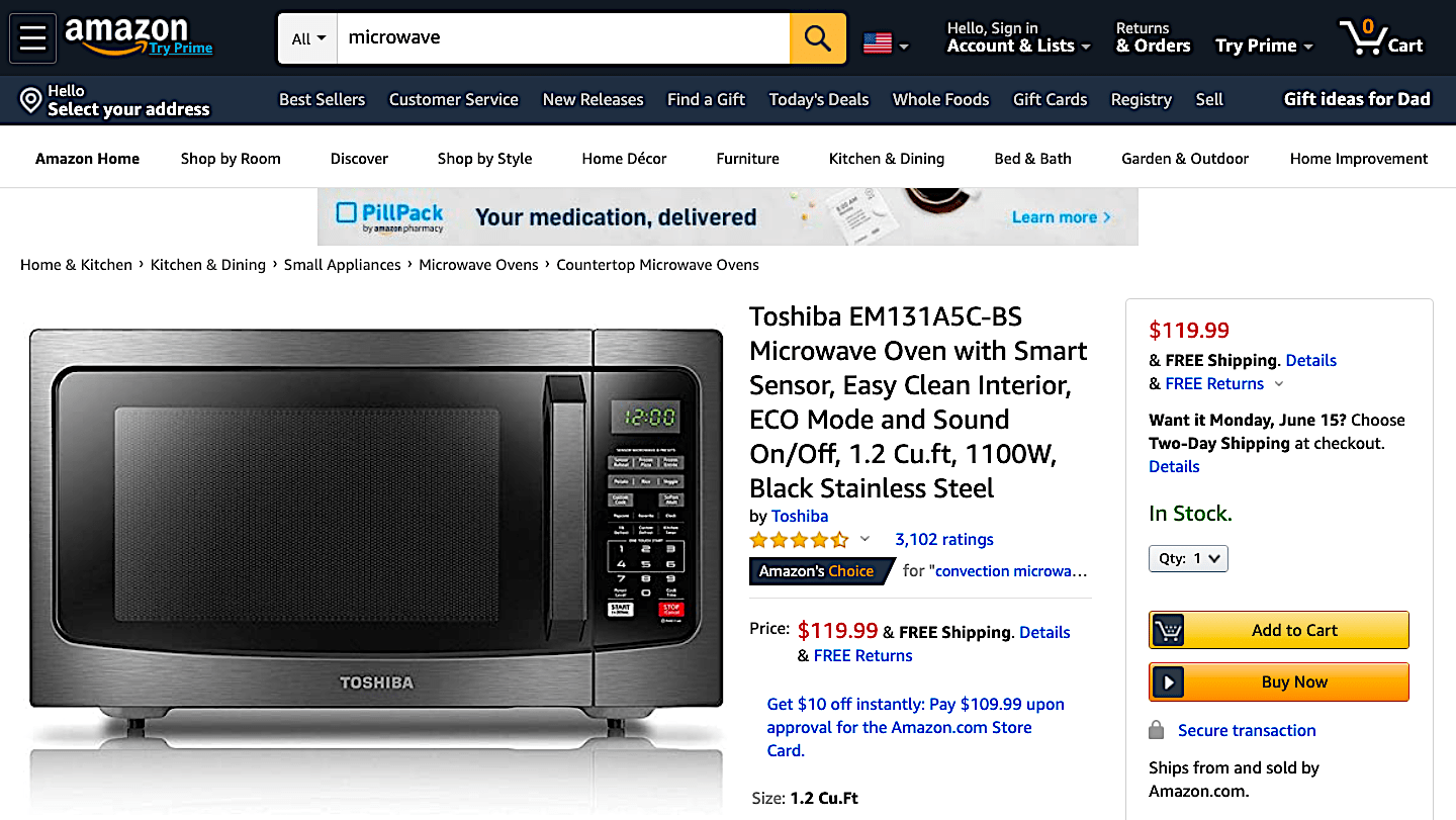
The microwave is called the Toshiba EM131A5C-BS Microwave Oven with Smart Sensor, Easy Clean Interior, ECO Mode and Sound On/Off, 1.2 Cu.ft, 1100W, Black Stainless Steel.
I think we can all agree that this is more than enough detail – so you can just stick to the basics like Toshiba EM131A5C-BS Microwave Oven with Smart Sensor Black Stainless Steel.
Product images
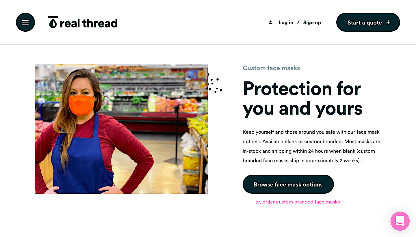
Images might just be the most important feature of a converting product page – they speak louder than words, and they allow visitors to actually see what they are buying.
To your product pages, you should add more than one image if you can, from different angles, and make the images zoomable, so the customer can look at all the different features up close.
It is also nice to have a point of reference – like a person or a hand – to show the item’s size.
Also, remember to always use high-quality images – anything in a low resolution or not sharp and appealing enough will quickly drive customers away.
Product description
Product descriptions should not only provide more details about your product, but they should also aim to convert your visitor.
In your product description, provide as much detail as you can, and mention anything that you find important – sizing, use, tips, and tricks, etc. Also, make sure your information is correct, and double-check with the manufacturer and any other source you can think of.
People won’t like it if you provide inaccurate or faulty product descriptions.
The copy you use here should be persuasive and geared towards making sales – explain why an item should be purchased and what it will provide the shopper with.
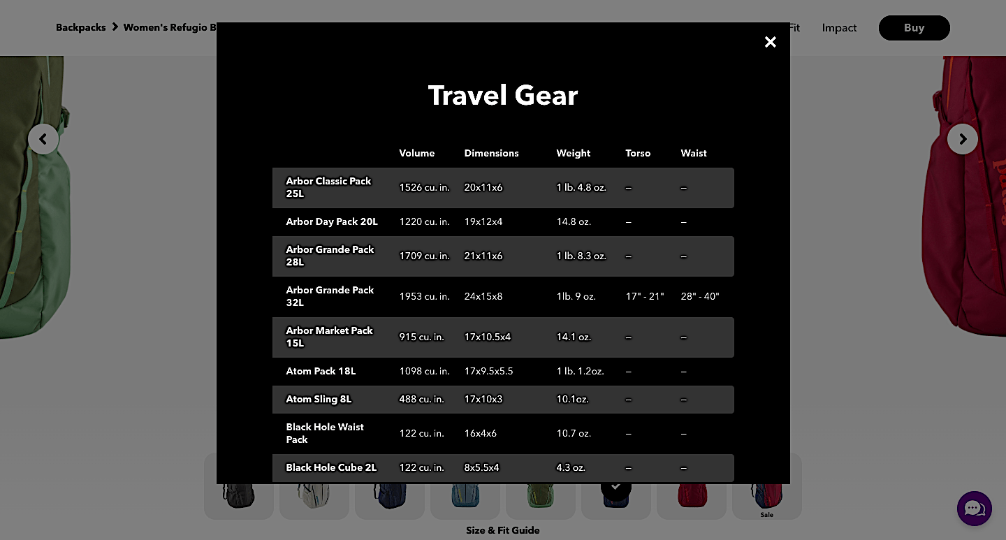
Here is an example from Patagonia, which sells outdoor gear: everything you need to know about an item is listed clearly.
Price
The price of your products should be clearly visible – large and bold enough to be spotted right off the bat. This piece of information is considered to be of paramount importance by most shoppers, so make sure you include it at the very top of the page, as near to the product image as you can.
You can also showcase things like discounts here – note the former price in smaller font and make the new price more prominent.
While you’re at it, it’s also a good idea to emphasize how much the customer will be saving with this deal.
Additional options
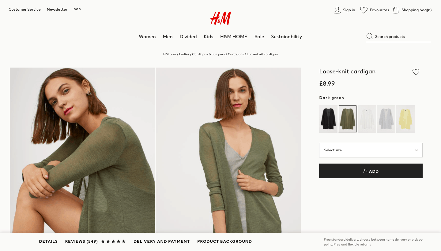
If a product is available in different colors and sizes, or if there are any other personalizable elements to it – this should also be featured prominently.
Customers like to know they have a choice available, so making sure this choice is easy to spot is very important.
Here is an example from H&M, which makes it very clear that a certain piece of clothing comes in different patterns and colors.
Shipping information
While some websites have a dedicated shipping and returns page (and by all means, you can have one too), it is often better to include this information on your product pages too – as it will help a customer make a purchase decision.
If they add something to their cart and discover that shipping is too expensive for them at checkout, they are not likely to return to your site.
In addition to that, add a shipping calculator to your pages, and make sure you clearly state which countries you ship to and how long a parcel will take to arrive.
Policies and warranties
Highlight customer-friendly policies such as warranties on your product pages will make your customers trust you and will also make them more likely to shop in your online store.
Make the duration of the warranty as prominent as possible without making it too flashy, and also provide any additional details less prominently, because a customer who makes a purchase will have plenty of time to peruse the warranty.
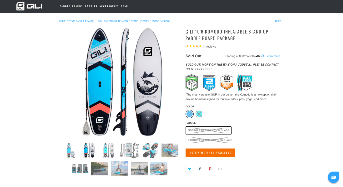
Return policies are also good to note, because they will let the customer know how much hassle it will be for them to return an item that may not fit them well, or that may not be quite what they were hoping for.
Reviews and customer ratings
Pages that have product reviews perform better than pages that don’t. And although if your products are getting bad reviews, you may not want this element featured on your pages. If this is the case, you should be doing some very hard work to improve said products, as opposed to worrying about your product pages.
Also, don’t expect to get only good reviews, nor should you feature only the positive ones.
Negative or mediocre reviews lend authenticity to your page – after all, there is no one size fits all product anywhere out there.
You can use the industry-standard star score below your product’s image, to let a customer know immediately what other shoppers think about the product.
Final thoughts
Of course, your product pages shouldn’t be limited only to the elements we’ve just listed. Anything else you feel will contribute to positive user experience and will help your visitors convert is welcome. After all, you know your target audience best.
However, make sure that the elements we have mentioned are included because they are the lifeblood of a converting product page.
Without them, your pages will not work as well as you hope.
