


You’ve just signed up for a newsletter, made a purchase, or submitted a form. A message appears on the screen confirming your action. But what happens next? That tiny moment—between the action and the user’s decision to engage further—is a goldmine for conversion optimization. It’s here where Success Message A/B Testing comes in, particularly in examining which type of success message works best: Buttons, Links, or Redirects.
Success messages can heavily influence user behavior. Should you encourage more engagement, drive users to a new section, or simply let them bask in the glow of success? Let’s dive deep into this fascinating area of design and user experience optimization.
Why Success Messages Matter
Success messages are more than just notifications—they are pivotal UX moments with real business implications. Aside from confirming that a user’s task is complete, success messages offer opportunities to:
- Guide users to the next logical step
- Promote related products, services, or content
- Encourage sharing or feedback
- Enhance user satisfaction and trust
In essence, success messages can either be a dead-end or a launchpad depending on how they’re implemented. This is where A/B testing becomes a powerful tool.
Understanding the Three Success Message Variants
Let’s break down the three most common variants used for success messages:
1. Buttons
A button typically accompanies a success message with a clear call-to-action (CTA) like “Continue Shopping”, “Explore More Articles”, or “Invite Friends”. The advantage of using buttons lies in their visual prominence and interactive appeal.
Pros:
- Highly noticeable
- Clear, actionable next step
- Easy to track user engagement
Cons:
- Too strong a CTA can feel pushy
- Might distract from the success moment


2. Links
Some designs opt for textual hyperlinks in the success message. These links might say “Check out our blog” or “Return to homepage”. They tend to blend more into the content continuum.
Pros:
- Subtle and less intrusive
- Well-suited for low-stakes contexts
- Gives experienced users more control
Cons:
- Can be easily overlooked
- Less likely to drive engagement
3. Redirects
Some websites or apps automatically redirect users after a successful action. For instance, completing a signup might instantly take the user to their new dashboard.
Pros:
- Reduces decision fatigue
- Creates a seamless transition to the next task
- Great for onboarding flows
Cons:
- Feels abrupt if unexpected
- Removes user choice entirely
- Can lead to confusion or disorientation
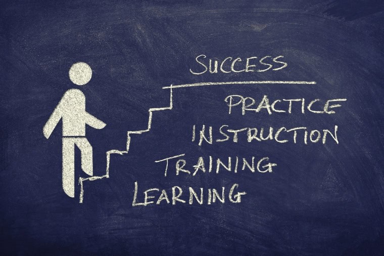
The Importance of A/B Testing
No matter how smart your design may seem, assumptions can quickly be proven wrong in the real world. That’s why A/B testing is essential. It enables you to compare different success message implementations in real-time and determine which one performs best based on your objectives.
Common goals for success message A/B tests include:
- Increasing user engagement post-conversion
- Reducing drop-off rates
- Boosting secondary conversions, such as social shares or upsells
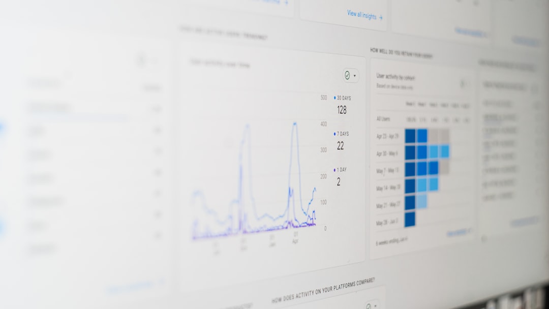
Metrics That Matter
To understand which format wins in your A/B tests, you’ll need to focus on several performance metrics:
- Click-Through Rate (CTR): Measures how often users interact with the button or link
- Time on Task: Indicates how long users spend before moving to the next step
- Bounce Rate: Tracks users who leave immediately after the success message
- Conversion Funnel Completion: Measures how many users complete the next step you’re guiding them to
Unexpected Findings from Real A/B Tests
Multiple companies have experimented with success message A/B tests, often with surprising results. Here are a few examples:
- A SaaS platform found that buttons increased demo bookings by 22% compared to simple success messages with links.
- An e-commerce retailer saw that a redirect to a personalized product recommendation page instead of showing a basic confirmation increased upsell rates by 18%.
- A newsletter subscription form tested links vs buttons in their pop-up success message. Surprisingly, links resulted in more social shares—possibly due to lower pressure and more organic interaction.

Use Context as Your Guide
If there’s one truth in UX design, it’s this: context is everything. The success message that converts well on one platform might flop in another. For example:
- Onboarding screens may benefit more from redirects to keep the momentum going.
- Product checkouts might do better with buttons that encourage sharing or related browsing.
- Newsletters and article sign-ups often work best with links so users can casually explore other content.
Best Practices to Follow
Here are several best practices to consider when designing and testing success messages:
- Set a clear goal. Whether the aim is user retention, engagement, or upselling, know what you’re trying to improve before you test.
- Only test one variable at a time. Mixing a new success message with a new design or layout will skew your results.
- Ensure accessibility. CTAs (whether buttons or links) should be easy to see, tap, and understand for all users.
- Respect user intent. Don’t force people into actions they didn’t expect (a common redirect pitfall).
- Keep it fast. Delayed redirects or unresponsive buttons can completely nullify positive results.
What’s the Verdict?
So, are buttons better than links? Are redirects the ultimate solution? The answer isn’t black and white. Instead, the best success message type hinges on:
- The stage of the user journey
- The user’s intent
- The design of the overall experience
- The business’s main objectives at that moment
Testing different formats and analyzing user data is the only way to know what works for your specific use case. Remember, even small tweaks in success messages can lead to massive improvements in user flow and business metrics.

Final Thoughts
Whether your priority is nudging users into another conversion or simply acknowledging their successful task in a clean, efficient way—designing and testing success messages is a crucial aspect of user experience. Through careful A/B testing of buttons, links, and redirects, you can transform a simple moment into a strategic asset for long-term growth.
So the next time you launch a feature, offer, or signup process, don’t stop at the conversion. Start testing what happens after.