


Ask any product team why their interface feels slightly off and icons will appear on the list. Not because they are missing, but because they come from five places at once: an old UI kit, a random free pack, someone’s side project, and a couple of quick doodles done directly in Figma. Icons8 exists to replace that pile with something you can actually maintain.
The service treats icons as infrastructure. You do not just download a few nice symbols and forget about them. You plug into a living, curated system that designers, developers, marketers, teachers, and students can all use without tripping over each other.
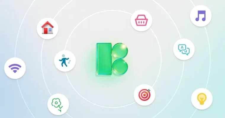
What Icons8 Really Brings To The Table
Icons8 is a large icon library, but the size is only half the story. The important part is that the collection is built as families. Inside one style, every icon follows the same grid, stroke logic, corner treatment, and level of simplification. A lock for security, a card for billing, a bell for alerts, a gear for settings, and a heart for favorites all look like they belong on the same screen.
That consistency is what most internal design systems try to create manually. Icons8 simply exposes it as a ready-made resource. Design students can see what a production-grade icon system looks like. Startups get a visual language on day one instead of cobbling it together sprint by sprint.
From a high level, the library can be split into three groups:
- Platform-aware UI sets for apps and SaaS dashboards.
- Neutral outline, glyph, and flat icons that work almost anywhere.
- Decorative, colorful, and 3D packs for marketing and education.
Across these groups you get coverage for generic interface actions, industry-specific concepts, and niche topics that are painful to draw by hand every time.
Style Systems And Platform Expectations
Users do not read icon specs. They recognize patterns. An iOS user expects thin outlines and familiar metaphors. Someone in a Windows-heavy office environment is used to a certain mix of color and shape. A browser dashboard has to live next to Chrome or Edge UI without clashing.
Icons8 leans into those expectations by offering style families that match the tone of major platforms:
- Stroke and proportions aligned with Apple’s Human Interface rules.
- Material-flavored sets that echo Google’s spacing and geometry.
- Windows-style icons tuned to the more rounded, colorful Microsoft ecosystem.
- Generic UI packs that deliberately keep branding light so they drop into almost any product.
- Experimental and 3D sets that are better suited for campaigns, hero sections, and explainer decks.
For designers this feels less like browsing stock and more like picking a direction for a design system. Once a team decides on a base style, every new icon for the product can be pulled from that same family, which keeps the interface from slowly drifting into visual chaos.
Formats, Specs, And Developer Concerns
Developers are not hired to think about the exact angle of a chevron. They care about file size, rendering issues on older devices, and the cost of changing assets later.
Icons8 respects that by shipping icons in formats that cover most stacks:
- SVG for scalable interfaces and component libraries.
- PNG in multiple resolutions for email templates, PDFs, and stacks that do not love vectors.
- GIF and Lottie JSON when animated icons are part of the design.
- Print-friendly options for manuals, posters, and training materials.
On top of raw files you get:
- Direct CDN links for quick prototypes and simple sites.
- Inline SVG snippets so performance-sensitive projects can avoid extra requests.
- An API that lets engineers pull icons automatically, transform them into React, Vue, or other components, and map them to design tokens.
This matters once the product matures. If a company decides to switch from outline icons to filled ones, the mapping can change behind the scenes while the component names in code stay the same.
Search, Filters, And In-Browser Editing
A huge library without decent search is a time sink. Icons8’s search is tuned for the way real teams write tickets and specs, not for academic taxonomy. You can type terms like billing, incident, quota, refund, or attendance and get useful candidates on the first screen.
Filters narrow results by style, category, and animation. Visual search lets you drop in a screenshot of an existing interface and find related icons, which is handy when you inherit a legacy product and do not know how the originals were named.
Once an icon is selected, the browser editor handles routine tweaks:
- Adjusting color to match brand variables.
- Adding or removing background shapes.
- Changing padding to line up with grids or auto-layout containers.
- Preparing a dark-theme-ready version without blowing out contrast.
For marketers, content managers, and junior designers this is enough to avoid constant hand-offs for trivial adjustments. The base style remains intact while surface-level details adapt to each project.
Collections sit on top of this workflow. You group all icons for a product, feature area, course, or campaign, then export them together in the formats each team needs.
How Different Roles Use Icons8
Product and UI designers
Product designers typically discover icons as a bottleneck mid-sprint. New flows appear, edge cases pile up, and suddenly the interface needs ten more states and actions visualized.
With Icons8, icon work becomes largely about curation. A designer selects a base style, builds a starter set for navigation, state messages, and key actions, and saves it as a collection. When a new feature arrives, they do not start drawing; they search within that framework and extend it.
This keeps studies and prototypes focused on behavior, copy, and accessibility instead of redoing yet another alert symbol from scratch.
Developers and engineering leads
For engineering teams, Icons8 acts as a predictable asset provider. A front-end lead can integrate the API with the design system, using semantic names in code while mapping them to specific icons in a chosen pack.
The benefits show up months later. When branding evolves, the mapping table updates, builds regenerate, and the interface adopts the new look without surgeons going through templates manually. That is the difference between treating icons as files versus treating them as part of a system.
Mobile engineers benefit from platform-specific sets. Icons sized and tuned for iOS and Material Design fit system bars and list rows without constant pixel nudging.
Marketers and content managers
Marketing assets are noisy. You have headlines, photography, charts, buttons, badges, and social proofs competing for the same few inches of screen or paper. Icons have to cut through that noise without turning the layout into clipart soup.
Icons8’s decorative and colored sets help here. A single concept like navigation, branches, or proximity can be portrayed in a strict monochrome style for a serious whitepaper or in a bright, rounded variant for a landing page. A simple location icon can appear as a flat pin, a 3D marker, or a playful badge, depending on the brand tone you aim for.
For content managers, this means less reliance on designers for every infographic or blog illustration. They can stay within defined style boundaries and still adapt visuals to the story they are telling.
Startups and small teams
Early-stage teams usually treat design as a shared chore. No one has time to craft a bespoke icon language, yet everyone wants the product to look like it belongs in the same league as tools they admire.
Icons8 gives them a ready-made foundation. A founder and a single designer can pick a style and use it across the app, marketing site, pitch decks, and support docs. Investors see a coherent product. Early customers do not have to relearn symbols every few screens. When a dedicated brand designer arrives, they can either keep Icons8 as the backbone or slowly replace pieces with custom work.
Educational projects and teachers
Education is full of abstract ideas. Good visuals make them easier to grasp; bad ones get ignored. Many teachers end up dragging inconsistent clipart into slides simply because they do not have time to do better.
Using Icons8, a teacher or course author can assemble a consistent set of symbols for an entire subject: diagrams for physics, process icons for business courses, timeline and map symbols for history and geography. Because many assets are available with attribution-based free use, schools and universities can build more professional materials without blowing their budgets.
Design students gain something else: a real-world example of how icon systems work. They can reverse-engineer how Icons8’s internal guidelines translate into shapes that remain legible at 16 pixels and still feel cohesive at 128.
Licensing, Attribution, And Legal Safety
Pulling icons from random corners of the internet is cheap until the day legal asks where they came from. Icons8 avoids that by making licensing rules explicit.
At a basic level, you get:
- Free access to parts of the library, usually with attribution and limits on size or formats.
- Paid options that unlock vector files, higher resolutions, and broader commercial rights.
- Clear separation for logo-like icons and character work that may involve third-party trademarks or recognizable people.
For design leads, product owners, and teachers this clarity means fewer last-minute asset changes before a big release, public launch, or course rollout.
When Icons8 Is The Right Tool And When It Is Not
Icons8 is extremely good at solving one class of problems: providing a broad, coherent set of icons for real products, marketing ecosystems, and educational content. It will not replace a dedicated brand designer on a flagship project where every shape has to be unique.
Use the library when you want:
- Coverage for most interface actions and states.
- A visual system that will keep expanding with new concepts over time.
- Non-designers to safely work with icons inside defined guardrails.
Commission custom work when:
- The entire brand is being defined from scratch and icon style is a central pillar.
- You need symbols tied to proprietary workflows or internal jargon.
Understanding that boundary makes it easier to trust Icons8 for what it is extremely good at, instead of forcing it to be something else.
Practical Habits For Teams Using Icons8
Teams that get the most value out of Icons8 tend to follow a few simple habits:
- They decide on one or two base styles and document that choice in their design system.
- They build shared collections for each product, area, or campaign instead of downloading icons ad hoc.
- They let marketers and content creators use the web editor for small adjustments while keeping deep changes in professional tools.
- They review new packs on a schedule, not impulsively, to avoid slow visual drift.
Icons do not sell a product on their own, but they absolutely shape how trustworthy it feels. By turning iconography into something structured, searchable, and maintainable, Icons8 gives designers, developers, marketers, students, and teachers one less source of friction to worry about and one more part of the stack they can rely on.