Affiliate page design is, in a way, no different from any other webpage design. It needs to appeal to your target audience, it needs to be aesthetically pleasing, and it needs to be easy to navigate, bolstered by quality copy and creative imagery.
However, the one main difference that sets affiliate websites apart is that they technically only serve one purpose: to convert visitors into customers.
So let’s explore some affiliate page design best practices.
White space is your friend
The clever use of white space can help you draw attention to specific areas of your page. You don’t have to use a whole lot of color or crafty design elements – simple white, essentially empty areas will do the trick.
White space is also one of the most important elements of modern design, so if you are looking to achieve a clean and uncluttered effect, this is the kind of page layout you should be going for.
For example, here’s how Seriously Smoked does it: they have various features, from charts to images, but all of them easily stand out on the page because they are surrounded by plenty of white space.
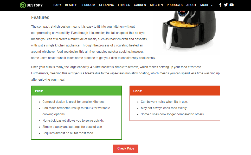
List the pros and cons
Your visitors will want to know what a product is all about in as little time as possible. Sure, they might also end up reading your copy, but they would love to be able to tell at a glance what the main features of the product are, and what some of the drawbacks may be.
This is why the use of pro and con widgets can be so useful – you instantly reveal to a visitor why a product is a great choice, and alternatively, why it might not be worth the money.
Make sure you are very honest and focused in these pro and con lists, and don’t soften any blows: the more honest and trustworthy you are, the more traffic you can expect in the long run.
Here is an example from Best Spy: they not only feature a clever pro-and-con section on their website, but there’s also a Check Price button right below, making it easy for visitors to make a purchase if they come across a product they like.
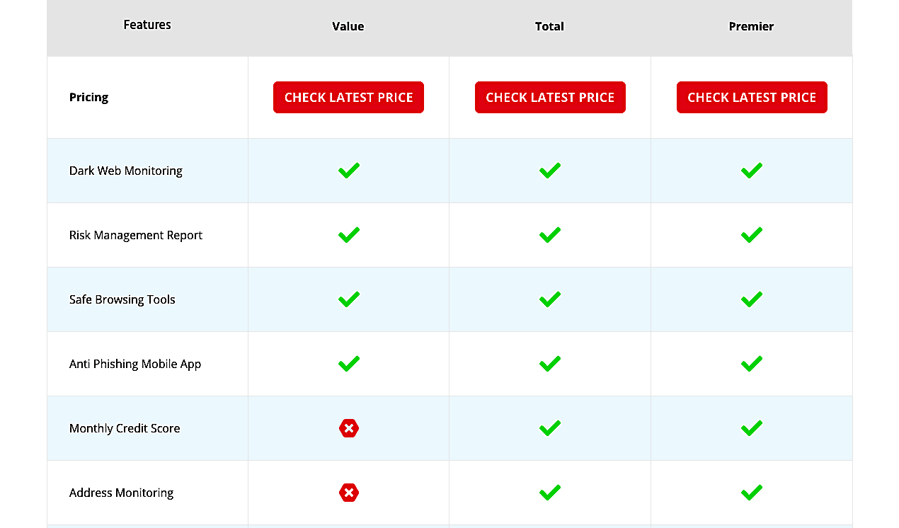
Offer comparison tables
If you are reviewing more than one product or service on a page, sometimes it can get a bit confusing. You have all this information, and you can do your absolute best to be clear and concise, but people will still forget what they’ve read a minute ago. They’ll need to keep scrolling and comparing in order to get the best possible picture.
Even if you are comparing the different features of a single product (for example, different pricing plans), you can seriously benefit from using a comparison chart or table. This will not only provide a visual representation for the most important facts you’ve covered in your copy, but it will also be a very easy way to figure out which product or plan is right for a reader.
Here’s an example from Home Security Heroes. They’ve done a great job of illustrating how these visuals can help a visitor out and nudge them to reach a decision.
Offer your own opinion
A lot of affiliate websites are a bit dry and generic. There is very little personalization in them, and they don’t actually offer any of their own opinions. If you add a bit of a personal touch to your posts, you can appeal to your readers in a new way, and perhaps inspire even more conversions.
Here is an example that is off the charts, in the sense that this is a personal blog that uses affiliate links, but you can get a clear idea of the kind of personalization we have in mind. You don’t have to invent a whole new persona whose voice you’re going to use, but you can state an opinion here or there, make a joke or a pun, and help your readers relate to you a bit better.
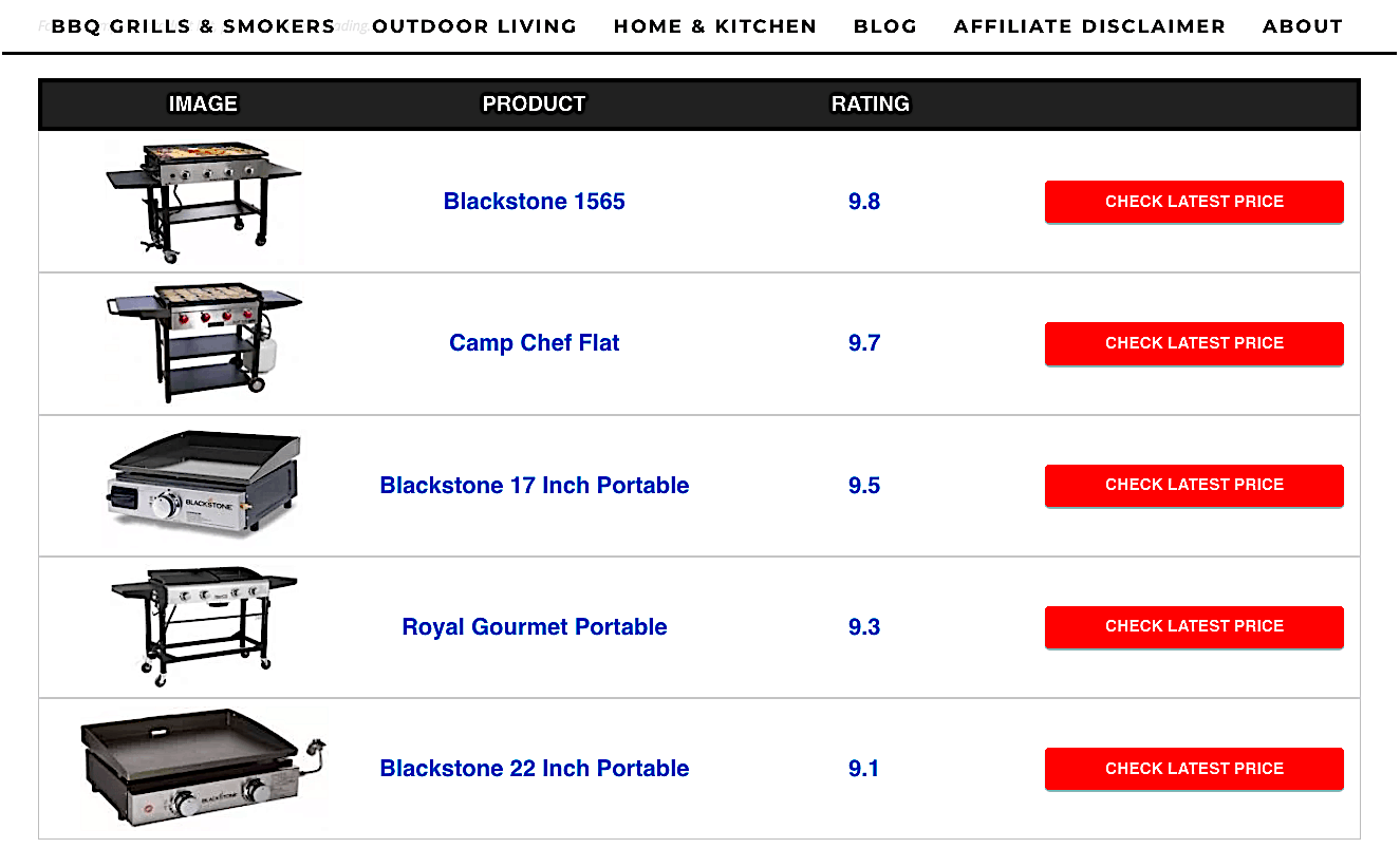
Rate the items you review
Apart from the comparison tables and the pros and cons we have already mentioned, another great way to inspire more conversions is to use ratings. They can be your own, or they can be imported from the affiliate you are working with (like Amazon), but in any case, they are a straightforward way to clearly show a visitor which product is better than the rest.
You can do this with the usual star system, which is most recognizable, and make sure you prominently feature these ratings on your page.
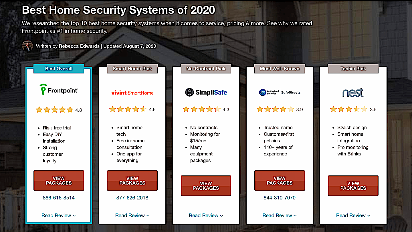
SafeWise does this well with this main table they feature on their pages. The reviews are clear and easy to spot, along with a whole host of other useful information about a certain product.
Use creative and action-inspiring CTAs
You sometimes need to push your visitors a bit to make a purchase. Not in the sense that you need to talk them into it, but that you need to give them plenty of opportunities to convert, and use the right words to inspire action.
CTA buttons that are simple and to the point are okay – something like Buy Now, or Click Here, and so on. But you can also make them a bit more urgent than that, and add a bit of dynamic to your page.
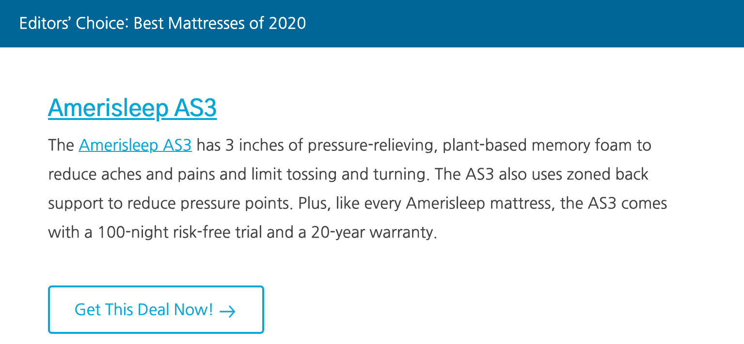
Here is an example from Savvy Sleeper, which has a neat Get This Deal Now! button that is certainly more effective than your garden-variety CTA. It’s especially useful when there is an actual expiration date on an offer.
Final thoughts
Designing an affiliate page that converts will require a bit of time and effort, but all of that will surely pay off if you approach the task with the right mindset.
Don’t aim just to make it look good – aim to elicit plenty of conversion points. And do that, you’ll need to think of your target audience, rather than what you personally might like on a page.